Toronto Form Condos | 50.59m | 14s | Tridel | a—A

Pics taken Apr 26, 2019


fullsizeoutput_241e.jpeg


DSC04245.JPG


fullsizeoutput_2425.jpeg


fullsizeoutput_2421.jpeg


fullsizeoutput_2422.jpeg


fullsizeoutput_2423.jpeg


fullsizeoutput_2424.jpeg
 
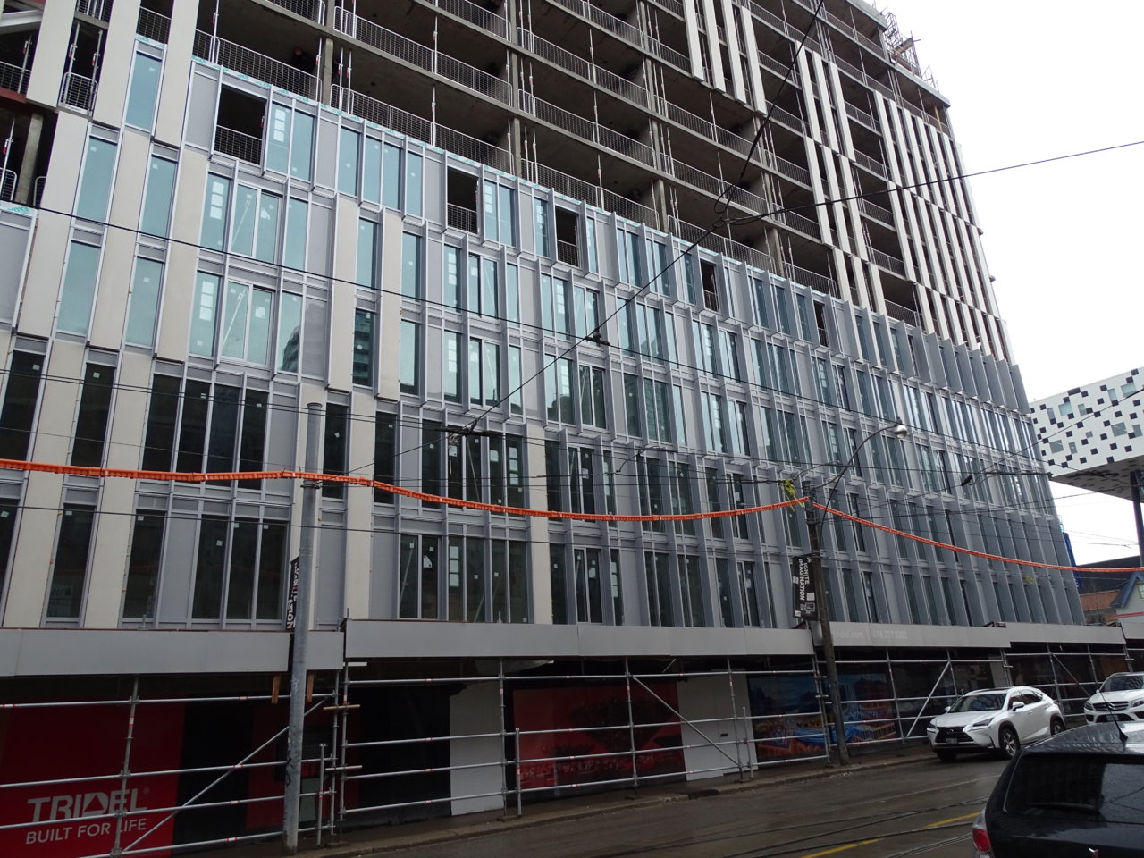
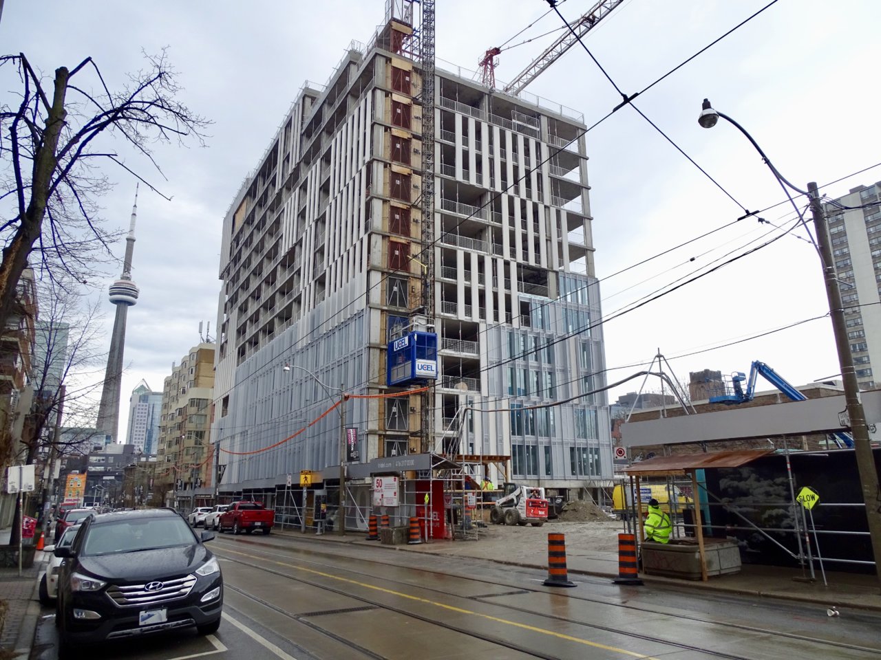
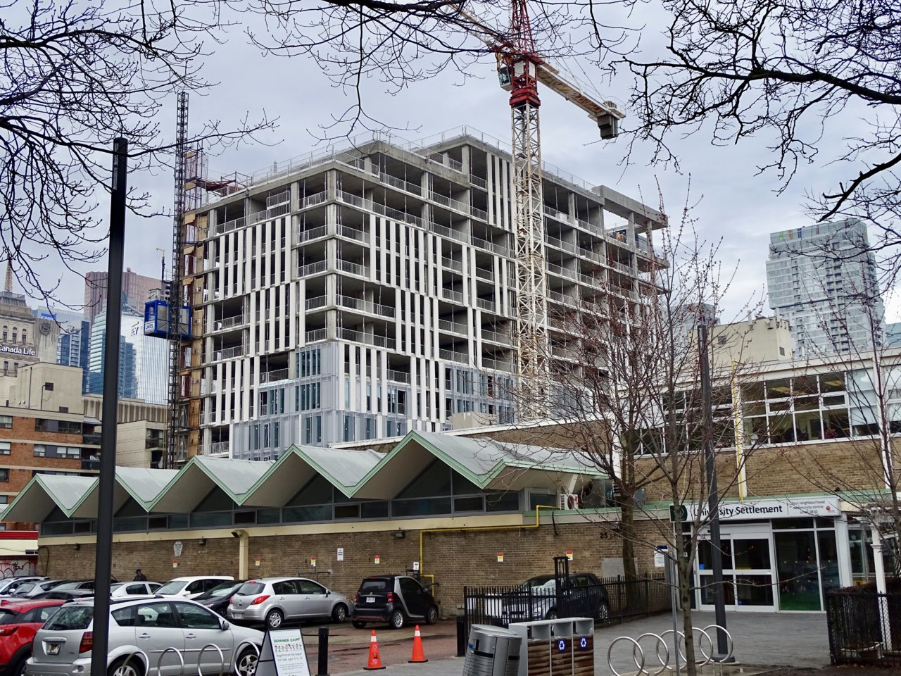
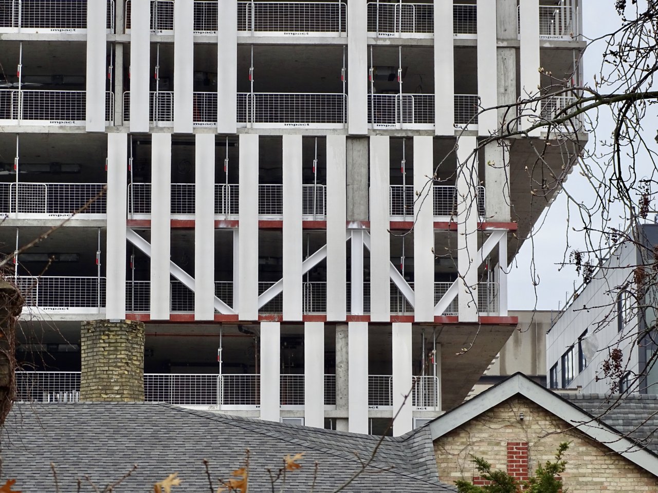
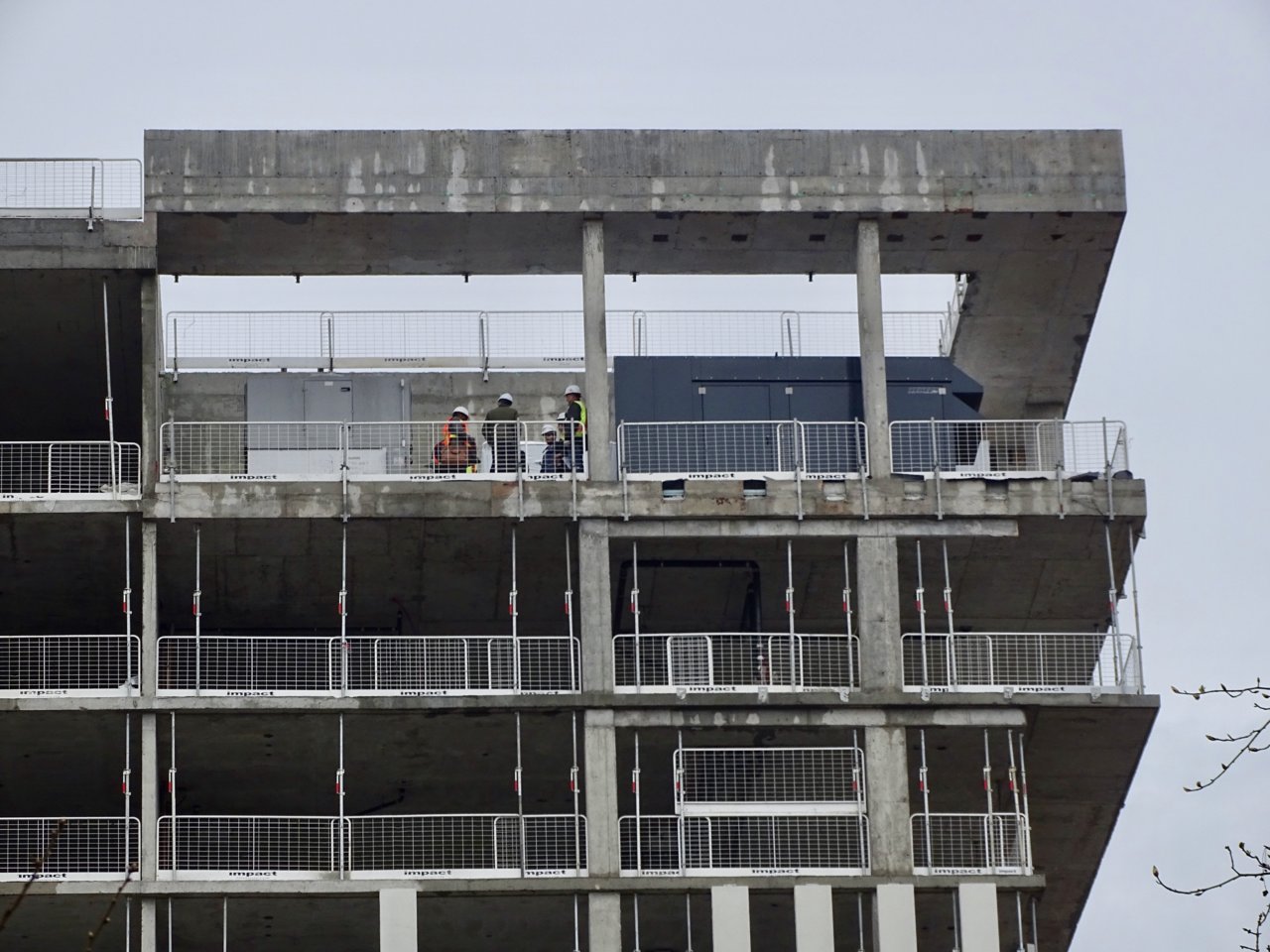
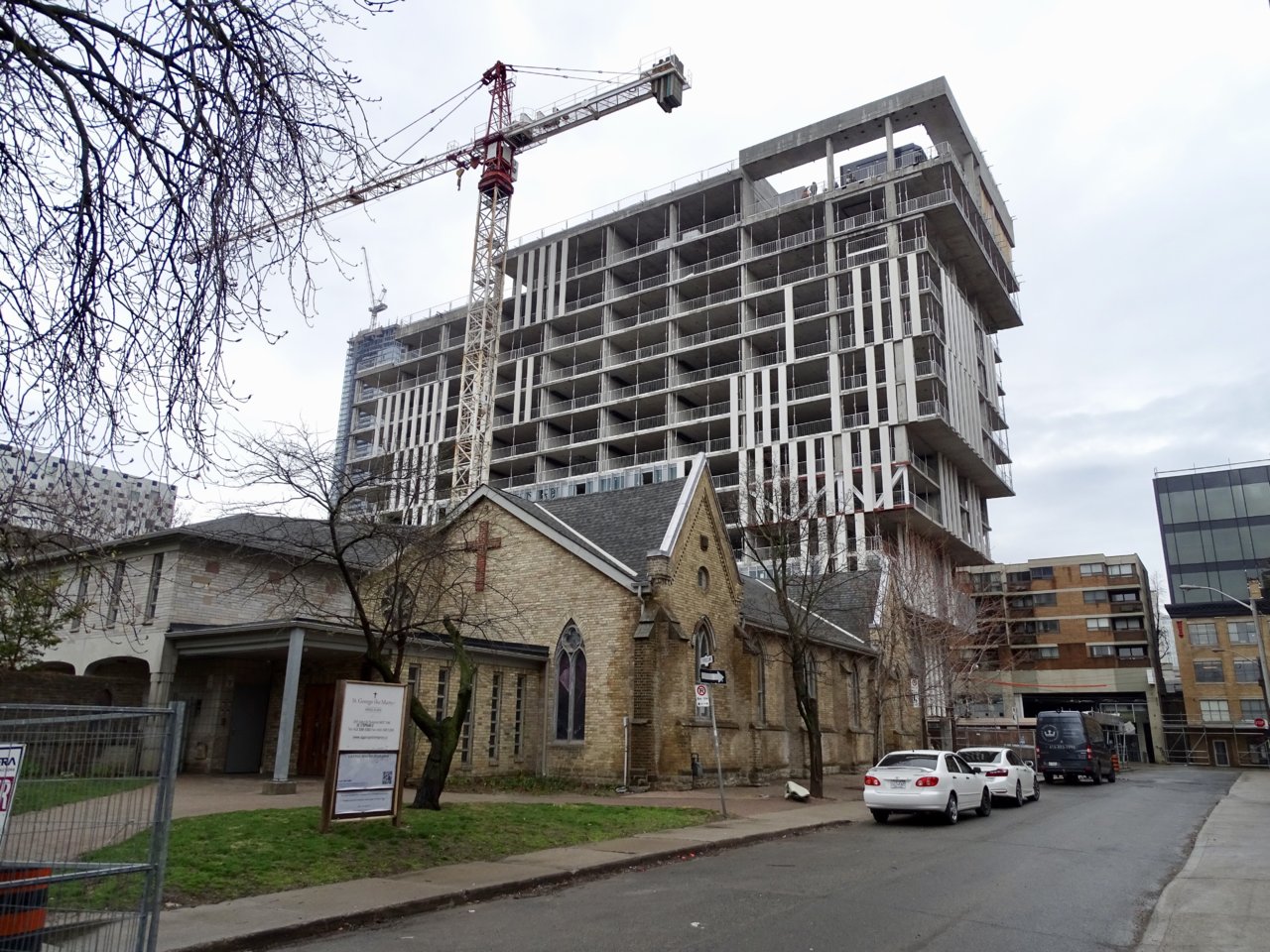
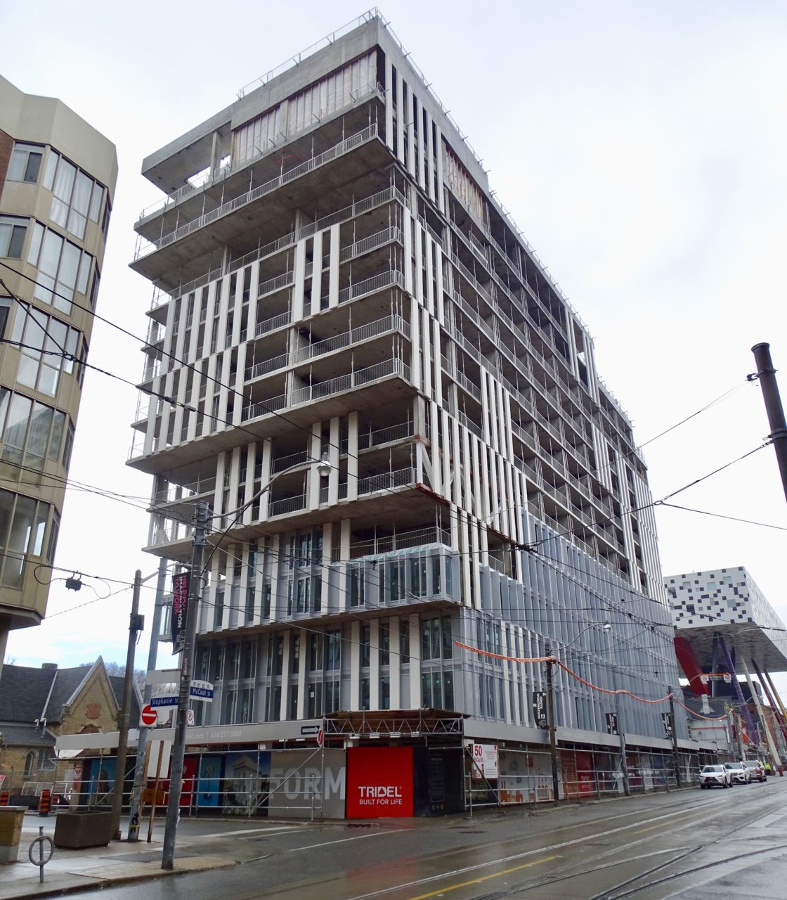
i had such high hopes for this one. I've seen correctional facilities with less oppressive facades and better material selection.They could've at least chosen some colour spandrel to play off OCAD up the street. The grey spandrel and the beige precast are not distinct enough yet still clash.
 
From the weekend, two different cameras:

DSC00862.jpg
DSC00863.jpg
IMG_5388.jpg


42
 
Walking by I'm trying to like it but it's hard. I do think it looks better in person but reminds me of Alter. High hopes but falls short due to....Tridel doing Tridel things.
 
The problem is the window-wall/spandrel panels should've had a metallic-silver finish instead of flat grey. I think aA's design intent was for the building to shimmer. The absence of this effect is likely due to Tridel value-engineering the cladding. It's still interesting to look at and I'm hoping it'll all come together but I doubt it.
 
Last edited:
I noticed that there’s very few operable windows in this building. I do see some very skinny sliding glass doors for barely adequate anorexic Juliet balconies though.
The windows are not tinted (well, slightly blue-green) so expect this building to look much worse when residents start moving in and window coverings will mess up the facade even more.

If the window mullions and spandrels were black, the glass tinted, and the fins a warmer metallic or shimmery grey, this building would have been a real stunner. Looks like a giant damaged mechanical vent.
 

Back
Top