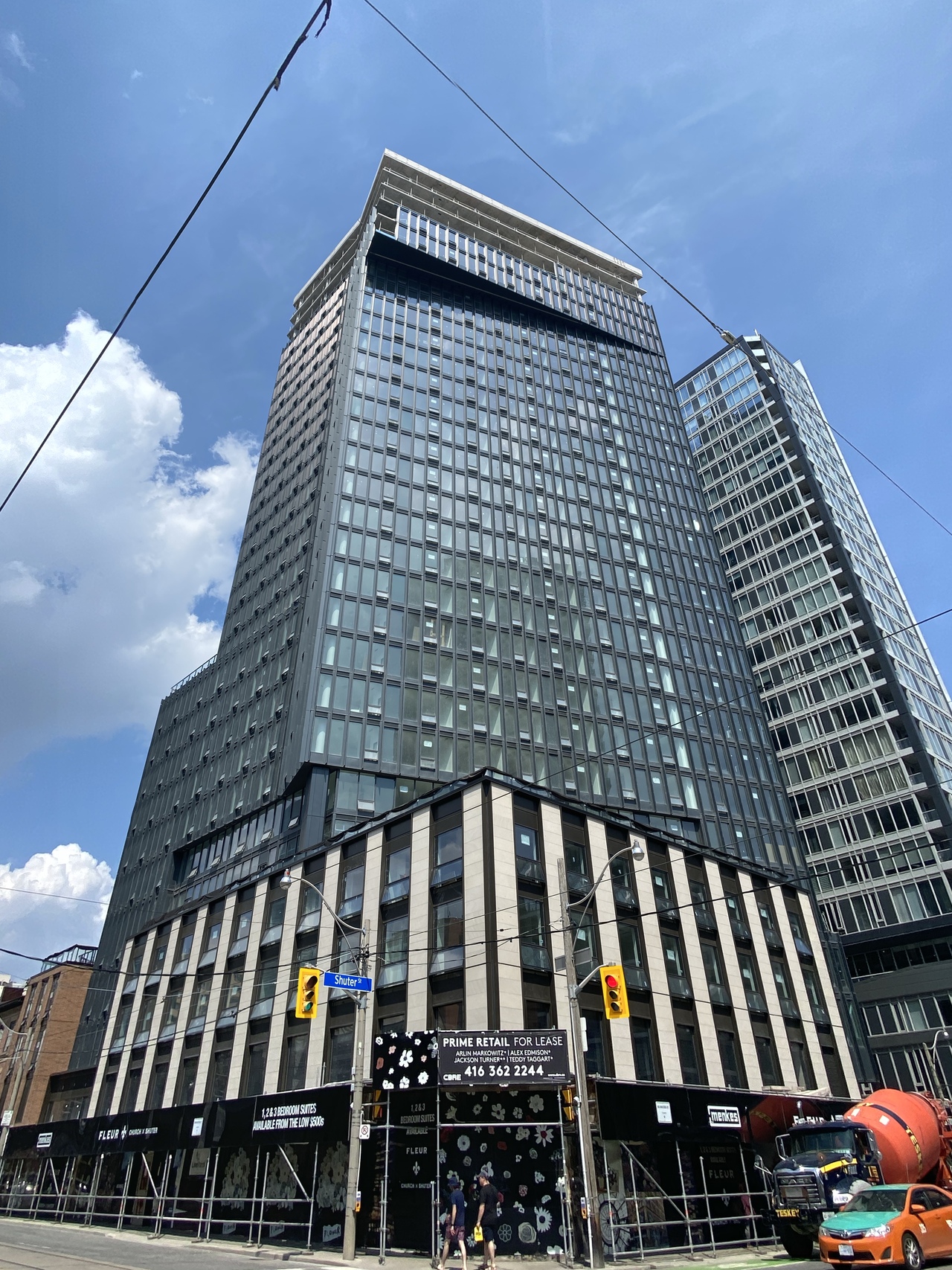
Toronto Fleur Condos | 85.34m | 29s | Menkes | a—A

Taken – 08/10/2020

IMG_5264.jpeg


Turned out phenomenal. In my opinion, of course.

Menkes and architectsAlliance = now twice a winning combination.

Now, if only Menkes would hire them on more projects...
 
The aesthetic quality on Menkes projects tends to fluctuate. They've hit some home runs like Fleur and Harbour Plaza of course. Some decent mid-table ones like Lumiere and Fabrik. Going down the spectrum, 87 Peter and Pears on the Avenue unfortunately missed the mark and are pretty subpar.

They've then hit rock bottom with 365 Church and the Eglinton. While in.DE looks like it'll end up being crap based on renderings. I'm not going to bother ranking their work in North York and Etobicoke as they're all collectively dreadful.
 
Last edited:
The aesthetic quality on Menkes projects tends to fluctuate. They've hit some home runs like Fleur and Harbour Plaza of course. Some decent mid-table ones like Lumiere and Fabrik. Going down the spectrum, 87 Peter and Pears on the Avenue unfortunately missed the mark and are pretty subpar.

They've then hit rock bottom with 365 Church and the Eglinton. While in.DE looks like it'll end up being crap based on renderings. I'm not going to bother ranking their work in North York and Etobicoke as they're all collectively dreadful.

Agreed almost entirely except I'm not as charitable towards Fabrik. For myself, it falls into the 'pretty subpar' category, only narrowly escaping 'bargain basement' level.
 
The Eglinton is an especially egregious project of theirs because it's highly visible and blocks out the Y+E skyline from the east, and is unlikely to be blocked anytime soon since Eglinton Public School rests to the east of it.
 
The Eglinton is an especially egregious project of theirs because it's highly visible and blocks out the Y+E skyline from the east, and is unlikely to be blocked anytime soon since Eglinton Public School rests to the east of it.

There's so many things wrong with the Eglinton, but my absolute biggest gripe is the vertical strip of mostly spandrel running along the west side of the building. This hideous thing actually makes the Madison one block west look good in comparison.

The other major chance to block out this when viewed from the east is if someone buys the Finnish Credit Union building and redevelops it.


1597201015429.png
 
There's so many things wrong with the Eglinton, but my absolute biggest gripe is the vertical strip of mostly spandrel running along the west side of the building. This hideous thing actually makes the Madison one block west look good in comparison.

The other major chance to block out this when viewed from the east is if someone buys the Finnish Credit Union building and redevelops it.
I stare at this turd every day, as my view looks out to it when I look toward the Yonge n Eg skyline...I absolutely hate that steaming pile. The podium is honestly just as uninspired as the old office building's street treatment...heck eben worse in some ways. The spandrel strip seems like a reference to the old building...but a juvenile attempt. It's a really sore thumb in the area which really sucks...and it replaced a decent office building too. I wish the city had more vision....

Menkes confuses me as a company, with regards to product quality. I dont ever want to see them anywhere near Yonge and Eg is all I will say...even with projects they work on like this.
 
Beautiful, thanks for the images! Something like this in southcore or by the waterfront would do wonders in adding some materiality and breaking up the sea of blue.
For the waterfront, a building like this could use a pop of colour, similarly to what was done with the primary colours on X (or is it X2) condos that really contrasts with all the black.
 
That building is sculpture.

42
 

Back
Top