Toronto Five St Joseph | 160.93m | 48s | Five St. Joseph | Hariri Pontarini

They've started brickwork in the laneway, but it's hard to see from outside the fencing. It's toward the north end, right behind the scaffolding. There should be more visible progress soon.
 
Some of the best cladding on any new condo in the city right now.
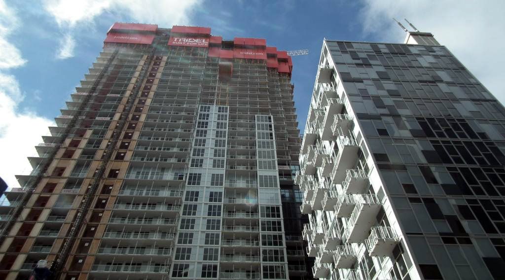

yea, compare that to the giant mountain of cheap window-wall garbage that Tridel, Kirkor, P+S, Canderel and the rest have been foisting on the city over the past 10 years.

if we are lucky, the bottom feeders will soon be embarrassed into raising the extremely low bar they've set for themselves and the city.

 
Five is impressive up close and from a distance. My view is of the Y/B cluster, and this building is standing OUT!

As for shaming other developers: is Five a higher cost condo? The above list strikes me a down-market targeted - and it's a big market.
 
I would say that the developers mentioned above are not targeting down-market purchasers. Projects like Aura, YC and 300 Front frequently tout themselves as luxury/high end condos.

On a side note: While I agree that Tridel usually doesn't produce the nicest looking buildings, they do build very high quality suites with great management afterwards.
 
Last edited:
They've got brick all the way down to the open part of the laneway now. It looks good, as expected. The intersection of St. Nicholas and Phipps is going to be a little urban gem once this is done.
 
I would say that the developers mentioned above are not targeting down-market purchasers. Projects like Aura, YC and 300 Front frequently tout themselves as luxury/high end condos.

On a side note: While I agree that Tridel usually doesn't produce the nicest looking buildings, they do build very high quality suites with great management afterwards.

These companies are degrading their brand identity then. That said, active public criticism and engagement for safety, environmental, and aesthetic reasons takes time to respond to, especially when cost pressures make cheaper methods more tempting. Kudos to the Five people for setting good precedents.
 
From today.

IMG_4719.jpg
 

Attachments

  • IMG_4719.jpg
    IMG_4719.jpg
    96.5 KB · Views: 5,554
yea, compare that to the giant mountain of cheap window-wall garbage that Tridel, Kirkor, P+S, Canderel and the rest have been foisting on the city over the past 10 years.

if we are lucky, the bottom feeders will soon be embarrassed into raising the extremely low bar they've set for themselves and the city.

Wow, I almost spat out my tea! You nailed it with this comment. I couldn't agree with you more.

EDIT: Although, I must say, those white lines cheapen the look of the building immensely, in my opinion at least...
 
EDIT: Although, I must say, those white lines cheapen the look of the building immensely, in my opinion at least...

I think they create a little bit of visual interest, what I'm perplexed about is why some of the tiles are white, and some grey?
 

Back
Top