Toronto First Canadian Place Rejuvenation | 298.08m | 72s | Brookfield | MdeAS Architects

I wonder if this has anything to do with it.
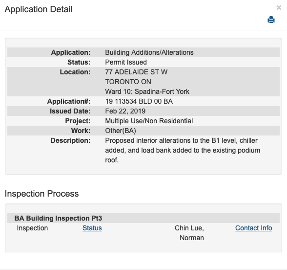
178986
 
So this is what that is for.

“BMO First Canadian Place Trading Floor project team has reached an exciting milestone after officially mobilizing on site and for the assembly of their first tower crane! This project includes a major modernization and redesign program of the Bank of Montreal’s Toronto Trading Floor, creating a new state-of-the-art 500-seat office that will support future growth and operations.”
 
The exterior update to FCP was nice, but the interior needs to be modernized by softening it somehow. The old marble on marble on marble feel/look is very cold and sterile. Most new buildings incorporate wood and other softer materials that give them a warmer and more inviting vibe. Not sure if this would ever happen with FCP, but it would be nice if it did. Actually, now that I think about it, they did a good job with the lower food alley. Better colors and textures. I'd like to see them do that to the main lobby in the basement and on the main floor.
 
I strongly disagree, to be clear I could see why someone would say it needs to be softened but said marble design (and even the cold /sterile look ... which is indeed one interpretation of what that material exudes) is what differentiates FCP from many other buildings - why change that ?
 
I strongly disagree, to be clear I could see why someone would say it needs to be softened but said marble design (and even the cold /sterile look ... which is indeed one interpretation of what that material exudes) is what differentiates FCP from many other buildings - why change that ?

Agreed. Scotia Plaza changed materials on their concourse level presumably to brighten the corners and the result is bland – it now looks a lot more like any number of other places. It's an office tower lobby, it can be more grand and less 'warm'. (And I don't find it particularly 'cold' feeling – it's a lot of white marble, but it's a bright, light-filled space that's always bustling with tons of people.)
 
I strongly disagree, to be clear I could see why someone would say it needs to be softened but said marble design (and even the cold /sterile look ... which is indeed one interpretation of what that material exudes) is what differentiates FCP from many other buildings - why change that ?
My main office is down there, so I spend a regular amount of time in FCP.

In its current incarnation, it is something to be appreciated if you walk through it once or twice, or only consider it from a designer's perspective. But. It is not a place you want to spend any time in. It's not pleasant to be in day to day, and it lacks any kind of human connection to the people that use it regularly. Everything about it right now is correct from a design view, but it fails on an emotional level imo.

I'm not sure how you'd fix this, as any update would still need to fit the context of the overall building. Perhaps bring in some of those black elements they used on the exterior. Something to break up the wall-of-white coldness. Or extend the work that was done in food-alley in the basement, as that flows well into the main portion of the building, while now feeling very warm and personal.
 
The exterior update to FCP was nice, but the interior needs to be modernized by softening it somehow. The old marble on marble on marble feel/look is very cold and sterile. Most new buildings incorporate wood and other softer materials that give them a warmer and more inviting vibe. Not sure if this would ever happen with FCP, but it would be nice if it did. Actually, now that I think about it, they did a good job with the lower food alley. Better colors and textures. I'd like to see them do that to the main lobby in the basement and on the main floor.
The lobby used to be partially carpeted. Originally, the carpet had the original logo for the building woven into. That carpet was replaced shortly before the lobby was renovated, and then removed entirely in the renovation.
 

Back
Top