eastsidemarios
New Member
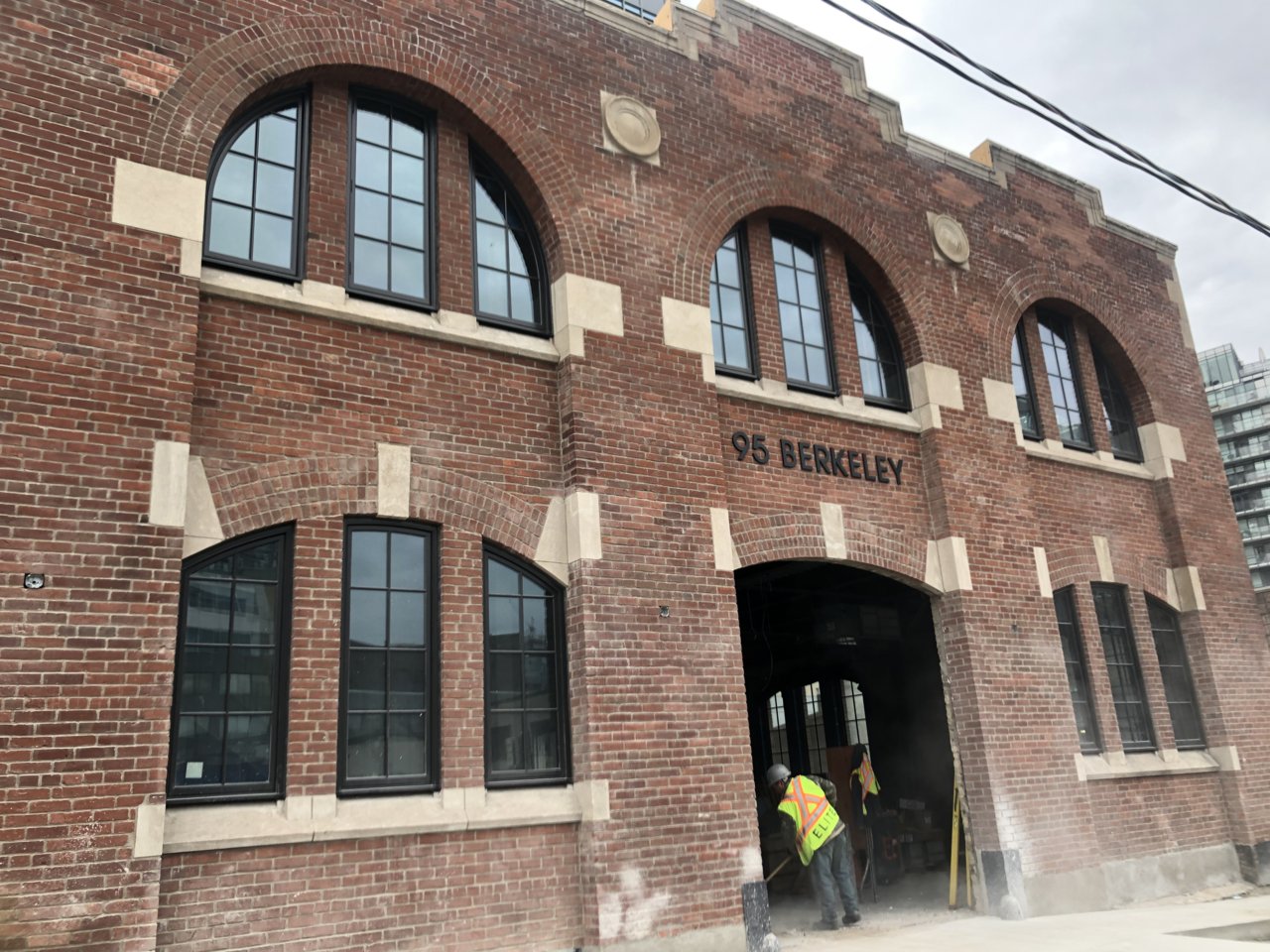
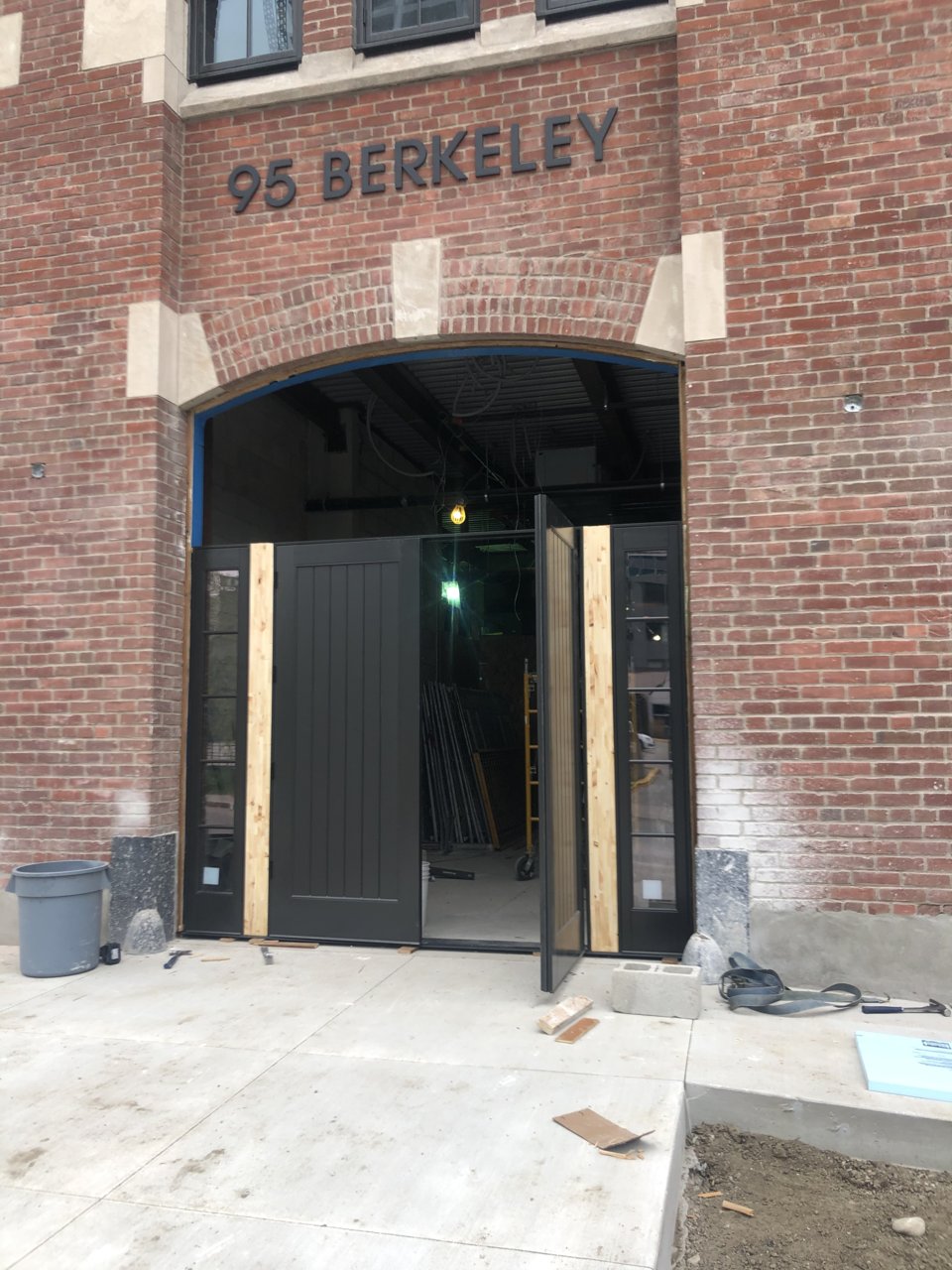
Some pictures of the Heritage building.


Or a "salvaged from fire" sale...goodness, those cladding materials must of been a part of some sorta fire sale.
The pedestrian walkway is now open:
The landscape design is almost as bad as the architecture. Just a brutal dog’s breakfast of a project on (literally) every level.The pedestrian walkway is now open:
Sept 27, 2020
View attachment 272472View attachment 272473View attachment 272474View attachment 272475View attachment 272476View attachment 272477View attachment 272478View attachment 272479
Thanks for the pics. I have walked through here several times recently, at night and during the day. I do appreciate the presence of this mid-block connection. But I have to criticize the design. Just like the building above, the design of this mid-block connection is an incoherent amalgam with no clear vision or objective. The details are as cheap as possible, the railings and barriers are thoughtless, the lighting is either too dark or too bright, there is no sense of transition to or privacy to and from the at-grade towns, etc. It's just a really sloppy job. Feels cheap and careless. Disappointing.