G.L.17
Senior Member
Last week:


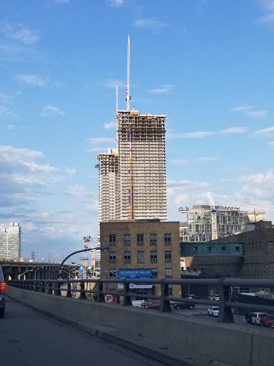
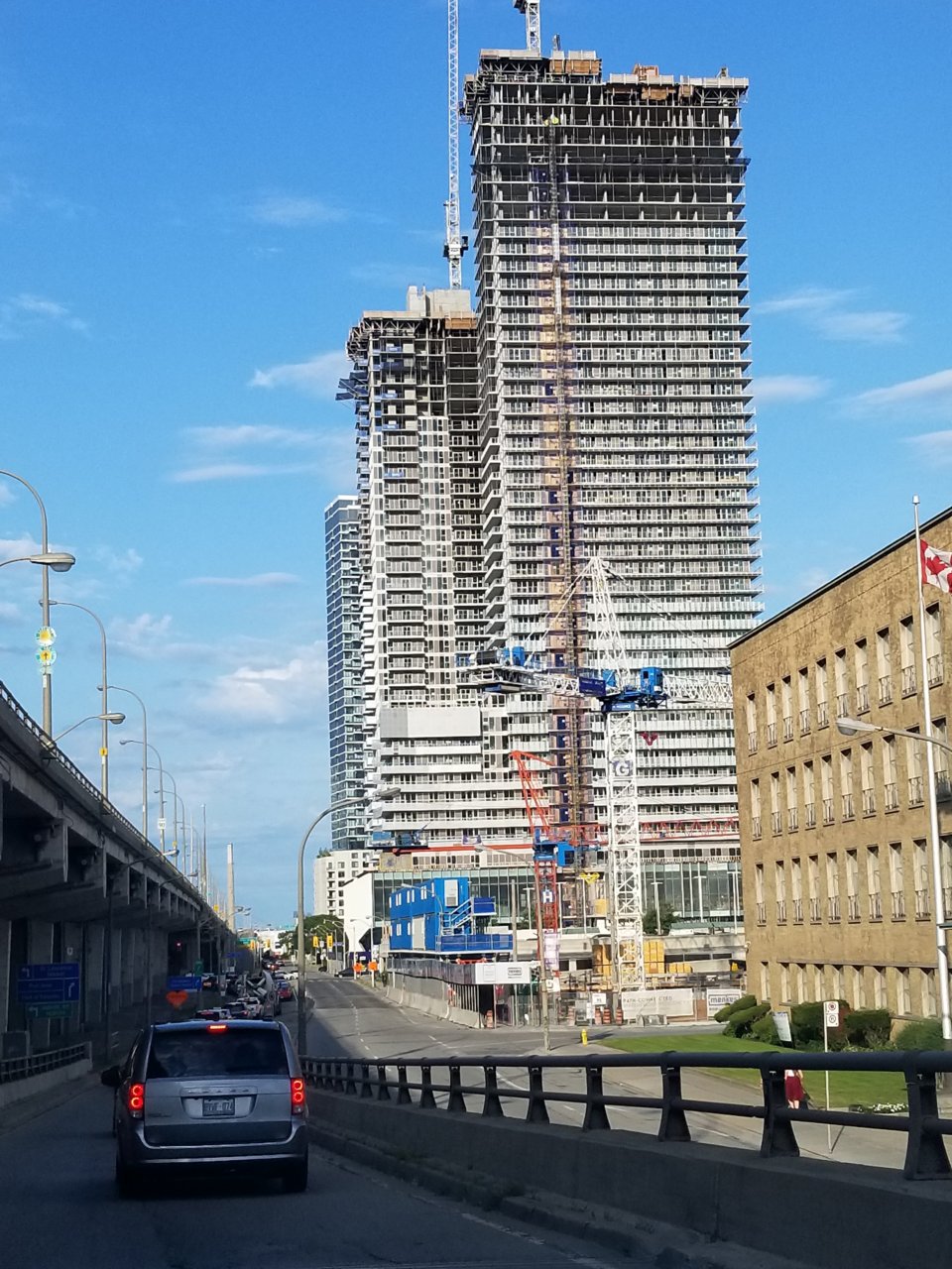
The towers are garbage. Let's call them for what they are and stop making excuses and squinting our eyes (and intellects) to find a rational for why they are not hideous. The two towers being built across from Maple Leaf Gardens, on Carlton, demonstrate that even moderately priced condo development can be aesthetically pleasing and creative. These towers are neither. It is a shame.
Well it's not as if we didn't know this was coming. Think back to the interview with the developer and the architect discussing where the limited design resources would go for this project, namely to the lowest street levels. I felt badly for the architect having to sit through that discussion, while the developer knew exactly what he was doing.
This is just about the worst advertisement for Daniels. Even Wallman was smart enough to put their offices in one of their best buildings (Tableau). Daniels on the other hand, preferring to save their best projects for places like Erin Mills, decides to include their head office in a project whose residential towers could very well be one of the worst (if not THE worst) waterfront builds of this cycle.
It's visibility screams to all Torontonians, all visitors, all potential clients, "We are completely out of ideas, but if you have one, we will value engineer the life out of it so that it resembles a flimsy cardboard box!"
All the waterfront buildings are like calling cards. Safdie/Great Gulf"s Monde says, "We build quality." Pinnacle hiring HP on One Younge indicates they are about to do the same. Daniels is well on it's way towards accomplishing the opposite. I am open to the possibility that the circular frit pattern may redeem the design somewhat under certain lighting conditions, but I am equally open to the possibility that standing beside Monde and One Younge it will come off as a cheap, well worn slight of hand that fools nobody.
Heck you dont even have to travel that far to see a better waterfront district. Vancouver, San Francisco, and a whole bunch of other North American cities handle their waterfronts with much more aptitude than Toronto does. Waterfront Toronto was created in part to avoid the mistakes that were done on Queens Quay West, but yet their allowing for even more clunkers to come online.
I've said it before and i'll say it again, our waterfront is a joke.
It's actually embarrassing what the waterfront looks like at this point. Aside from Monde and Pier 21, everything is bland crap. This is what I feared.
Can you think of any major city "new" waterfront that looks like this?
I don't want to see anything from Tridel or Daniels along the waterfront. I get that they're big boys and self financed but they are bland and unimaginative as can be.
I want to see Freed, Mod, Urban Capital, I'll even take CityzenFernbrook (not the greatest builder but they at least have balls to build something different), Great Gulf, Lanterra, Cresford, etc. You know, builders who actually have some pride and have a track record of building well designed buildings.
Yes, I'm simplifying things here but this is inexcusable.