yyzer
Senior Member
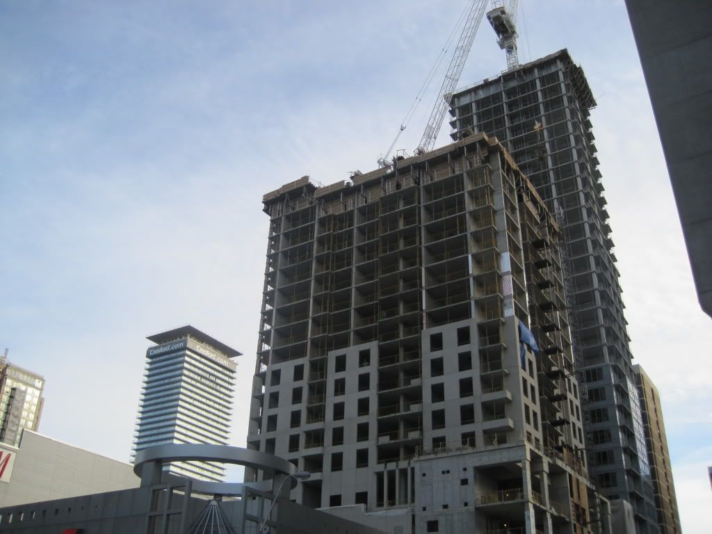
I'll admit to being sceptical about this one, based on the renderings....
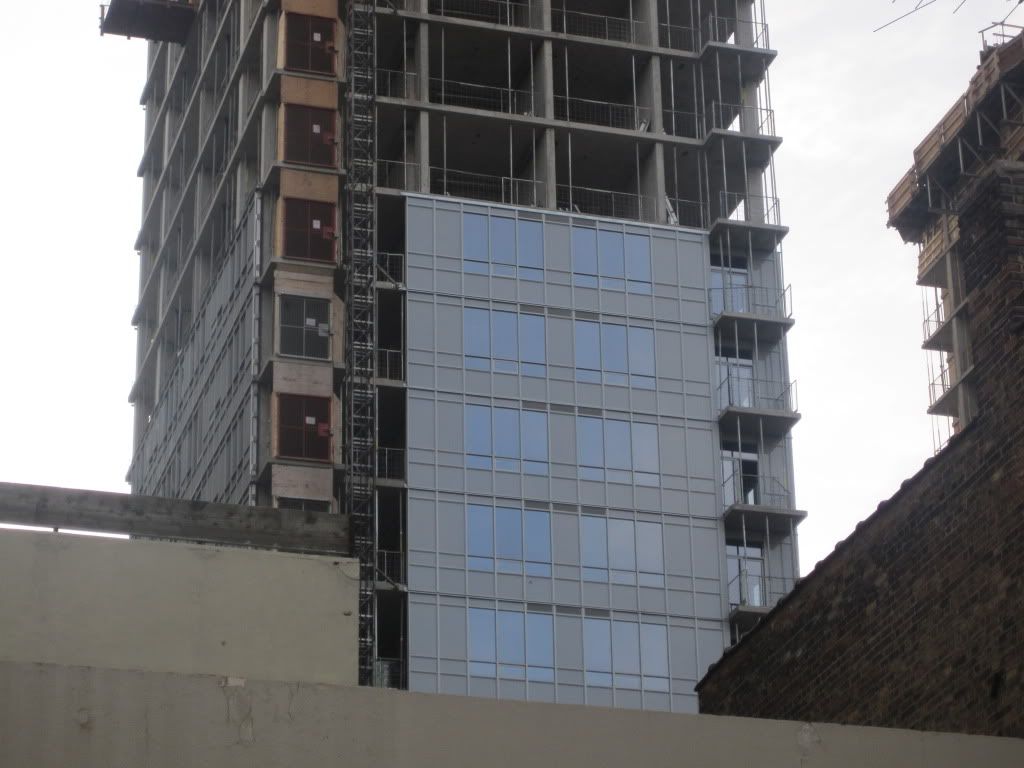
Turning out way better than expected...")
Turning out way better than expected...
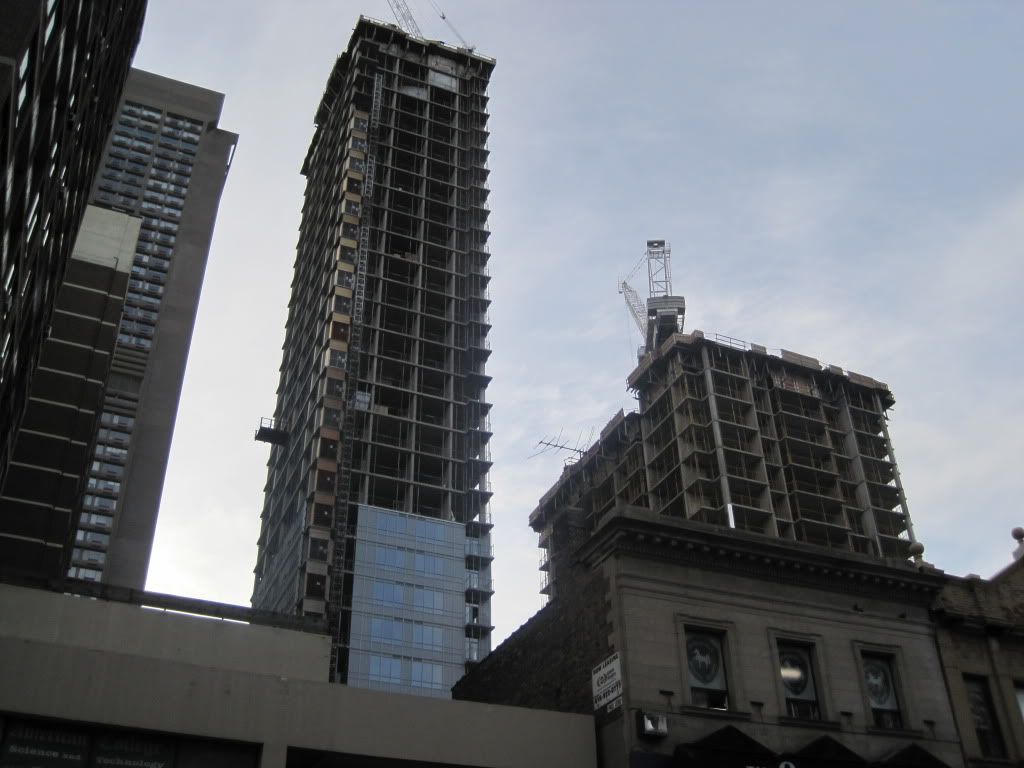
I count 33 storeys, so it looks like this might top out by the end of the year.
I think this is the best I've seen this tower look so far. Once the grey concrete starts to disappear and the balcony glass starts showing up, this is going to start looking really pretty.
These two towers look quite charming next to one anotherIndeed, it looks tall - a good fit for the area. What I find exciting is when uptown dwarfs crystalblu, we'll get even more height
Uptown kinda clashes with Crystal in so many ways (architecture, height, colour, etc...) and it will make Crystal look alot shorter but lets pray it works out!... we gotta think positive
Indeed, it looks tall - a good fit for the area. What I find exciting is when uptown dwarfs crystalblu, we'll get even more height
 )
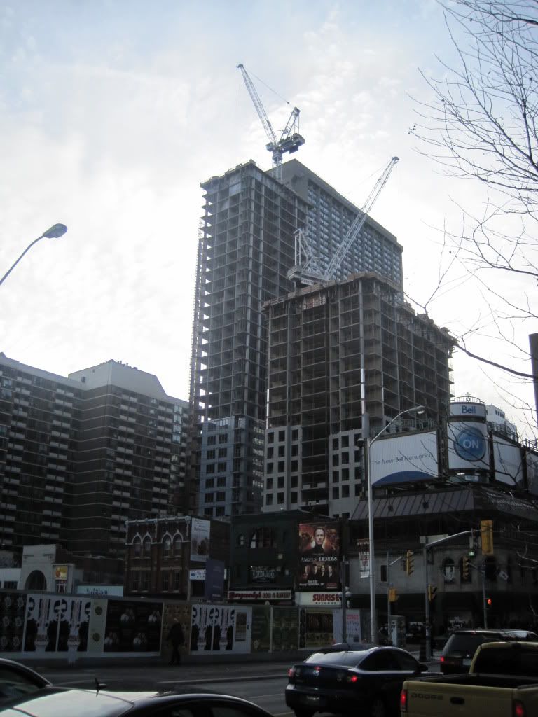
)^Grey on grey by the greys? Yep, most architects hanging out with developers these days have grey hair. Not surprising the results.