crs1026
Superstar
^I have yet to see a Crosstown render showing the TTC logo.... but I'm glad to hear ML confirming that it will be included in the signage.
- Paul
- Paul
What I get from guide, the illegible LRV icon is for streetcars. Line 5 is using the front facing icon (and eventually switched over to the LRT/subway icon) that we should already recognize.View attachment 328709
This is so incredibly stupid. As if riders are supposed to differentiate a "side view" LRV from the "front view".
This should be a massive red flag. I hope this is not indicative of a general inflexibility to change due to the Crosstown's management structure.
View attachment 328712
Yea, the "Line 5" iconography will appear everywhere but the exterior of the station, where we're stuck with the illegible "LRV" iconography.
This doesn’t make a ton of sense to me at all. Riders care about where the lines are taking them. The type of vehicles used to transport them is almost immaterial. I don’t care if it’s an LRV or helicopter transporting me, as long as it gets me to where I’m goingThe reason the "Line 5" bullet doesn't appear on station exteriors is because, from Metrolinx's wayfinding standards, the approaches or entrances to stations are to only denote the mode of transports available at the station. This is a breakdown from their standards pdf on how passengers are to follow the signage:
View attachment 328776
I see the logic in it as this looks like a copy and paste of London's wayfinding standards. However, I agree that the transport modes iconography seem difficult to distinguish from a distance unlike TfL's roundel which are distinguishable through their colours.
I really don’t understand why Metrolinx thinks it’s necessary to complicate things by imposing a second totally different wayfinding standard on the city that has nothing to do with the existing standard. The TTC already has a brand new wayfinding standard which by all accounts is working well for customers. Complaints I’ve seen about the TTC’s wayfinding has more to do with the inconsistency of its application (a lot of the legacy signage still remains), rather than problems with the design standard itself.This doesn’t make a ton of sense to me at all. Riders care about where the lines are taking them. The type of vehicles used to transport them is almost immaterial. I don’t care if it’s an LRV or helicopter transporting me, as long as it gets me to where I’m going
Under this system, commuters entering Don Mills Station will only know this is a bus/streetcar/LRT/subway station. Where this station will actually take you is unknowable until you’re inside the station complex.
Further, this appears to not take into account that there are dozens of entrances to stations across the region that might only provide access to a subset of the lines servicing any given station.

I wonder how many of the designers involved in the creation of the design systems in Metrolinx have actually lived in Toronto for any significant portion of time. Both the station naming and the wayfinding standard appear to be a copy of the Transport for London system, with little regard for local customs. I specifically look to how Metrolinx has named many stations after neighbourhood names that see little real-world usage outside of official maps.I see the logic in it as this looks like a copy and paste of London's wayfinding standards. However, I agree that the transport modes iconography seem difficult to distinguish from a distance unlike TfL's roundel which are distinguishable through their colours.
Mixed case, if the right font, is easier to read because the letter shapes are more distinct with bdfhklt being taller and gjpqy going below the line. When capitalized letters are more visible it is only because they are massive.idk about you guys but I always found mixed case harder to read especially on signage. Also mixed case looks really weird and awkward when placed on a banner especially on an entranceway.
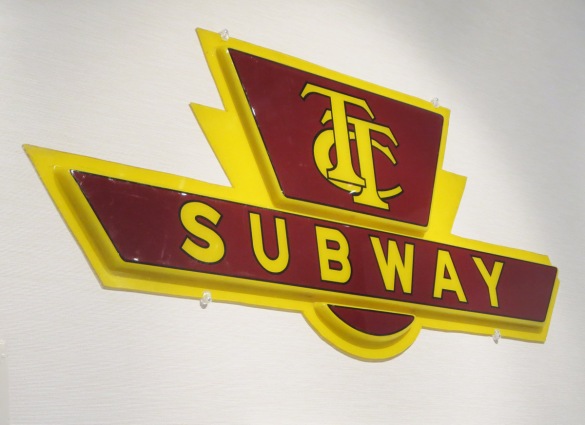
When the subway opened in Toronto in 1954, they used words. No pictographs, other than the TTC logo.I wonder how many of the designers involved in the creation of the design systems in Metrolinx have actually lived in Toronto for any significant portion of time. Both the station naming and the wayfinding standard appear to be a copy of the Transport for London system, with little regard for local customs. I specifically look to how Metrolinx has named many stations after neighbourhood names that see little real-world usage outside of official maps.
Just overall this whole design system seems poorly conceived and sloppily implemented. Metrolinx needs to do better than this. They’ve spent too much of our money for this poor level of quality to be acceptable.

The logo itself has undergone many variations over the years.
Leaside station from today:
View attachment 329510View attachment 329511View attachment 329512View attachment 329513View attachment 329514
Sunnybrook:
View attachment 329515


