AlbertC
Superstar
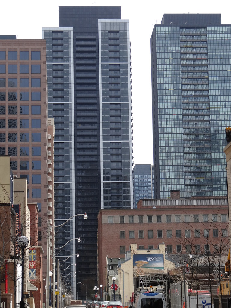
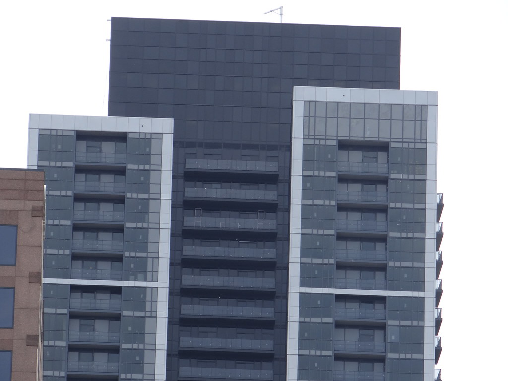
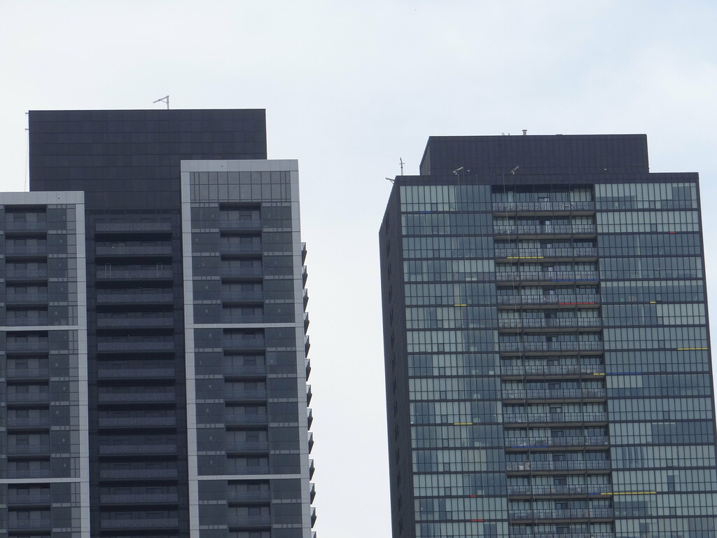
As usual G+C buildings are best viewed from afar. This is another example of their embarrassing attention to details.
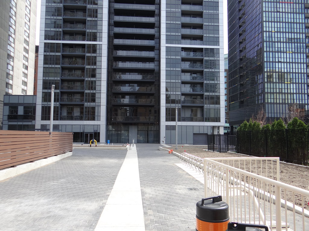
I agree with Ramako that it would have been best leaving the overall floorplate to be consistent with the tower profile. Appears to be design indecisiveness on the architects part, like an after-thought to just include a podium that has no flow with the tower above. Reminds me of those awful frontal additions on converted Victorian commercial buildings.
I agree with Ramako that it would have been best leaving the overall floorplate to be consistent with the tower profile. Appears to be design indecisiveness on the architects part, like an after-thought to just include a podium that has no flow with the tower above. Reminds me of those awful frontal additions on converted Victorian commercial buildings.
