Toronto Couture The Condominium | ?m | 42s | Philmor | Graziani + Corazza

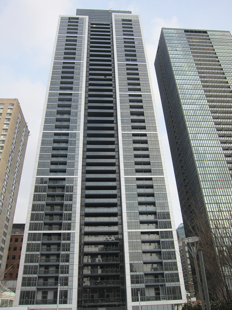
West facade, images from today.
8417647033_4f78d91170_b.jpg


8417648695_ef345313d1_b.jpg


8417647919_b721f358a7_b.jpg
 
I never imagined I would say this about a G+C design, but this is one good-looking tower!

Materials could be a lot better and the podium is awful, but the tower itself looks great.
 
It's a far cry from the iridescent gilded prism we were promised, but not as bad as was feared. At least it forms a relatively unobtrusive background to X and is solid, decent infill.
 
Look at Couture. Then look at X. Then look back at Couture. Then, having done that, where does your eye want to go?

Depends on the angle, sometime Couture sometimes X, but it helps that Couture's unoccupied at the moment. Once people start moving in it'll lose much of that sleekness.
 
Look at Couture. Then look at X. Then look back at Couture. Then, having done that, where does your eye want to go?

To my surprise, Couture. I didn't think a building could compete with X Condos, but this one does. It's a very handsome building with strong lines. X Condos is a different aesthetic, but they compliment each other.
 
Last edited:
Is that a recent photo? People have been moving in for a while but I don't see curtains or blinds, could it be the dark glass? I go by regularly but it's dark out then.
 
You've got to give it up for Couture. It's looking damned good. I'm sure many people on here are quite surprised. The podium didn't turn out so well but the tower stands proud.
 

Back
Top