You are using an out of date browser. It may not display this or other websites correctly.
You should upgrade or use an alternative browser.
You should upgrade or use an alternative browser.
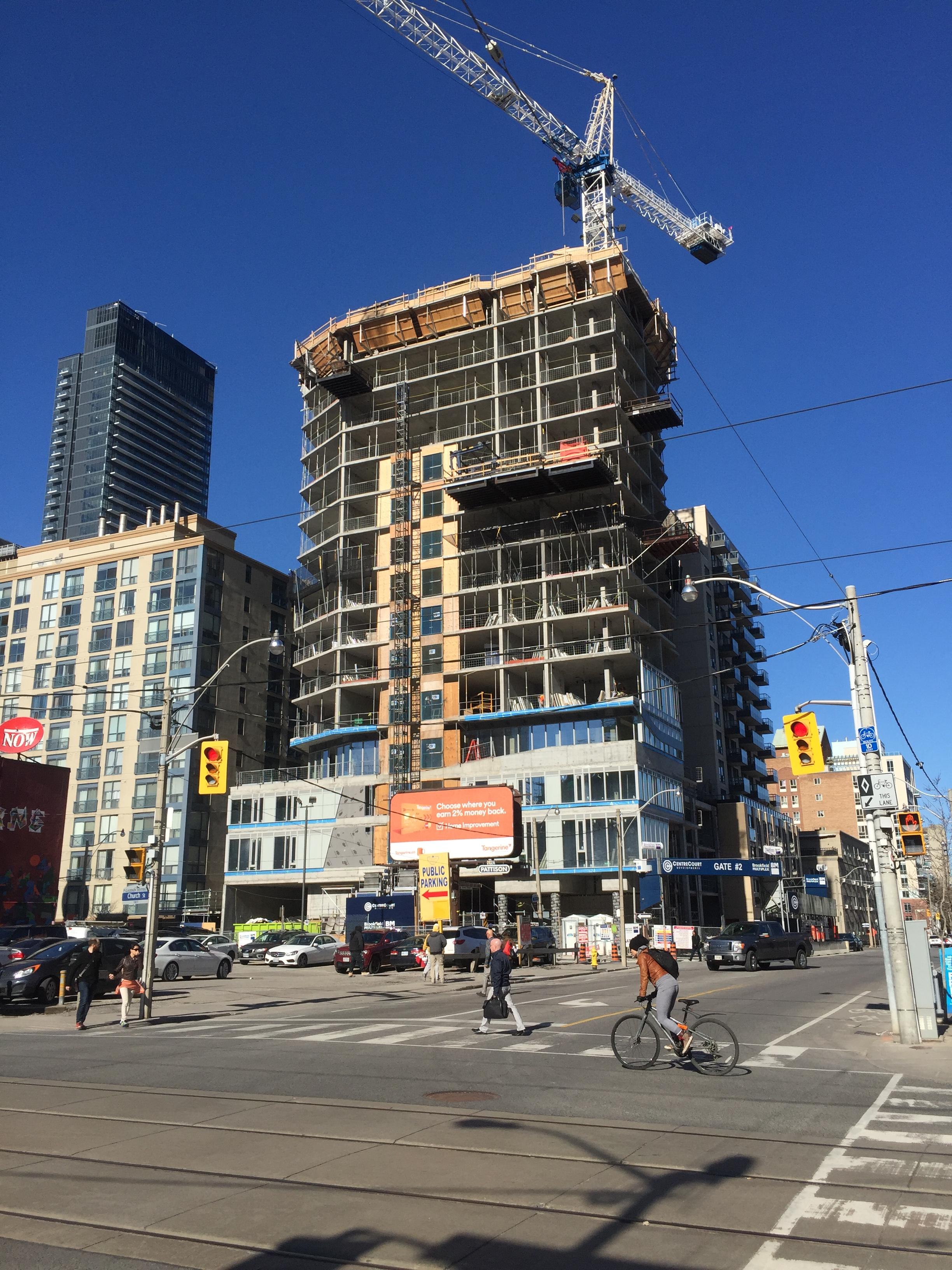
Toronto Core Condos | 84.12m | 24s | CentreCourt | P + S / IBI
- Thread starter AlbertC
- Start date
ProjectEnd
Superstar
G.L.17
Senior Member
skycandy
Senior Member
I had moderately high hopes for this, based on the irregular shape, the contrast of the dark framing against the whiter eastern sheath, etc. It started off ok, then they had to introduce that dead-grey spandrel. The dark framing has begun as seen above the podium in someMidTowner's photos. It will make a nicer diversion from said spandrel, but framing a grey spandrel wall might be more like putting a frame on an unattractive painting that's more deserving of the attic. Let's hope the overall effect is ok. At least it'll add a little more much-needed vibrancy to this up-and-coming area.
Stupidandshallow
Active Member
How did spandrel come into fashion? It's so prevalent in our recent buildings -- I don't see it used as much around the world quite like it is here...It's gross and in my eyes akin to cladding the facade of a house in angel brick or vinyl.
neuhaus
Senior Member
It's going to get a lot worse with the new energy code already in effect where a maximum of 40% of the exterior wall can be fenestration. Spandrel panels is a cheap and easy way of introducing solid exterior cladding without the added cost and coordination of another material and trade added on site. This building doesn't look like it will meet this energy code.
Unfortunately almost all of the sleek and glassy renderings you see in condo marketing will be much further from the truth now as a good 60% of the building exterior will turn to spandrel, or some other solid cladding compromise.
That dull putty grey looks so drab and seems to suck the life from anything around it. I would expect the black frame architectural element to protrude from the building a bit. Having it flat with the façade looks cheap and superficial giving it more of a wallpaper quality.
G.L.17
Senior Member
stjames2queenwest
Senior Member
Today April 14

ksun
Senior Member
This goes up fast. Is there any proposal for the parking lot west of it?
stjames2queenwest
Senior Member
Yes for an aA menkes tower.
Jacob Laponointe
New Member
This goes up fast. Is there any proposal for the parking lot west of it?
Yes, though that one is moving a bit slowly.
60 Shuter street
skycandy
Senior Member
G.L.17
Senior Member
drum118
Superstar
April 15


