Fritter
Active Member
Can't wait until those orange construction type barricades are replaced with the permanent railing. They are the only blight on those podium photos!
In most cases the site plans etc say nothing about streetlighting so the default is the usual THSL palette. THSL are responsible for ensuring streets are lit to the standards set by the Ontario Ministry of Transport. In a few cases, someone (I suspect usually a neighbourhood assn) will manage to have streetscape improvements included in a site plan and this may include streetlighting. Even so, THSL has the right (they would say 'obligation') to approve what is installed to ensure it meets standards and may refuse to maintain anything not their standard. (I think this may explain why one sometimes sees old Acorns or Cobras left in place with other more aesthetic lights added in.) This allows THSL to ensure street is lit to standard with their (old) lights and allows a developer the ability to add 'something special" too. (In these cases I assume they are not maintained by THSL but ...)It looks very nice, although I'm disappointed by the weird utilitarian street lights. Could it be Toronto Hydro's fault or was it the landscape designers? I would appreciate some insight into this.
Not sure what their schedule is, but they put a couple glass railings at the ends (where the turn is) and it’s been sitting like that for a few months. The interior of the building is basically finished, so just the CIBC branch on the south side, the food hall, and this staircase left for 81 Bay.Can't wait until those orange construction type barricades are replaced with the permanent railing. They are the only blight on those podium photos!
Agreed - especially the one in the middle... I mean what absolute halfwit thought that having gone through all the effort and care to set up that central axis - that goes from artwork of Canadian forests, framed by monumental scaled, sculpted travertine walls through the crisp facade and main entrance, then picked up in the external landscaping - that sticking a nasty street light in the middle was a good idea?!It looks very nice, although I'm disappointed by the weird utilitarian street lights. Could it be Toronto Hydro's fault or was it the landscape designers? I would appreciate some insight into this.
This isnt the only example of Toronto Hydro desecrating streetscape. Just like the "The Scourge of Window Film" our city also suffers from "The Scourge of Cobra heads" phenomenon.It looks very nice, although I'm disappointed by the weird utilitarian street lights. Could it be Toronto Hydro's fault or was it the landscape designers? I would appreciate some insight into this.
Thanks for the information on why we see special lights attached to utilitarian poles. Site plans absolutely should include street lighting fixtures, as they do for other landscaping features. The thing is, I've never seen this combination of poles, brackets, and luminaires. I've never seen this street light design in Toronto nor can I find it in Hydro's or the city's standards, so it remains a mystery as to why this design was chosen.In most cases the site plans etc say nothing about streetlighting so the default is the usual THSL palette
Exactly! So sad.It's kinda like having your wedding group portraits photobombed by someone in oily dungarees stood front and centre of the group, in front of the bride and groom and holding a powertool

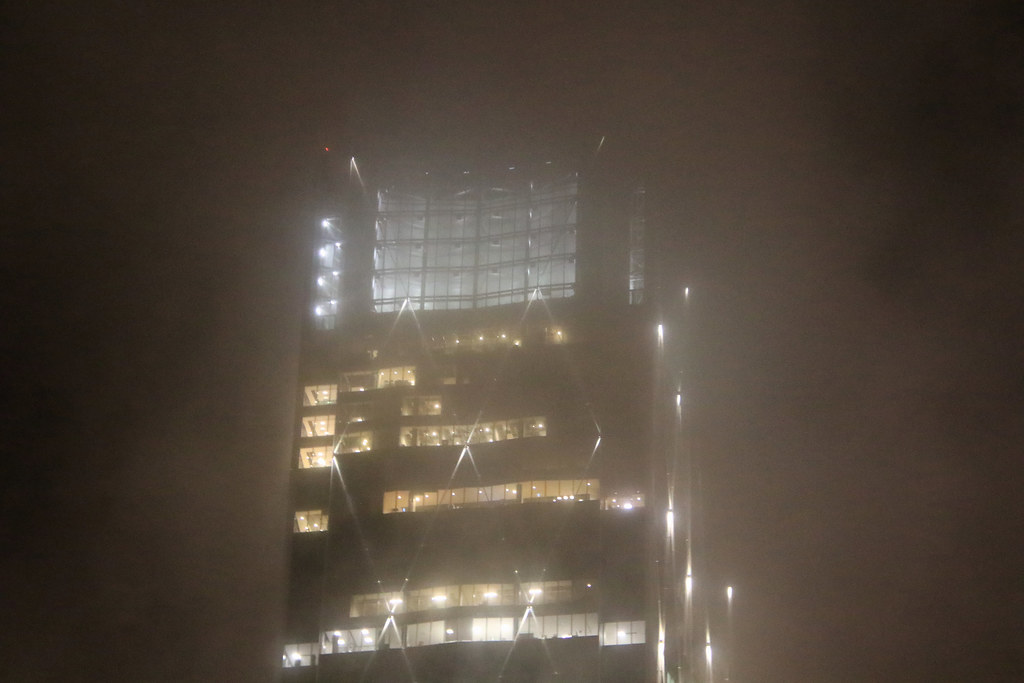
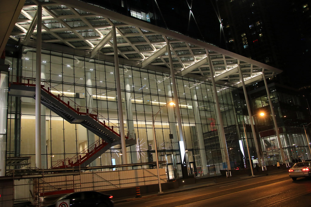


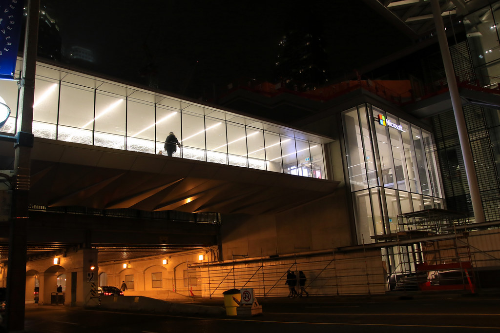
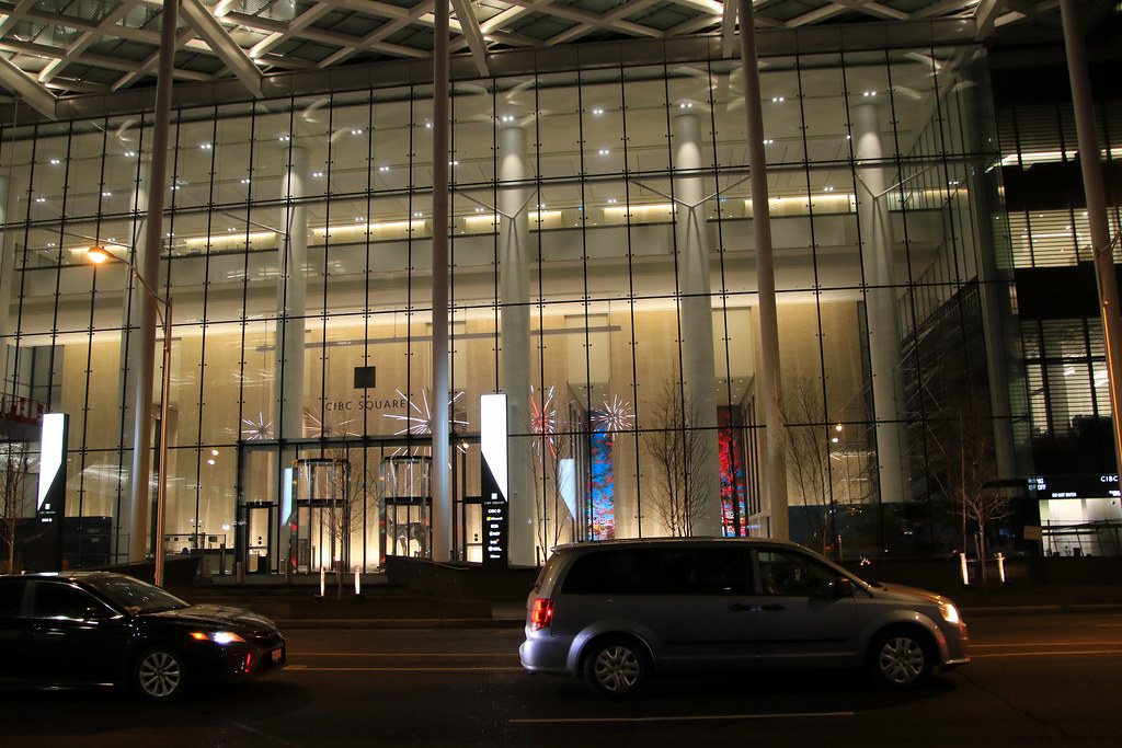
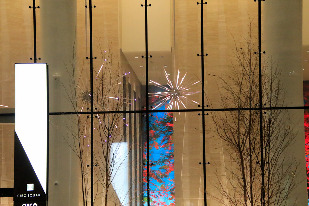
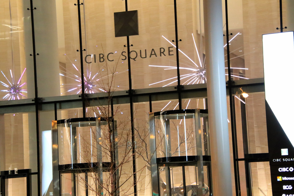

It looks very nice, although I'm disappointed by the weird utilitarian street lights. Could it be Toronto Hydro's fault or was it the landscape designers? I would appreciate some insight into this.
 CIBC Square by Marcanadian, on Flickr
 CIBC Square by Marcanadian, on Flickr
 CIBC Square by Marcanadian, on Flickr
 CIBC Square by Marcanadian, on Flickr
 CIBC Square by Marcanadian, on Flickr
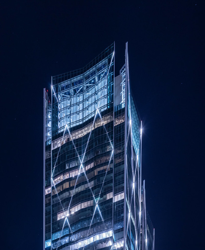 CIBC Square by Marcanadian, on Flickr