AlexBozikovic
Active Member
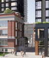
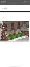
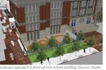
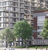
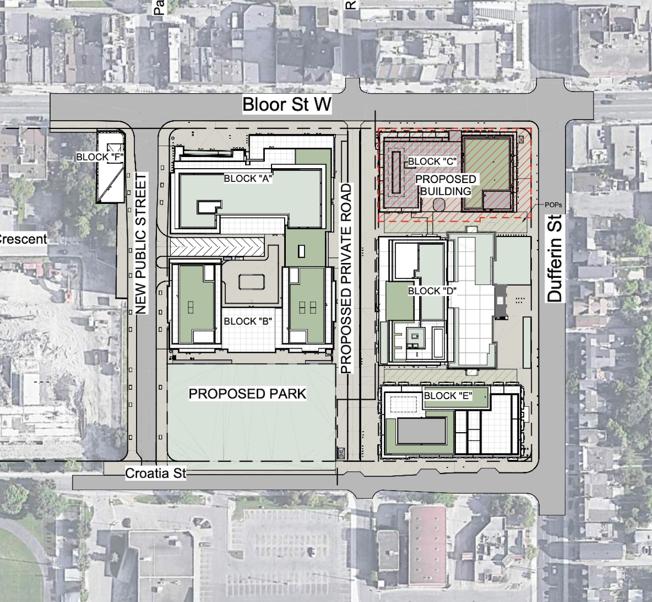
This could have been one of the best projects in the city. It’s been clear for a while that it will be… Not that. Now we can see the towers are boring at street level and have zero relationship (colour, material, detail) to the school building. The landscape architecture is a mess.
Red brick, meet orange aluminum panel. No sense of place, no coherence, no attention to detail at the ground level.
It’s hard to think of this project as being especially bad. There are worse buildings. But this is so big, and the site has so much history, that it’s really sad to see it end up like this.
Attachments
-
 A0264945-FF8F-4272-8A66-75B46AB9E51F.jpeg34.4 KB · Views: 95
 -
 643BDB92-A47C-45E6-8C82-40DAF56C5686.jpeg11 KB · Views: 107
 -
 0E3393B1-458A-4AC8-8185-BAABCC3E24DD.jpeg255.4 KB · Views: 82
 -
 AFE92A9A-893A-420A-A6B5-790342772FAE.jpeg255.4 KB · Views: 106
 -
 C69D8CDE-DE94-4E44-BB4A-B3E898A93B7D.jpeg42.8 KB · Views: 98
Last edited:
