You are using an out of date browser. It may not display this or other websites correctly.
You should upgrade or use an alternative browser.
You should upgrade or use an alternative browser.
Toronto Bay Adelaide Centre | 217.92m | 51s | Brookfield | KPMB
- Thread starter yyzer
- Start date
Redux
New Member
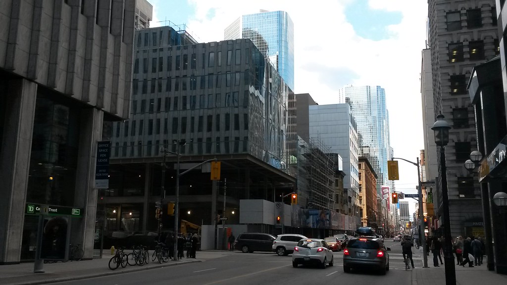
The reflection of the TD building in the glass of the podium makes it look like a Frank Gehry monstrosity... I mean... "Original, non-repetiitive-themed, creation".
Ramako
Moderator
The reflection of the TD building in the glass of the podium makes it look like a Frank Gehry monstrosity... I mean... "Original, non-repetiitive-themed, creation".
That effect is actually what I like so much about the podium and why I photographed it that way. It's one the best examples I've seen of a minimalistic design playing off its context.
AndreaPalladio
Senior Member
You get the same effect from the old stone building across Yonge. It's interesting how the podium disappears if you are walking west on Adelaide and north on Yonge, and becomes a copy of those two buildings.
Redux
New Member
Wow, actual praise for lazy architecture... ie: Don't actually put thought, detail, design or hand-crafted-by-artisans ornamentation on your buildings (even though they are admired and desirable)... Just put up mirrors and borrow all the beauty and respectibility from the place across the street.
Sheesh!
Sheesh!
innsertnamehere
Superstar
there is a lot of thought and detial in this project, minimalism is celebrated for good reason. not all buildings need to be twisty-curly to look good.
AndreaPalladio
Senior Member
Wow, actual praise for lazy architecture... ie: Don't actually put thought, detail, design or hand-crafted-by-artisans ornamentation on your buildings (even though they are admired and desirable)... Just put up mirrors and borrow all the beauty and respectibility from the place across the street.
Sheesh!
Not everyone craves a bowl of ornament like The Prince of Wales.
AndreaPalladio
Senior Member
there is a lot of thought and detial in this project, minimalism is celebrated for good reason. not all buildings need to be twisty-curly to look good.
I was thinking tonight on my way home that the effect that will result looking up Yonge from Adelaide will be 1) Ephemeral reflection of heritage building 2) Solid pastiche of part of the facade of the old Holts building 3) Reconstructed relocated facade of the old Holts building and 4) Restored Dineen building. If that's an accident, its a happy one. If its intentional, its the most interesting thing that's been done in town for a long time.
Redux
New Member
That is a sham of an argument... Because if the exterior of this podium were made of non reflective material such as (let's get all science fictictiony here) *transparent concrete, so that from inside you could look out at the view but from outside it looked like one of those Brutalistic 1970s Bell Telephone bunkers, almost completely windowless concrete, then (despite that the exact same minimalistic form would be present) I would bet everyone of you minimalism supporters would be cringing in horror.
The only thing saving the podium from that horror, is that it is mirroring OTHER views. It's own simplicity is NOT being admired so much as what it is borrowing from its surroundings.
In my books that is a lazy co-opting of someone else's respectability.
*Admittedly I am employing reductio ad absurdum, yet when viewed through such extremes my argument is irrefutable.
Last edited:
junctionist
Senior Member
It's just a functional frame covered in glass for shelter. What is the minimalist architectural detail? There are no creative uses of colour or patterns in the facade. The tower lacks an interesting profile. That it reflects the neighbouring buildings might as well just be a coincidence--glass is shiny.
Ramako
Moderator
It's just a functional frame covered in glass for shelter. What is the minimalist architectural detail?
I think you just answered your own question.
junctionist
Senior Member
True. The tower will provide shelter but has no detail at all.
AlvinofDiaspar
Moderator
True. The tower will provide shelter but has no detail at all.
No detail is the highest, most demanding kind of detail.
AoD
ProjectEnd
Superstar
In some cases, yes, but don't delude yourself into thinking BAC is some sort of SANAA or Chipperfield masterpiece. This is just the lazy application of a product (the curtain wall panel) to a repeated structural frame.
'Highest?' 'Demanding?' Hardly.
'Highest?' 'Demanding?' Hardly.
taal
Senior Member
Right now my issue is portion fronting Yonge street, its way to plain / reflective glass, no detail at all, even the office building slight inserts between the floors.

