Northern Light
Superstar
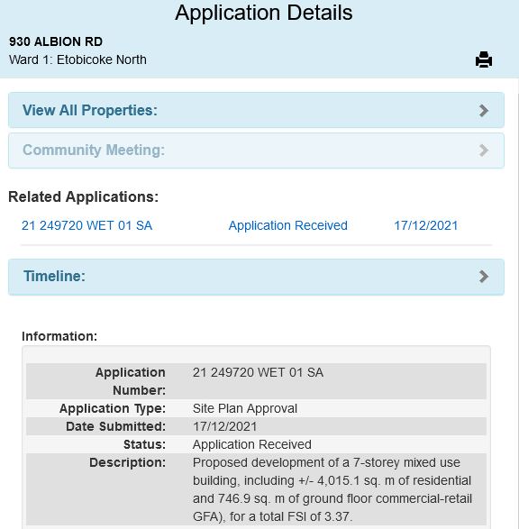
New Application into the AIC for this one.

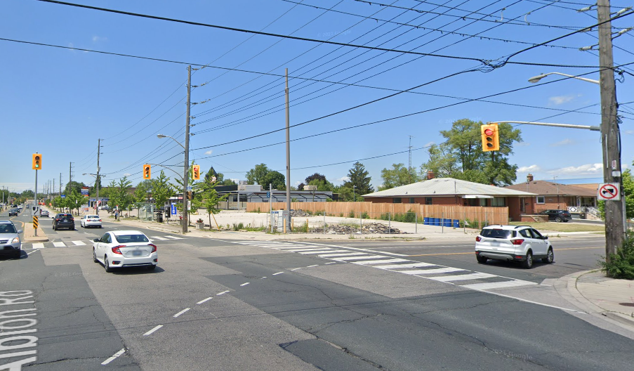
Streetview:

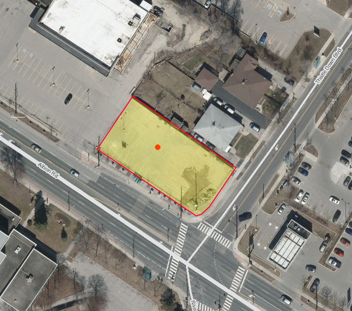
Aerial:

Streetview:
Aerial:
*Docs are Up*
Architect is Gabriel Fain
View attachment 376723
View attachment 376724
View attachment 376725
View attachment 376726
View attachment 376727
View attachment 376728
View attachment 376729
From the Cover Letter:
View attachment 376730
Thank you! I'm not a big fan of these 70s-looking balconies and the triangle-shaped pillars must be pretty disorienting at the level of the human eye. At the same time, the shape of the street-facing facade is kinda weird and there's nothing breaking up the facade. The windows are also kinda cold-looking and the facade, even though the materials are nice, has a very boring set of colours. Yes, it's not grey or blue but it just has that 20th-century old apartment look that I personally don't like. And just look at those slab balconies on the other side of the building! Perhaps it's just the renderings or maybe because my father lives in one of those tower-in-the-park buildings that makes me so sick of this aesthetic, as I spent so much of my childhood observing the design motifs and experience of living there.@daniel_kryz You're the first to make a 'sad face' at this one......
Do share why you find it disappointing.
Thank you! I'm not a big fan of these 70s-looking balconies and the triangle-shaped pillars must be pretty disorienting at the level of the human eye. At the same time, the shape of the street-facing facade is kinda weird and there's nothing breaking up the facade. The windows are also kinda cold-looking and the facade, even though the materials are nice, has a very boring set of colours. Yes, it's not grey or blue but it just has that 20th-century old apartment look that I personally don't like. And just look at those slab balconies on the other side of the building! Perhaps it's just the renderings or maybe because my father lives in one of those tower-in-the-park buildings that makes me so sick of this aesthetic, as I spent so much of my childhood observing the design motifs and experience of living there.
Interesting how that works. For me, the back gives off a prison vibe. For you, it's beautiful and interesting. Respect.I understand where you're coming from, but many of the aspects of the design you dislike are the ones I love. A case where preferences are subjective.
To me, this takes what worked best with '60s - '70s apartments and brings it into the 21st century. I like the earth-toned brick, which is brought down to ground level. I like the angles incorporated into the facade and balcony designs providing depth and interest. I like the balconies at the back which have useable proportions.
To me, this is all a breath of fresh air.
Interesting how that works. For me, the back gives off a prison vibe. For you, it's beautiful and interesting. Respect.
Thank you! I'm not a big fan of these 70s-looking balconies and the triangle-shaped pillars must be pretty disorienting at the level of the human eye.
At the same time, the shape of the street-facing facade is kinda weird and there's nothing breaking up the facade.
The windows are also kinda cold-looking and the facade, even though the materials are nice, has a very boring set of colours.
. And just look at those slab balconies on the other side of the building
Oh boy, here we go! This is not missing middle. It is midrise. And I agree, it’s great to see.I'm indifferent to this design! However good to see another "missing middle" type project in the city!