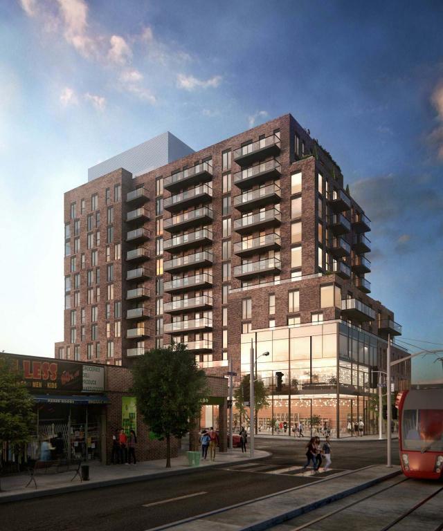
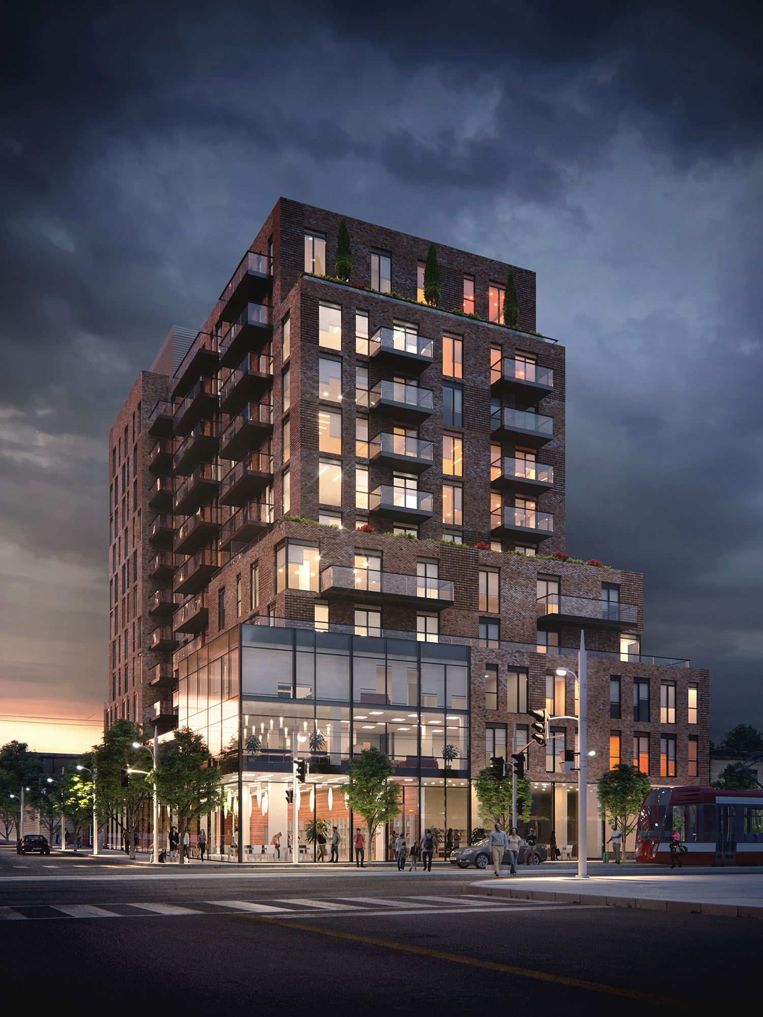
It doesn't look incredible, but it's not bad. I like the use of brick all the way up.
The architecture is always cheaper on dedicated rental buildings - they just don't have the budget that condos do.
Actually, while there is some truth to this currently, it's going to change drastically in the coming years as more and more purpose-built rental comes online. The logic is that if a developer is going to keep an asset on its books and in its marketing material (if they don't sell or contract the asset to a property management company), it's going to become increasingly incumbent on them that buildings are of a quality that reflects the aspirations of their creator(s). In this vein (and from everyone I know) the next generation of rental buildings are going to become more, not less, interesting.
Old One:
New One:
You tell me. Does this look better? Higher quality? I would say that the process is the cheapening of the finishes and blunting of the architecture to lower costs. The Developer would be the one to blame.
The real question is: did you expect that it was going to look like the initial rendering?
Once a building begins the municipal process the city is going to demand certain things, the developer must then revisit the design, program & resulting costs, the architect is going to have to find ways to comply, and the finished project is going to
change. Remember, because of this process (essentially unique to Toronto in terms of its complexity and uncertainty), what is initially proposed is almost never what is built so expectations have to be adjusted accordingly. This building in particular has not had an easy time with Planning and many changes to the initial concept were demanded by the department. In light of this, 'cheapening' is a facile and neanderthalic term for what is actually very complex and multi-layered negotiation.
But yeah, let's just 'blame' someone / thing, it sure seems to be working south of the border...


