You are using an out of date browser. It may not display this or other websites correctly.
You should upgrade or use an alternative browser.
You should upgrade or use an alternative browser.
Toronto 88 Queen | 167.35m | 52s | St Thomas Dev | Hariri Pontarini
- Thread starter taal
- Start date
skycandy
Senior Member
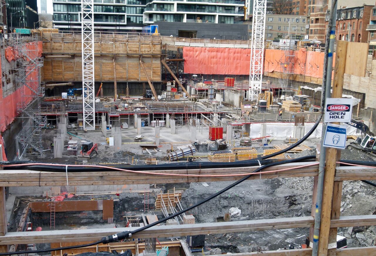
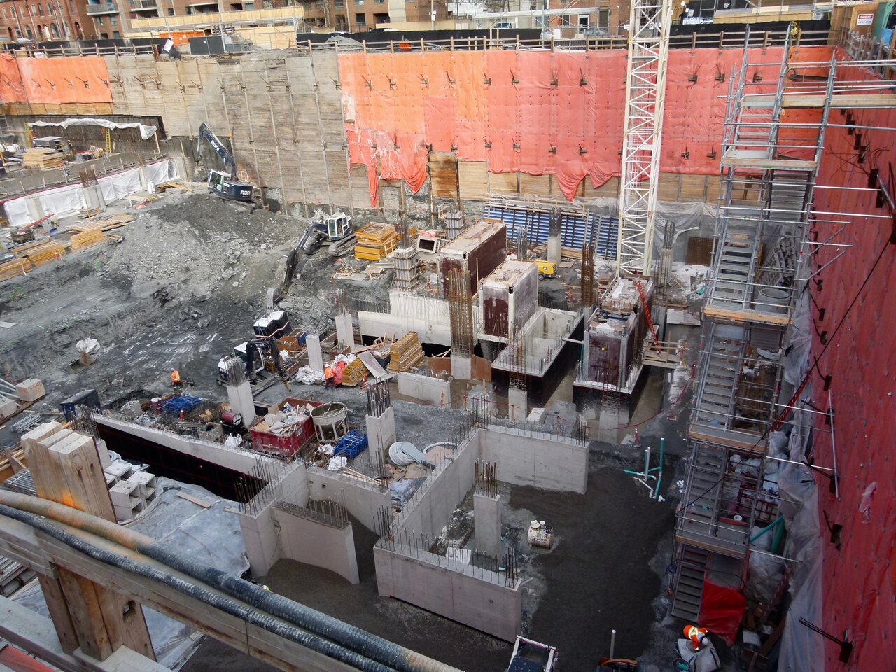
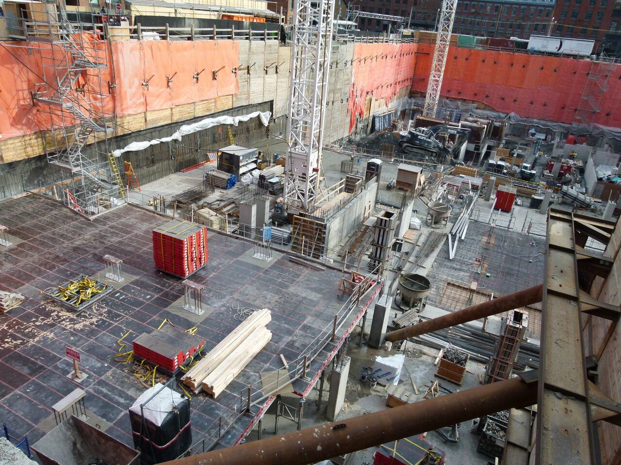
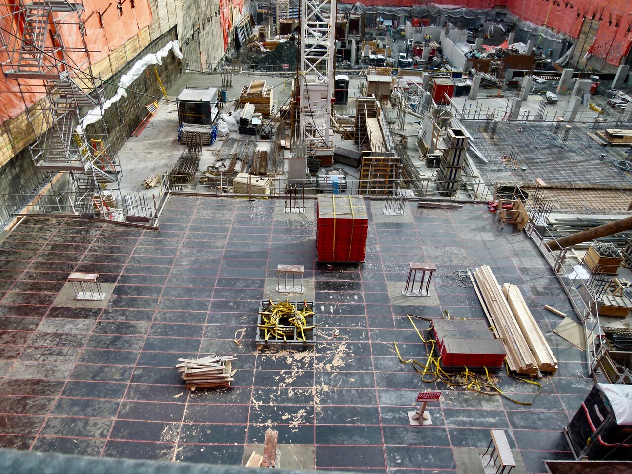
Yep, that's some 'hole'!!
bilked
Senior Member
ushahid
Senior Member
im not sure if this has been posted before or is it even true? , saw it on Claude Cormier site.
 www.claudecormier.com
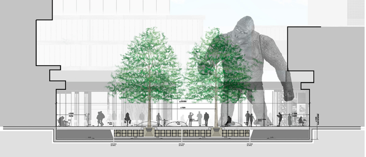
weren't posted in the last eight pages.
claudecormier.com - claudecormier Resources and Information.
claudecormier.com is your first and best source for all of the information you’re looking for. From general topics to more of what you would expect to find here, claudecormier.com has it all. We hope you find what you are searching for!
 www.claudecormier.com
weren't posted in the last eight pages.
Last edited:
Towered
Superstar
I want that giant ape monster!!
Irishmonk
Senior Member
King Kong is there for security. It's a rough neighbourhood so they need the best.I want that giant ape monster!!
Northern Light
Superstar
King Kong is there for security. It's a rough neighbourhood so they need the best.
Its entitled 'Queen Kong' on Cormier's site.
ushahid
Senior Member
yeah thats what is saysIts entitled 'Queen Kong' on Cormier's site.
claudecormier.com - claudecormier Resources and Information.
claudecormier.com is your first and best source for all of the information you’re looking for. From general topics to more of what you would expect to find here, claudecormier.com has it all. We hope you find what you are searching for!
 www.claudecormier.com
Towered
Superstar
yeah thats what is says
View attachment 302889claudecormier.com - claudecormier Resources and Information.
claudecormier.com is your first and best source for all of the information you’re looking for. From general topics to more of what you would expect to find here, claudecormier.com has it all. We hope you find what you are searching for!www.claudecormier.com
My personal bias would be for this instead, but it would never happen:
Irishmonk
Senior Member
Actually, monster wise, I'd like to see Guillermo del Toro whip something up.
Johnny Au
Senior Member
I would like to see a nearby building be called the Godzilla after the defender of Earth from the likes of Mothra, King Ghidora, Gigan, and the like.
indense
Active Member
innsertnamehere
Superstar
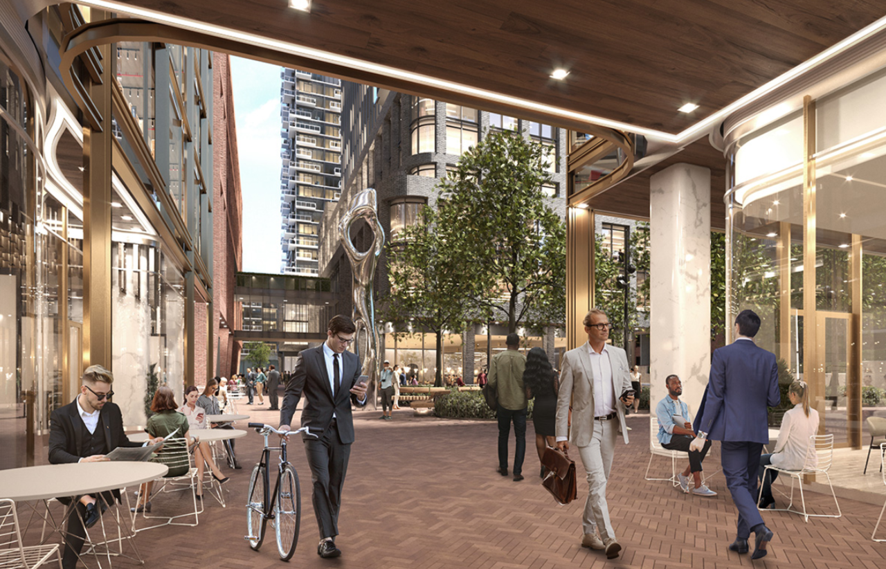
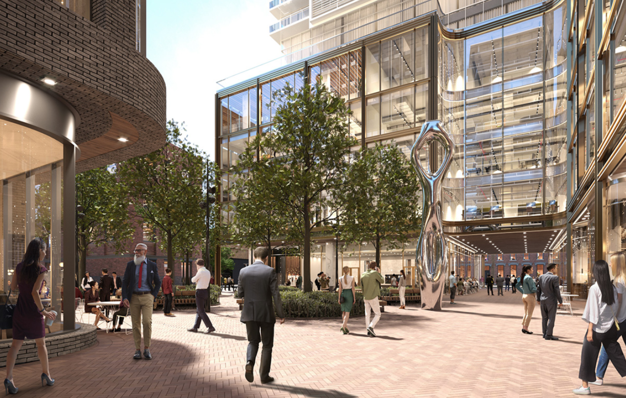
Park looks great. Gets me very excited for the public realm here. This area is going to be great in a few years.
Northern Light
Superstar
Park looks great. Gets me very excited for the public realm here. This area is going to be great in a few years.
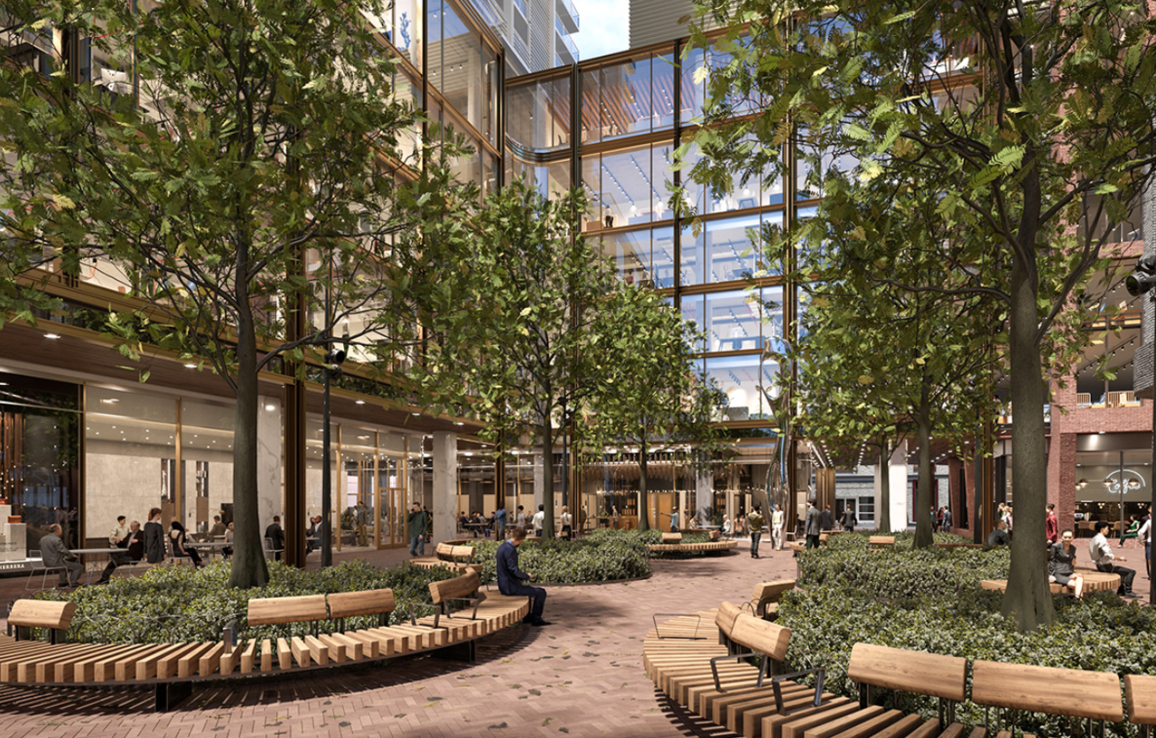
You can see in this pic from @bilked the attention to detail; and quality material palate.
In this one photo you can see illustrated many of the issues I raised in the Problematic Park Design thread, handled properly.
Note the the use of clear pathways for areas that Cormier wants you to come look at.........
Note the use of a practical and aesthetically pleasing surface making it easy to get to the highly visible seating.
Notice how there is nothing blocking your view of the central feature from the seating. The seats are not behind the trees, nor are there light standards in your line of sight, relative to the seating placement.
See also that the seating has been arranged to allow views of the centre, but also animation of the space facing outwards.
Finally, note the little mini-fence, that borders the planting bed, clearly identifying where you aren't supposed to walk.
Simple, straight-forward execution of basic design.
evandyk
Senior Member
Simple, straight-forward execution of basic design.
All it needs is a King Kong statue!