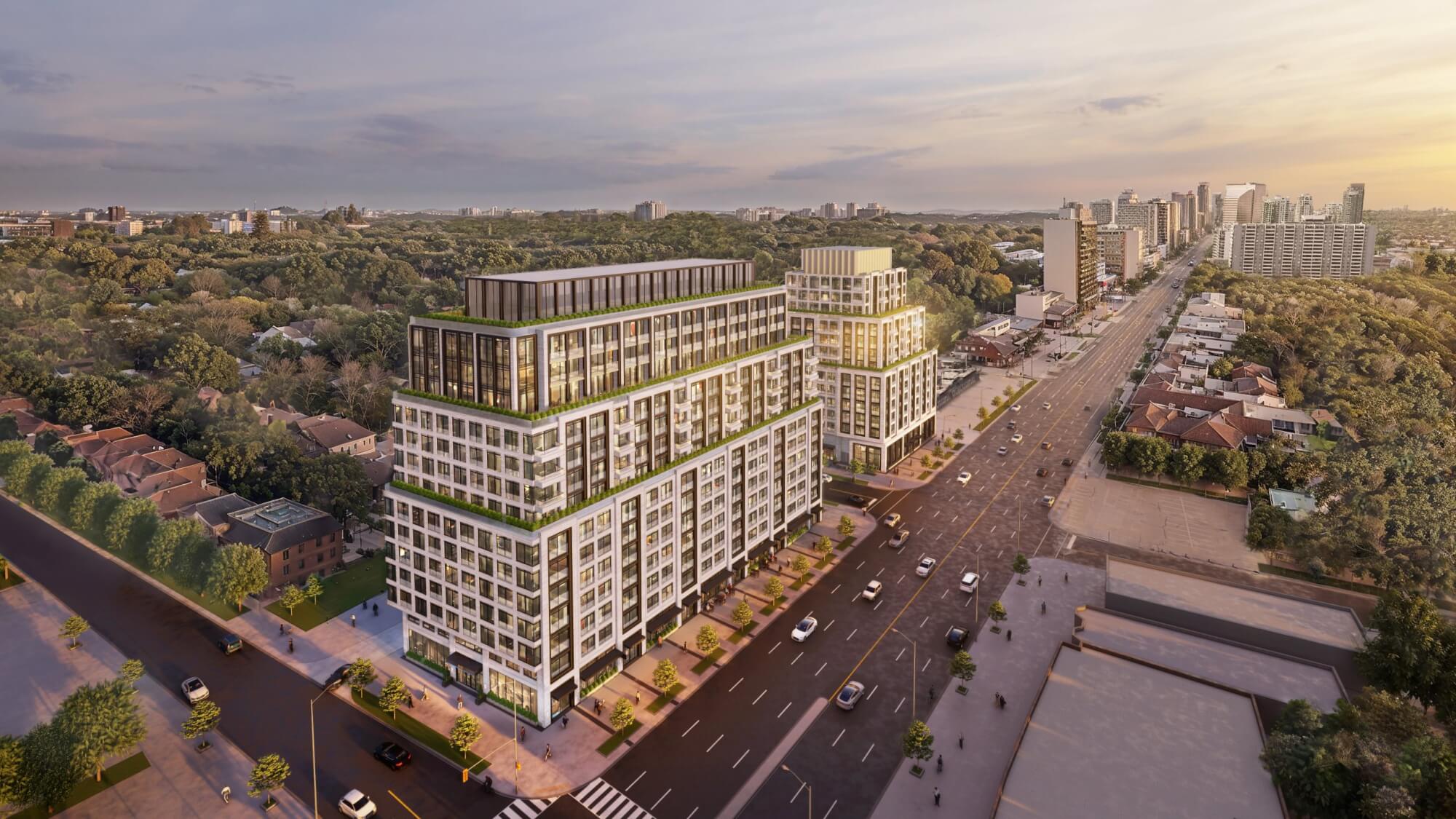
Toronto 6167 Yonge | 52.04m | 15s | Republic | Arcadis

Also notice, many Development Application were Official Submitted very recently here,... why? This area of Yonge Street North is subject to the new Inclusionary Zoning Policy starting this September,.... so now the race is on!!!
View attachment 377233

Actually, that's not necessarily the case as the date for IZ is the later of Sept OR the Minister approving an MTSA. As of now, Toronto hasn't shown delineations for Steeles or Cummer so seems unlikely to happen by then (though developers might not be hedging their bets).

I've mentioned this on the YNSE thread too but the forthcoming Secondary Plan for this area and inevitable up zoning, along with finally some certainty about the subway, timing, are likely bigger factors.
 
Another project by Republic Developments:


repub.jpg
repub2.jpg
repub3.jpg
repub4.jpg
 
Another project by Republic Developments:


View attachment 378373View attachment 378374View attachment 378375View attachment 378376

Overall, I like it.

There's some granularity in the larger block, breaking up the mass with three different treatments.

Not sure I wouldn't nix the weird L-Shape of the one treatment and just go vertical for all three.

Retail level even looks decent; I'm not completely sold on the canopy in its current form; but I'm not opposed either.
 
This is really nice actually. Good materials, good massing, good colour scheme. Perfect for the location. Is the yellow facade a heritage building, hence the cut-out over it?
 
This is really nice actually. Good materials, good massing, good colour scheme. Perfect for the location. Is the yellow facade a heritage building, hence the cut-out over it?
No, there's simply an everyday Mazda dealership on the site now. The yellow façade and reveal around it are there to provide articulation what would be an overwhelming wall of sameness otherwise, as is the red brick section at the south end of the building.

42
 
This one was appealed to the OLT at the end of November. It is now the subject of an Appeals Report to the next meeting of NYCC:


The City is really not keen on this one! I note that while other units in Planning are clearly letting the angular plane rule slide; the non-compliance w/same is highlighted here.

1676038161286.png


There is also an issue w/parkland in terms of size, with the City's read on the policy framework suggesting any new park dedication here will need to be larger than what Republic proposed:

1676038229568.png


Here we find a less common objection:

1676038303724.png

1676038346084.png


I can't speak to the technical concerns by Toronto Water.

In respect of the 'neighbourhoods' stuff, I'm not taken by that, but I agree the Yonge Streetwall treatment is pretty sheer.

On Parks, I would strongly disagree with an onsite dedication, and frankly think any space to that effect might be better utilized to 'transition' to adjacent typologies.

I would prefer to see off-site dedication expand this park, just to the south:

1676038691710.png


To me, extending Centre Park along Everingham makes a world of sense, if home on both sides said street could be acquired, you get a bonus, in that the street ROW here could be added to the park.
 
Last edited:
Nearby/adjacent 11 (& 15), 17, 19, 21, 23, & 25 Newton Dr currently being offered as Land Assembly for sale,.... overpriced but,... hmmm,... BTW, the first 3 western lots (11 (& 15), 17, 19) closest to Yonge are owned by the Eye Doctor at 11 Newton Dr and his partner/family,....
1682339562904.png
 
Last edited:
Where'd all the nice, warm, colour go?

@RepublicDevelopments
We love colour as much as anyone, but felt this new design with the buff brick and black window accents would fit in better in this location and target the right audience. Would have warm lighting so the building facade and interiors provide the warmth. Different design but the concept below can help for visualization.

1720736350989.png
 
We love colour as much as anyone, but felt this new design with the buff brick and black window accents would fit in better in this location and target the right audience. Would have warm lighting so the building facade and interiors provide the warmth. Different design but the concept below can help for visualization.

View attachment 579795

Totally appreciate your timely response. But I think I'm going to have to differ on this one.

I think Toronto as a whole, but also North York City Centre has a relative dearth of colour and warmth in design

I appreciate the idea of 'fitting in' to a point.......... but....as of today, this is what you have to fit in to:

1720736888889.png

Per Streetview

Assuming you were to go to market relatively soon, you would be a first-mover here. I would love to see the standard set high in that regard. I do recognize, of course that tastes differ, and I'm not utterly opposed to a white-black motif, but in this case, I did prefer the previous iteration.

That said, once again, my thanks for your thoughtful reply!
 

Back
Top