Northern Light
Superstar
Photos taken November 15th, 2023:


The merger was merely a corporate absorption. No Dutch 'Arcadis folks' have joined the North American team. And this was designed long before that took place so any suggested influence of theirs is just coincidence.IBI/Arcadis best designed building so far. That merger seems like a good thing because IBI was severely lacking in style, ambition & design. The works.
Agree. No doubt Arcadis‘ influence going forward, will be a significant improvement over IBI‘s mediocrity.Overall I really like this project but I have a few small gripes.
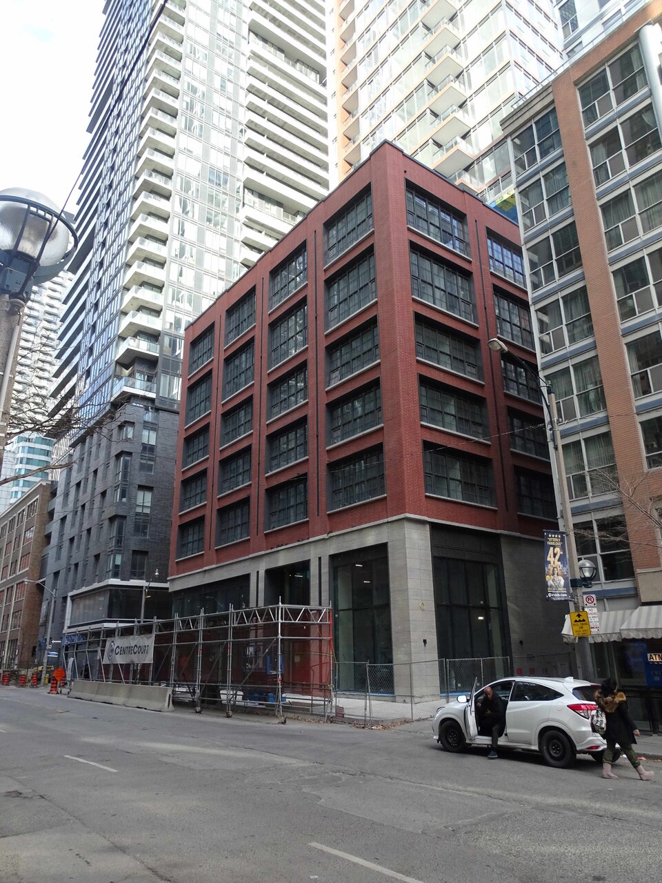
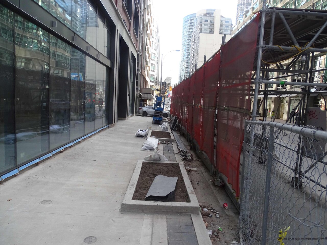
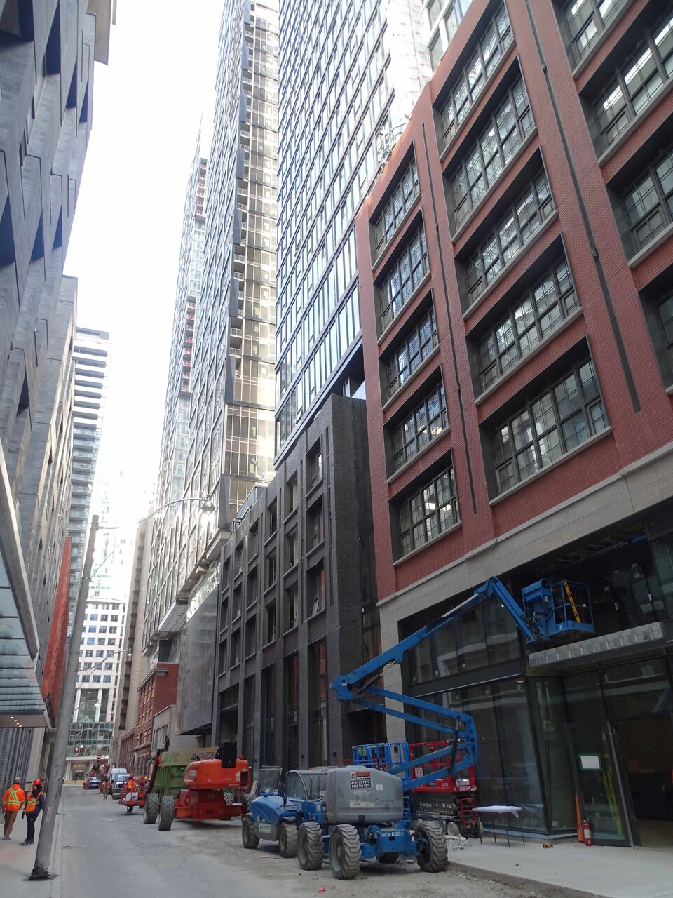
First off, glass at street level is just so overdone to me. In some contexts it’s ok, but here I really just wish they continued the vertical columns all the way to the street level. It would just feel so much more natural and classy imo. At the very least, continuing the column on the corner all the way to the ground would make this feel less awkward.
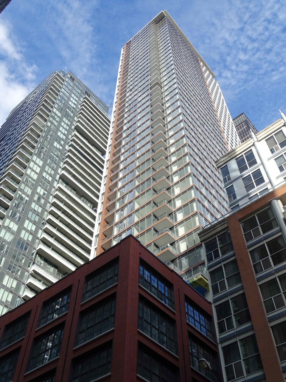
I also wish the red cladding was a little bit more prominent on the tower section as well. At the end of day it largely gets lost in the sea of glass which looks fine on its own merit but again there’s just so much similar stuff around. If the red cladding was a similar prominence to the white cladding I think I’d like this even more.
Lastly, continuing the glass windows up to the mech penthouse/combover feels weird, especially knowing it’s a solid concrete wall behind. Again I think the project would’ve benefited from just going a little simpler and using some sort of cladding that is one solid colour, or even just painting the concrete to top it off to be honest.
Overall I still really like this one and agree it’s among the best around. Small little things just could’ve elevated it even more in my mind.
Why are you so certain of this? Why do you think anything at all will change?Agree. No doubt Arcadis‘ influence going forward, will be a significant improvement over IBI‘s mediocrity.
The windows at Street level will be for businesses, not lobby or residential, I thought. If that is true, this is a good thing.First off, glass at street level is just so overdone to me. In some contexts it’s ok, but here I really just wish they continued the vertical columns all the way to the street level. It would just feel so much more natural and classy imo.
It is retail. Retail has never needed to be all windows. We went hundreds of years without having solid glass walls for retail stores and they managed just fine.The windows at Street level will be for businesses, not lobby or residential, I thought. If that is true, this is a good thing.
If this is a "Will build to suit" deal, then maybe the restaurant actually wanted as much window as possible. Some restaurants prefer lots of window. I'd hate to see the Windex bill though...It is retail. Retail has never needed to be all windows. We went hundreds of years without having solid glass walls for retail stores and they managed just fine.
Personally I’m far more inclined to enter a store that doesnt look completely sterile on the outside.
oh my.. a Brazilian steakhouse in an all glass podium?.. the height of sustainability!If you are referring to the space fronting BJW it is going to be a Brazilian steakhouse.
I personally prefer my and everyone else’s dinner not being available for the entire public to see but that’s just me LOL.If this is a "Will build to suit" deal, then maybe the restaurant actually wanted as much window as possible. Some restaurants prefer lots of window. I'd hate to see the Windex bill though...