Toronto 300 Front Street West | 156.05m | 49s | Tridel | Wallman Architects

thats a very NY style development...
 
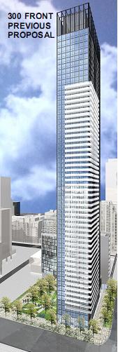
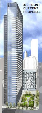
The original vs revised proposals:

2242192521_95735be1f9_o.jpg


2242982424_7ab022c118_o.jpg
shifting it west makes more sense but they could have kept the height
 
Too bad, I really think the height added a certain essence to the first proposal. The shortened version looks stubby - like there should be more of it but there just isn't. There was something really commanding and elegant about the height of the first one. Now it just looks like a post-2006 condominium in Toronto. Sad really, this should have been a place where something really commanding - a la the first proposal - would have worked well.
 
Any confirmation of what the new height is? I really wonder why the city has a stupid plan for a sloping skyline? What logic is there in doing this? Why do they care so little about design, but height is a big issue. Bugs me.
 
Hmm... with the redesign, if you are standing on Front street looking north at the park you'll see the transformer station right behind it. At least with the building on the east corner it would have blocked the view of it from front street. Although I guess it's covered with ads anyway.
 
I hate the second one!! Why does the city care so much about a bit of height! Id rather see a few tall buildings than the skyline tapering off! The second proposal just shows how close minded this city is!!
 
Why the fuss...?

The building is still tall and slender and looks very similar to the original version. It doesn't look that much shorter. I think people are way overreacting here.
 
I know that I'm sometimes accused of being a size queen, but the height reduction requirement seems silly. I think they should look at a height INCREASE for that site... it could handle it, especially given the lack of immediate parks, schools, and other residential. The whole business of skyline reduction seems silly... the benefits of city living, density, and good architecture are not influenced by the way a city looks when out on a boat or across the harbour. :mad:

Sometimes Adam Vaughn pisses me off. There, I said it.
 
if i was the developer i would go to the OMB and get my height back or maybe some sec 37 would do it.
 
I agree that the first is rather better, but really I don't care about height. I wish the city would spend a lot less time trying to lop off a handful of floors on every condo project, and a lot more time on improving their relationship with the street which is what really matters to the neighbourhood.
 
I'm not opposed to having the parkette on the corner and the tower itself is still fine - I'd even prefer the design of the second version if it was a bit taller (and therefore slimmer). They should be increasing density on this site, not worrying about the shape of the skyline in postcard shots.
 
Great to see another developer cheapening the proposal from the original. If only the city was to reward builders for interesting details than fussing over a few stories.
 
I like the re-orientation of the park which makes a lot of sense.
The shortening of the tower - while not dire, does seem rather silly, though. I mean this buildings is just a few hundred feet from the CN Tower!
Anyway, a fine looking proposal. I'm glad that the substation will at least be hidden from Front Street. Now if they could just bury it altogether...
 
I know that I'm sometimes accused of being a size queen, but the height reduction requirement seems silly. I think they should look at a height INCREASE for that site... it could handle it, especially given the lack of immediate parks, schools, and other residential. The whole business of skyline reduction seems silly... the benefits of city living, density, and good architecture are not influenced by the way a city looks when out on a boat or across the harbour. :mad:

Sometimes Adam Vaughn pisses me off. There, I said it.

Adam Vaughan had nothing to do with it based on my attendance at the info meeting. It was all City planning staff.
 

Back
Top