Toronto 300 Front Street West | 156.05m | 49s | Tridel | Wallman Architects

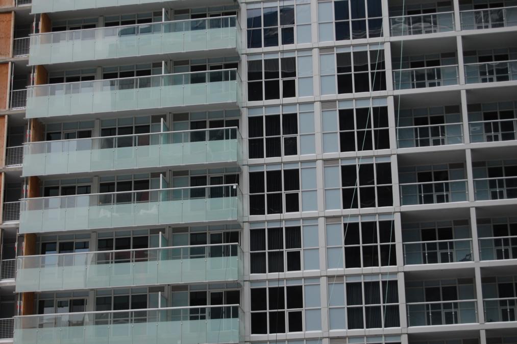
This image confirms what I feared: the curtains won't fix the look of this thing. you can clearly see them in the window, and it does nothing to change the colour.
attachment.php
 
This image confirms what I feared: the curtains won't fix the look of this thing. you can clearly see them in the window, and it does nothing to change the colour.

I have hopes that the blinds will have a significant positive impact on the overall look, but I don't see the blinds you're referring to in the picture you posted.
 
The balconies help, but it's a bit of lipstick on a pig, unfortunately.

I've seen far worse pigs.

I do think, however, that there was a missed opportunity to clad the western section of this facade in black/charcoal. It would have helped break up the monolithic impression this project can give, while highlighting the interesting design of the balconies and windows of the north eastern wing:


Still, if they can pull off the public plaza, that will make a big difference that just might tie this one together -- much like One Bedford's courtyard did.
 
The lower part of the building sticking out from the north looks pretty messy. The patterns used on the back wall make little sense with the rest of the design and its height is slightly too tall and dominating relative to the rest of the building. It's a weird form that acts as a nice filler though.

11468290856_35830fdbd5_b.jpg
 
Inconsistency is a major issue with this building. Every elevation makes multiple exceptions to its own rule, and there are competing patterns and themes and colour sets at work here. It's just an inconsistent mish-mash, which is unfortunate since consistency is incredibly important in a neo-modernist design like this. Some huge missteps here, when they could have just kept it simple and created something understated yet attractive. And the window-wall is brutal.
 
I think it's the dreary grey spandrel that ruins it for me. The colour choices in this building are unbelievably bad. Whoever thought that those colour choices were a good idea, needs to be fired. (and never allowed to work in this city again!)
 
I don't understand it. When this building was launched I recall being impressed by the renderings. It sold out quickly for high prices and was well received. Am I confusing this project with something else? It really does look like a home-depot greenhouse extruded up to 40 storeys to me. It looks very cheap.
 
We know they might build junk because Element and Infinity just went up in the area. I never said they would, and you know that. "Downtown" may have lots of redevelopment opportunities, but few of these sites are close to Union Station. Almost everyone here seems to think plain old condos are the best thing to put in the CBD near our central train station, so I won't bother trying to change your minds.

Excuse my untimely reply (6 years late), but scarberiankhatru made a good point. Residents of this location will not be needing access to Union Station, so it's a bit of a redundancy to locate condos in the heart of the CBD like this. Besides, who would want to live in the CBD which is a non-neighbourhood and completely dead outside of business and rush hours. It's short term planning.
 

Back
Top