tstormers
Senior Member
This would most likely be phased as well to keep the grocer open in its current location while building the new grocer spot on level 2 of the North building.I don't know how the prospective timing of the two projects lines up, but it would be a little annoying if the FreshCo here and the nearby Loblaws
https://urbantoronto.ca/forum/threa...38s-choice-properties-hariri-pontarini.27293/
were to simultaneously disappear for two or three years before their replacements opened.
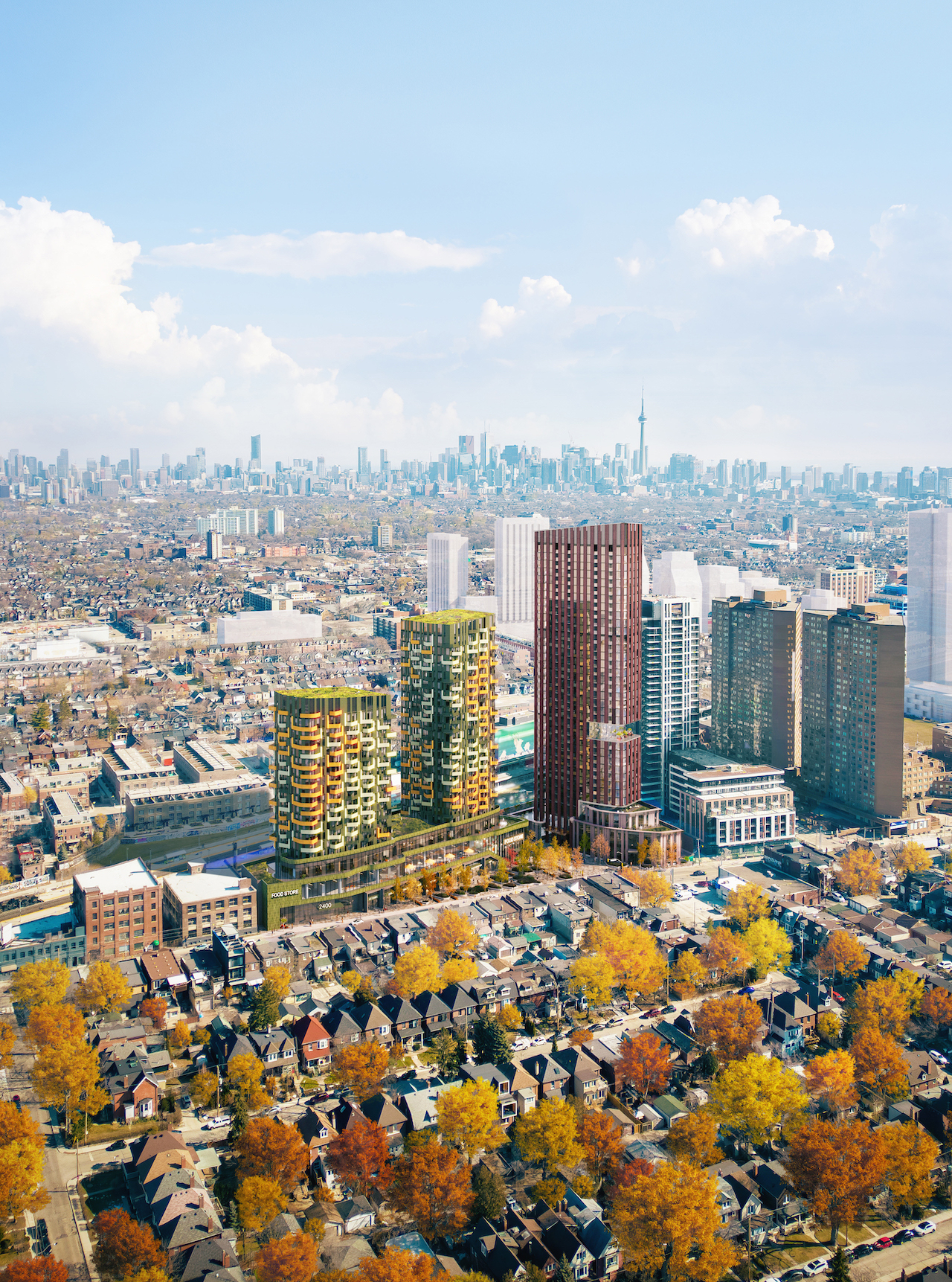
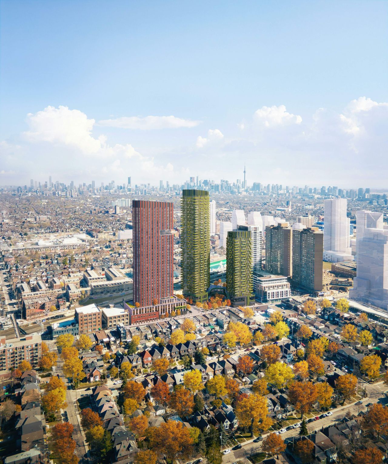
Wow I am astounded at how thoughtful the developers are being for this true gem of a location. I absolutely love the tall red tower to the south. It is elegant and modern, yet it draws inspiration from the neighbourhood's industrial past. This is exactly what sort of building should be built here. I just wish the developers of the Giraffe building and Loblows site see this and know what they should be aiming for.
The green building is nice as well, but it just feels out of place, both in the neighbourhood and in juxtaposition to the red tower. The geometry of it fits the location wonderfully, and I even think the balcony design could work but the materiality needs to change in my opinion. I appreciate the boldness of architect, but the green and yellow cladding makes it feel cheap and disposable, a contrast to the neighboring tower, which exudes a sense of permanence.
The idea behind the colours seem to be similar to a forest with "fluttering" and the South taller tower a strong stance like tree trunk and verticality of a trees.Respectfully, this city is dying for some boldness, while that green and yellow can't possibly look any cheaper than the Toronto standard grey spandrel. Ultimately I don't think that it's the color but the quality of the materials that determines whether a building looks cheap (ie. texture or lack thereof). Also, personally, I would pay a premium to live in a bright colored building, although I do recognize that I'm probably in the minority on this one
The colours may be bold, but I do think we need some of that. If you look at that winter shot, it makes the cold feel a bit warmer and bright, compared to the cold blah blue/grey glass of most DT towers.


