Toronto 2 Queen West | 34.44m | 7s | Cadillac Fairview | Zeidler

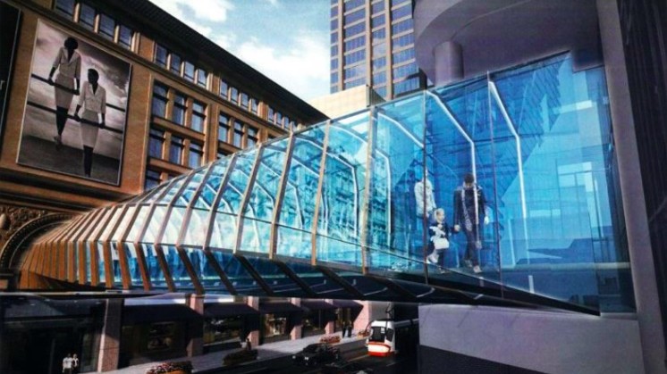
The architectural plans are up at the Dev App site - still a Zeidler, and the design is ultra-safe, ultra-inoffensive.

http://app.toronto.ca/DevelopmentAp...ion=init&folderRsn=3946404&isCofASearch=false

upload_2016-5-13_9-6-33.png

(p. 1)

upload_2016-5-13_9-7-31.png

(p. 16 - East elevation)

upload_2016-5-13_9-7-52.png

(p. 17 - South elevation)

AoD
 

Attachments

  • upload_2016-5-13_9-6-33.png
    upload_2016-5-13_9-6-33.png
    863 KB · Views: 1,443
  • upload_2016-5-13_9-7-31.png
    upload_2016-5-13_9-7-31.png
    104.3 KB · Views: 1,485
  • upload_2016-5-13_9-7-52.png
    upload_2016-5-13_9-7-52.png
    81.2 KB · Views: 1,452
So they are removing the current ugly cladding from 2 Queen West and revealing the original brick underneath? It is nice to see the original building rehabbed.
 
Looks like they'll be moving the Maritime Life building away from Yonge and Queen as well to create a giant plaza. :D

Or mess with the way light curves so that you get the impression of one :D

Anyways, the render also have the effect of showing just how the turn of the millennium addition, under the guise of good urban design is an utter failure.

AoD
 
Or mess with the way light curves so that you get the impression of one :D

Anyways, the render also have the effect of showing just how the turn of the millennium addition, under the guise of good urban design is an utter failure.

AoD

A different sort of failure than the failure that was there before.
 
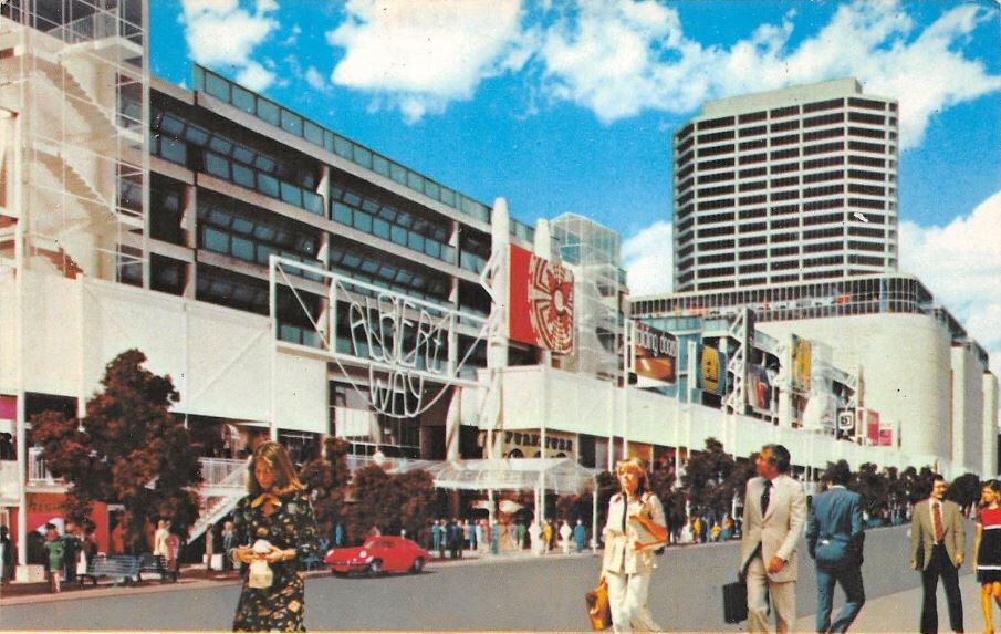
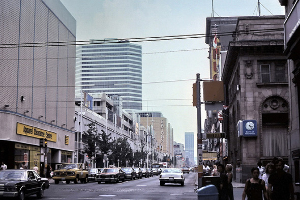
It was a failure in the sense that it was not properly built/designed or legally secured. Not sure how much of the stuff in that rendering was ultimately built (does anyone have any photographs?), but what did get built wasn't built to last. By the 1990s, it was a dead zone with animation limited to a Papaya Hut outlet and a rusty staircase up to East Side Mario's. The original 1970s plans might have been pretty on paper, but ambition without solid design and ensuring longevity is pointless.
 
Last edited:
Great minds think alike - I had just found that photo on Google. To be fair, hard to tell, but the colonnade (for lack of a better term) seems to create a bit of a dark zone along the facade (presumably particularly in the afternoon, when the sun was in the west). IIRC, the few retail spaces facing the street were unusually narrow, making them hard to lease (and, I am guessing, even more so if hidden by a colonnade). For whatever reason, Cadillac seems to have removed the colonnade by some point in the 1990s, and there didn't seem to be any planning restriction to stop them.
 
Last edited:
Love, love, LOVE that a rooftop patio is being included here! It will have some amazing views, since it should rise just over Hudson's Bay/Saks to the South
 

Back
Top