Toronto 2 Carlton | 251.1m | 73s | Northam | Arcadis

Another twin tower project again. Ugh.

As unfortunate as it is (thus far, at least based off what little info we have), I'm more interested in what they do for the first 10 or so storeys and the impact at street level. Given the size of the site and its prime location, I think there's a huge opportunity here to bring a sizeable indoor, multi-level retail complex, anchored by the pedestrian traffic generated by the subway connection and its proximity to the College Park building (which seems to be quite busy for the majority of the day). Ideally, I would have liked to see an entirely mixed-use component, but residential is all the rave nowadays, something we should be used to by now. I do think something along the lines of the proposed 1 Eglinton by HP would look nice here.
I do wonder who ends up being the developer.
 
Condescension is always a winning strategy in rebuking the validity of opinions we don't like.

Well, when the opinion is akin to finding this
medsq_hotels-11332-Courtyard-by-Marriott-Downtown-Toronto-hannahtheeditor-f5c5e.jpg

page-4


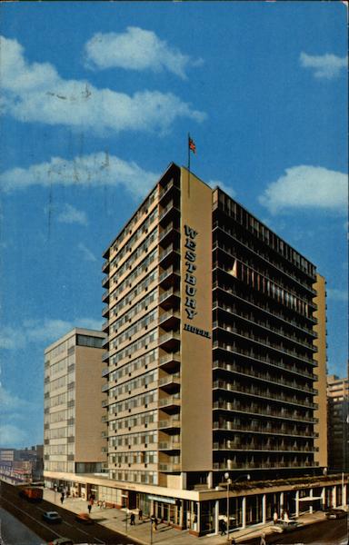
an improvement over this

card01248_fr.jpg


...you can understand the condescension
 
Tongue firmly in cheek, I trust. Let's not go any further down the ad hominem path please.

42
 
Wow !
What a beauty!
The wave effect is just perfect.
This complex will bring more diversity and beauty to the district.
 
Whoa. Don't know what to make of that. Looks like it's actively deforming - and that's not necessarily a bad thing. Don't think I like that shared podium though.

Still, it's more than I expected. But that podium...
 
yea, Like 385 yonge, this just isn't a two tower site. If you want this sort of density, you gotta do it in a single tower.
 
Nice but, I'm torn by this. We have more Aqua type towers built, construction, proposed than we do 1950s office buildings. Layers.
 
Last edited:
The rendering is not bad it could be worse. But I'm sick of seeing the colour of these facades looking a blue, green, black or white colour. One thing I liked about the buildings facades in the past. They were more distinctive to each other in colour and material usage.
 
Looks like a hybrid between the 8 Elm proposal and Aqua in Chicago, not exactly refreshing but I still find these towers to be quite an attractive twist on the glass box. That being said two towers still seems like overdevelopment, I'd have to agree with height advocates on this one, 100+ stories in one tower would actually make sense here.
 

Back
Top