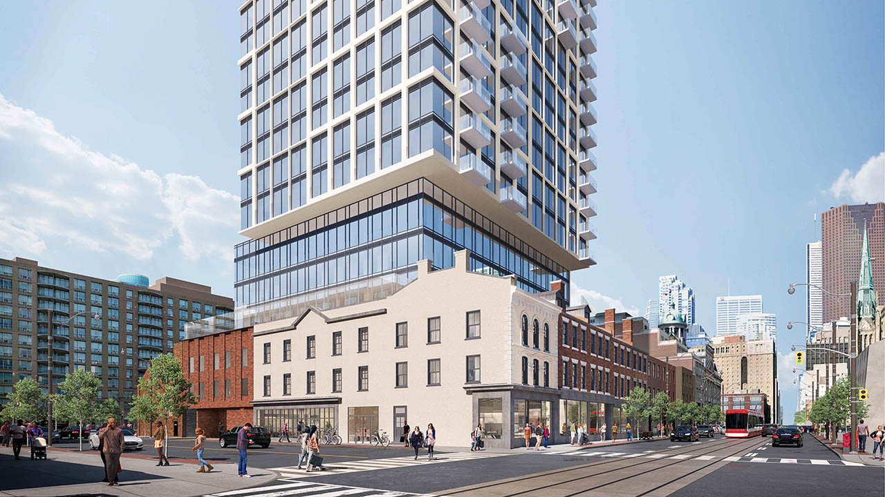
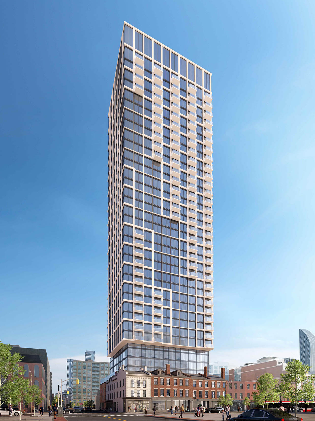
Toronto 185 King East | 157.12m | 46s | Gupta | Arcadis

A new rendering was added to the database. The height changed from 33 storey to 35 storey. The bike parking changed from 190 bikes to 440 bikes.

Rendering taken from the arch plan via Rezoning submission.
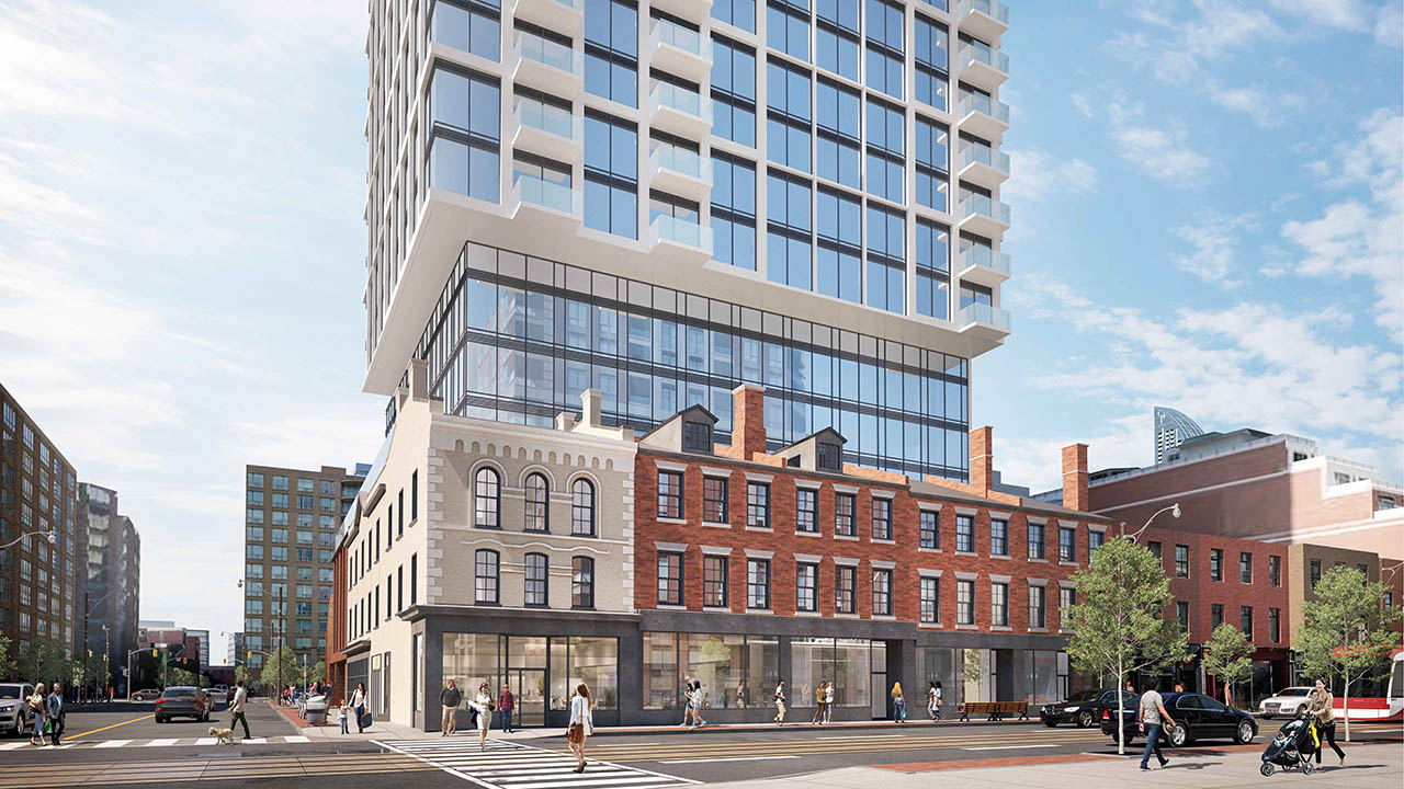
PLN - Architectural Plans - Architectural_Drawings_175-185 King Street E-115.jpg


PLN - Architectural Plans - Architectural_Drawings_175-185 King Street E-118.jpg


PLN - Architectural Plans - Architectural_Drawings_175-185 King Street E-121.jpg
 
The tower here remains way too bulky and overbearing on the heritage not to mention, just plain ugly.

Minimally acceptable changes:

Slim the profile of the tower on all sides, by 3M+

Lose all the balconies. I'm pro-balcony, but these look both useless as balconies and daft.

Make the building seem slimmer by going w/a vertical profile on the cladding.

The use of fins here might help.

***

To be frank, this proposal is trash, and the changes above would not so much make it great as less bad.

Making those changes brings it pretty much on par with 252 Church. Though all IBI/Arcadis buildings tend to share a very similar design language.

1693492148705.jpeg
 
The tower here remains way too bulky and overbearing on the heritage not to mention, just plain ugly.

Minimally acceptable changes:

Slim the profile of the tower on all sides, by 3M+

Lose all the balconies. I'm pro-balcony, but these look both useless as balconies and daft.

Make the building seem slimmer by going w/a vertical profile on the cladding.

The use of fins here might help.

***

To be frank, this proposal is trash, and the changes above would not so much make it great as less bad.
Yes, the balconies seem unnecessary and the whole thing too 'hulking' and overpowering. Not sure fins would 'slim it down' but ....
 
I don't find the floorplate too large, but think the cantelever above the stepback is awkward. In terms of the balconies, I agree that being both small and protruding makes them pretty useless, and they clutter the tower visually. Rather than simply removing the balconies altogether, another option would be to recess them.
 

As an Appeal Report recommending staff attend the OLT in opposition.

From the above:

1694097537680.png


**

1694097605389.png

**

1694097646027.png


Comments: The first two items are in line with both my own previous commentary in thread, and that of many other UT'ers.

I don't recall any of us looking at the Shadow Impact on St. James, but looking at the above that is not immaterial, and I expect changes will be required to reduce that impact.
 
They seem to be moving onwards ...


PB14.3 - 179-185 King Street East - Alteration and Erection of a Building on a Property Designated under Part V of the Ontario Heritage Act and Authority to Enter into a Heritage Easement Agreement - Request for Directions​

 
They seem to be moving onwards ...


PB14.3 - 179-185 King Street East - Alteration and Erection of a Building on a Property Designated under Part V of the Ontario Heritage Act and Authority to Enter into a Heritage Easement Agreement - Request for Directions​


Indeed, a Settlement Offer has been made here and the revisions are substantial.

Notably, a jump in height to 46s (+11s); which is being done, because the tower has indeed been significantly reprofiled with a smaller floor plate.

From the link above:

1707407296621.png

1707407329180.png


There are some additional bits and bobs, but that's the key stuff, I think.

Some new renders that are low quality but give a sense of the change:

1707407415767.png


1707407444208.png


1707407470236.png


Comments:

Fine w/the height increase in exchange for the floor plate reduction, that's exactly the right trade here.

A definite improvement.

But the tower expression would be immeasurably helped by getting rid of the balconies, They're too small to be functional anyway. I like balconies, but not these, not here.

@Paclo is flagged.
 
Just FYI re the sun / shadow studies that were referenced earlier.

Pink is as-of-right (I'm not sure why it's so tall at 90m, as it clearly shadows St. James), while orange is additional impact of the previous proposal.

Here are the impacts at March 21 / September 21 in the morning:

1707414525731.png

1707414579562.png


Here are the impacts at June 21 in the morning:

1707414700359.png


It looks like about 1.5 hours of morning shadow at the NE corner in spring / fall and 1-2 hours of morning shadow on the south side in the summer. Presumably the new, taller proposal will cover less area at the NE corner, but may extend further west into the park.

Personally, I am not supportive of any proposal here that further shades St. James Park. It is historic, one of the few large parks in the area, and the only downtown park that makes any real attempt at botanical planting. Plus, the proposal offer nothing to the public in terms of amenities or quality that might make up for this loss.
 
If there was ever a part of the city that should have its historical scale protected, it's here. It's one of the few relatively intact historical areas with several important landmarks nearby (St. James, St. Lawrence Hall) and of course as mentioned, St James Park that's at risk of additional shadowing. This thing looms like a giant middle finger to "old town" Toronto. Any new development should adopt the sensitive precedent set by projects like King George Square, Market Square, The Saint James, MoZo Lofts, Kings Court, etc.

Seems like wishful thinking at this point however.
 
Such an ugly but very effective way to destroy Old Town Toronto. A monstrously huge glass and bright white steel sky scraper to end the charm of the oldest part of the city. No honest thought to preserving heritage. The red brick and stone buildings from the 1830's will be in shadow most of day under the overhang of this thing. Hideous building. Shame on Gupta. Shame on the City of Toronto. Shame on the St. Lawrence Neighbourhood Association. This is the legacy you have left.
 
Last edited:

Back
Top