Toronto 164-168 Isabella Street | ?m | 67s | Elysium | Studio JCI

AlbertC

Superstar
Member Bio
Joined
Apr 24, 2007
Messages
23,156
Reaction score
63,585
Location
Davenport


The newest Toronto multifamily development site

Hepsor is also part of the Elysium Isabella Limited Partnership that assembled and acquired three properties from private property owners at 164-168 Isabella St. in downtown Toronto.

The existing single-family homes on the site have heritage features Pärloja said will be retained as an architectural element within the podium of a proposed residential tower once rezoning and other approvals are received. That’s expected to take up to 30 months.

There are plans for a 450,000-square-foot high-rise development, but the partners have not yet decided whether to sell at that point or carry on to the construction phase.


Current view of the site, on Isabella Street, just west of Sherbourne:
isbae.JPG


The newest Toronto multifamily development site

Hepsor is also part of the Elysium Isabella Limited Partnership that assembled and acquired three properties from private property owners at 164-168 Isabella St. in downtown Toronto.

The existing single-family homes on the site have heritage features Pärloja said will be retained as an architectural element within the podium of a proposed residential tower once rezoning and other approvals are received. That’s expected to take up to 30 months.

There are plans for a 450,000-square-foot high-rise development, but the partners have not yet decided whether to sell at that point or carry on to the construction phase.


Current view of the site, on Isabella Street, just west of Sherbourne:

View attachment 513663
I would imagine part of the heritage features of these Victorians, much like Keg Mansion IS their distance to the street. I dont think you can assume you can move these to the lot line as part of the podium and go up with a tower behind it. I couldnt find the designating by-law outlining the features, but this will be a tricky rezoning.
 
Aerial Pic of the above described assembly:

1697560532745.png


Nominal Site Size: ~1900m2 / 20, 600ft2

Comments:

The Heritage buildings can not be retained in their entirety, nor in-situ and have a viable floor plate, I assume any proposal with retail the south elevation facades, perhaps a portion of the western/eastern facades and a portion of the balance of the buildings, albeit shifted to the south a bit.

This assembly would make so much more sense with 562 and 564 Sherbourne in it.

The proposal's size, as described above, would dictated 62s if the floor plates were uniform from the ground up. I imagine, as per the norm, the podiums will be larger than the tower, so something in high 50s seems likely.

An interesting effect here may be the limitation of redevelopment on the Hotel Isabella site which may be stranded.

***

A limitation here is the school site immediately to the east, a site I have argued here should be purchased by all the area developers as a logical, larger park for their combined community, assuming the school board could be parted w/their land.

Having said that, while operating as a school, shadow impacts and overlook/noise mitigation may be issues next to such a facility.

On heritage: 168 is designated, while 164/166 is listed.
 
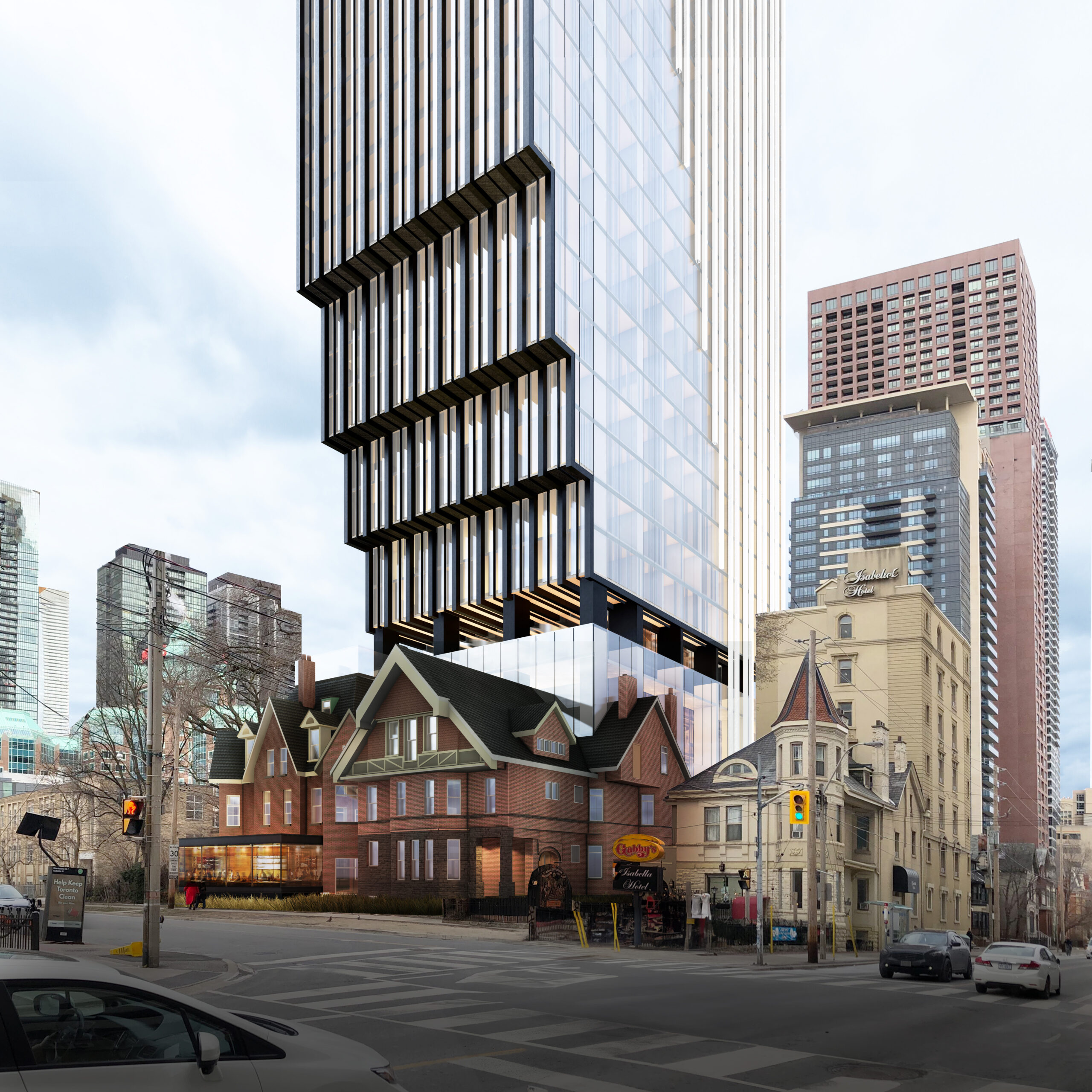
Holy heck - I'm no structural engineer, but how are they going to make this work... at Sherbourne and Isabella of all places.

Looks zone and flippish


1711663561996.png


1711663585237.png


1711663596461.png
 
Damn, I guess they are planning to move the houses to the front of the lots like they have for many other nearby projects. It’s definitely bold.
 
So aside from the obvious..........that its insanely bold and rather ugly..............

I assume they have LDAs with the abutting owners.................
 
..........that its insanely bold and rather ugly..............

Compared to The One or Forma, yes, but 90% of what Toronto builds is uglier than what this rendering suggests (if it's accurate).

I'd take this over almost every tower between Yonge and Bathurst south of Front, practically every glass condos that's gone up on Charles West, or that 30 floor condo directly south of The Selby (shown above). Thats ~85 buildings and maybe 77-78 of them are worse.
 
Last edited:
90% of what Toronto builds is uglier than what this rendering suggests (if it's accurate). I'd take this over almost every tower between Yonge and Bathurst south of Front, practically every glass condos that have gone up on Charles West, or that 30 floor condo directly south of The Selby (shown above).

While tastes will vary; and there certainly are no shortage of buildings in Toronto that are unattractive and/or mediocre, I certainly disagree on this building's virtues and would also suggest you really omit some nice offerings in your statement.

On this building: There are at least 3 different architectural expressions (2 cladding, one glazing shown) If each were brilliant I'd be inclined to call that too busy by at least 1/2. But the flat finish, clear glazing side has all the appeal of a suburban office tower to me. That, in particular, stands out unfavourably. I also have a visceral, negative reaction to cantilevers that make the building fatter as it rises.

I would commend Toronto House (19 Duncan) as superior within the area you specified.

https://urbantoronto.ca/forum/threa...-186-53m-58s-westbank-hariri-pontarini.21066/

While there are some others within that area; I would move over to the east side and note 'The Selby' and 'Maple House' among many nicer examples
 
I think moving the house for preservation's sake, while clearing up land for increased density is a good idea - we've seen it done succesfully a number of times in Toronto. It'd be better if they could find a way to do without that hefty cuboid attached to the front.
I like that so much effort has been put into variegating the finishes on the facade, but I think we've all learned a healthy mistrust of renderings. As maestro noted above, unless these are going to be ultra-luxury apartments, that side glass is pure fancy.
I don't like this recent fad of inverse steps and overhangs much. A little of it goes a long way. This tower way too aggressive with it, IMO, making it both awfully overbearing and enormously bulky. It being cut into the back of the house feels harsh. It's a form perfectly indicative of belligerent profiteering.

I looked up the developer, Hepsor AC. A brief skim online didn't turn up any highrises. Some unremarkable midrises, though - I've attached some photos here. It's about G&C -level stuff, with a few woodsy nods.

hepsor3.jpg


hepsor2.jpg


hepsor1.png
 
Sayf Hassan, who longtime members will remember from the now-defunct Symmetry Developments, is the proponent behind this.

TY for that PE; now would you mind sharing your thoughts on the proposal itself?
 
The site has been kicking around in one form or another for a good while now. I looked at it in 2016 and again in 2021. The biggest issue is moving the two manor houses forward and what to do about the Isabella Hotel, however this assembly seems to have omitted the latter. So it's just a matter of securing the proper permissions to exempt the project from setback requirements. Structurally what's proposed here wouldn't be cheap, but it's not particularly difficult either. I don't see this being something that 'Elysium' actually wants to undertake, just a zone-and-flip but who knows.
 

Back
Top