Undead
Senior Member
Today:


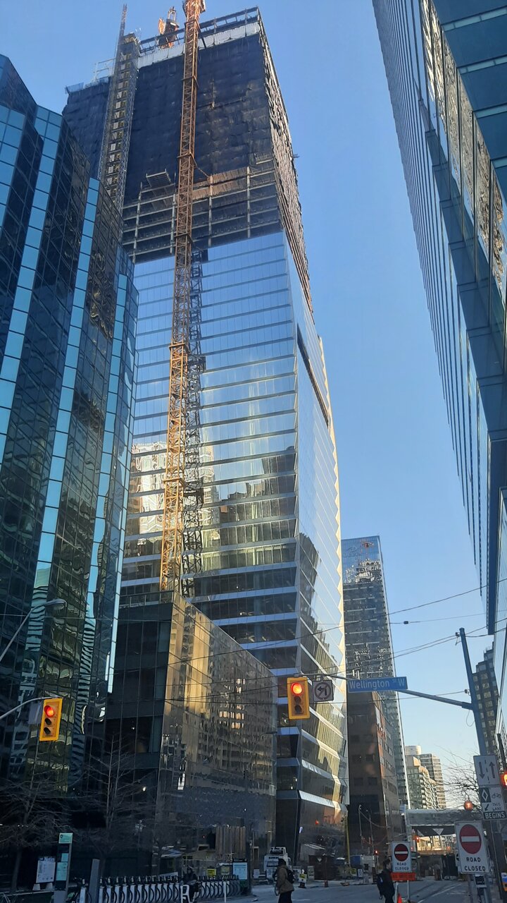
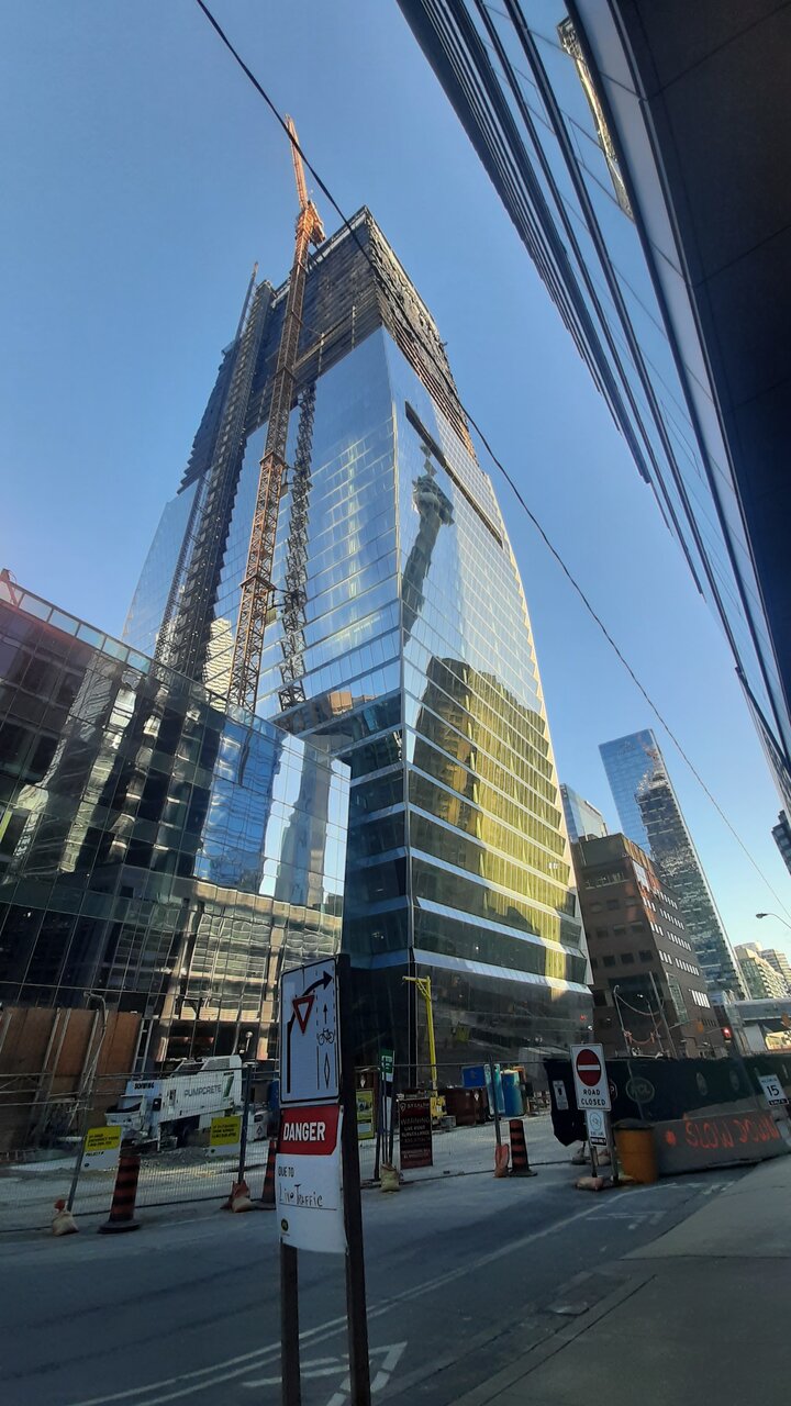
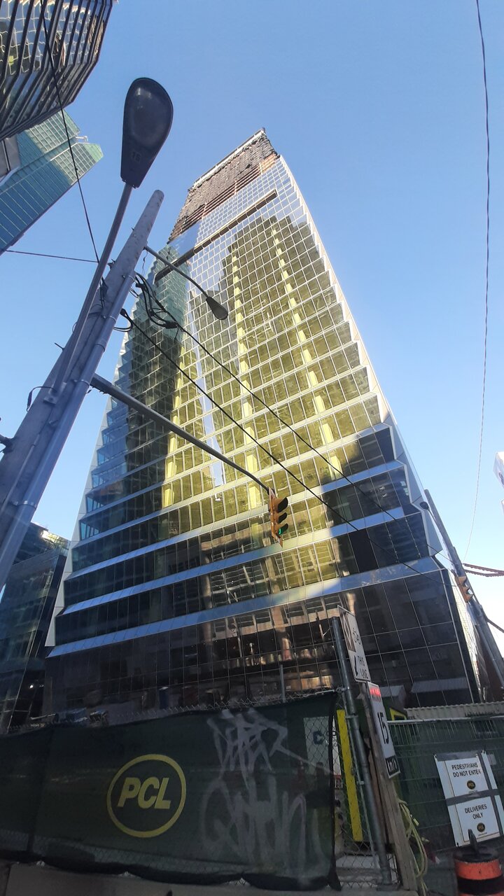
It looks better than 160 Front West's podium on Simcoe.Funny, from that vantage point at a glance, the Citi building looks like a facade for 160 Front West. Actually wouldn't be too horrendous.
I kinda agree. Right now, as has been already mentioned by a couple of posters, from the south, it looks fat. In addition those two maws and that cut out corner on the south-east look awkward, to me at least. Sometimes less is more! In an effort to make an architectural statement you get buildings like this or the walkie-talkie building in London England which to me is cringe worthy!Everyone was saying this from the start, but it's very apparent now that if this were 70+m taller it would have been an iconic Toronto building.
I personally love the Walkie Talkie (f.k.a Walkie Scorchie) - even if it is more eccentric, it is certainly memorable in my eyes.I kinda agree. Right now, as has been already mentioned by a couple of posters, from the south, it looks fat. In addition those two maws and that cut out corner on the south-east look awkward, to me at least. Sometimes less is more! In an effort to make an architectural statement you get buildings like this or the walkie-talkie building in London England which to me is cringe worthy!
Seeing this picture, It seems essential that a tall pinnacle one Yonge project balance out the sheer verticality of the CN tower and surrounding bank towers. While some towers seem prominent, we still see that our skyline from the postcard view still centres on CN tower and a few 1970s-constructed towers despite all the growth of the past decades.Original courtesy of Gavin Edmondstone
Fitting into the skyline nicely from across the lake.
View attachment 450013
Interesting angle to see all the buildings! Great shot!!Original courtesy of Gavin Edmondstone
Fitting into the skyline nicely from across the lake.
View attachment 450013