DopeyFish
Active Member
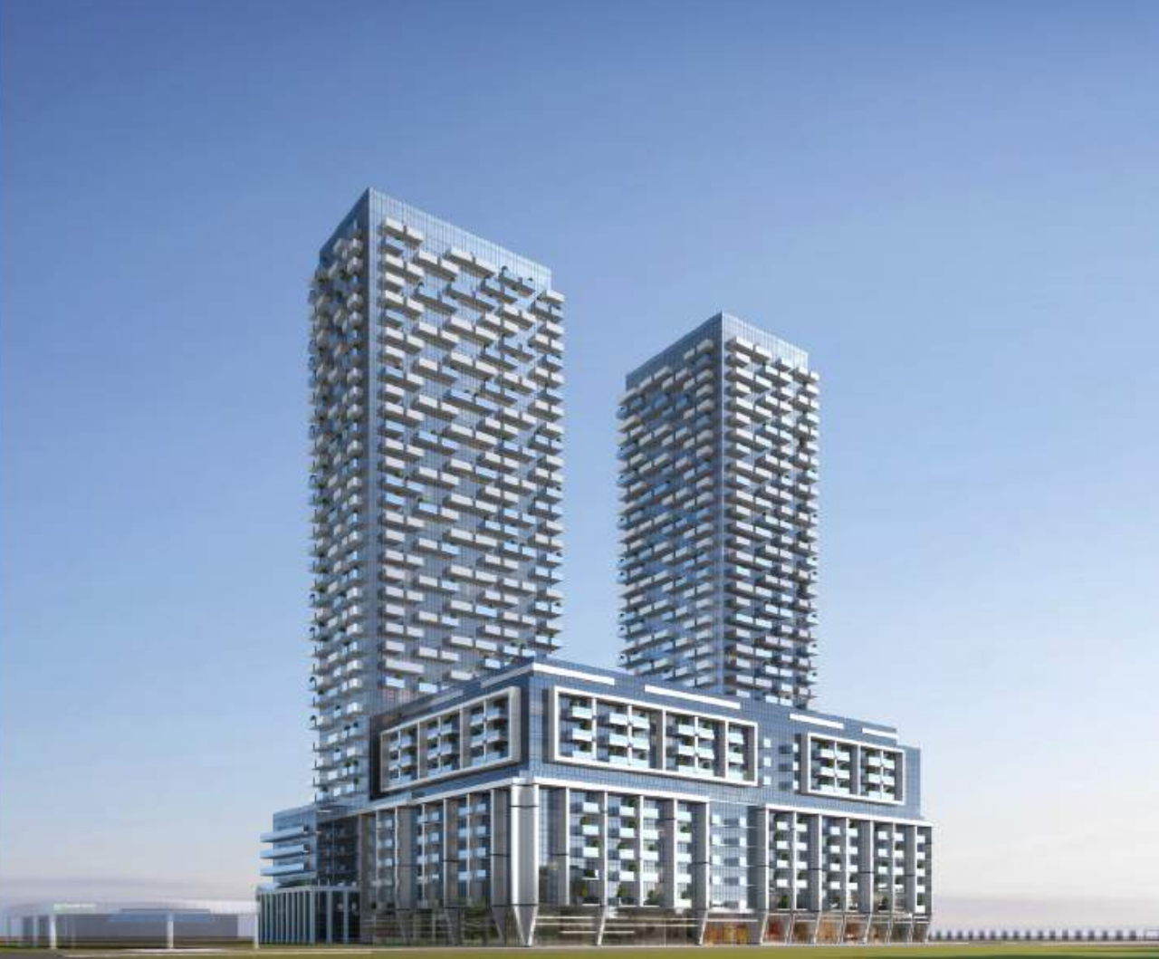
glass brutalism is here \o/
That should be a new word.G+C can't even do glass properly, this will be more like spandrel mullionism.
glass brutalism is here \o/
With the stuff that Tribute pulls, the cladding wont even come anywhere close to what we seen on 100 Queen's Quay.The podium is too bulky, but the towers look okay. With a slim podium and dark blue glazing like 100 Queen's Quay East, it would be decent. But the rendering is pretty sneaky when it comes to hiding the spandrel and transoms.
It's that bulking podium. I am sure it can fit a whole ton of units.*Edit: Side note I didnt realize how massive this proposal is....1,210 Units!?!? Talk about jamming a load into a thin pipe and hoping for the best.
It's that bulking podium. I am sure it can fit a whole ton of units.
As much of an affront that podium is to the eyes, one has to admit that it probably will allow for some decent floorplates and unit plans.

glass brutalism is here \o/
Yeah, looking at it, I thought the design process must have gone like this:
"Let's take modernism, brutalism and POMO design elements, throw out anything good , toss the worst parts from each in a blender and finish it with bad materials choices"
Nothing wrong with intensifying that location, but the only reasonable reaction to this design is:
Good thing I dont have Twitter, or else I would have openly trolled them and make them look idiotic for pumping this load of manure.