You are using an out of date browser. It may not display this or other websites correctly.
You should upgrade or use an alternative browser.
You should upgrade or use an alternative browser.
Toronto The New Residences of Yorkville Plaza | 92.05m | 31s | Camrost-Felcorp | WZMH COMPLETE
- Thread starter maestro
- Start date
steveve
Senior Member
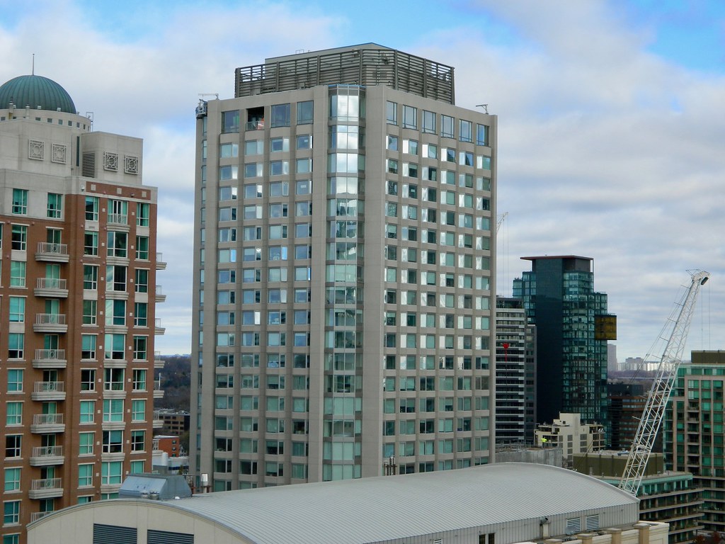
From Museum House:
Still ongoing work at the top:

Still ongoing work at the top:

salsa
Senior Member
The old glass looked a lot better. They should have replaced it in the same style.
alklay
Senior Member
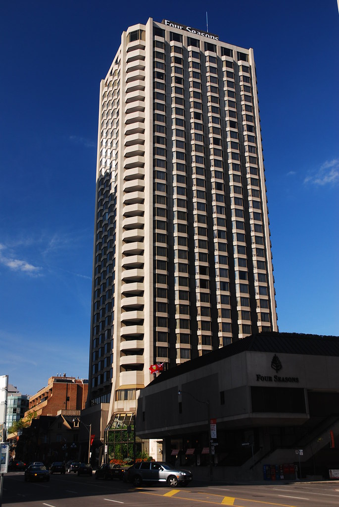
The base of this building is really terrible: cheap looking and giving nothing back to a potentially wonderful corner. It is a real missed opportunity.
Gphorce
Active Member
It is really bad. Everything about this project has been one misstep after another.
ADRM
Senior Member
They've somehow blackened what I think used to be a lighter back-painted spandrel on the podium and I can't tell if it makes it better or worse because it's just all so awful.
On the bright side, they've also added a couple rows of planter boxes along the sidewalk to add some protection for pedestrians exiting both the restaurant and residences. It's actually a very good idea that should be emulated widely both by developers and the city.

On the bright side, they've also added a couple rows of planter boxes along the sidewalk to add some protection for pedestrians exiting both the restaurant and residences. It's actually a very good idea that should be emulated widely both by developers and the city.
Attachments
LUVIT!
Senior Member
I like the planter idea as well.
alienhenny
New Member
So happy this got done. SUCH an improvement over the gross look of the old building. 
ADRM
Senior Member
Are we looking at the same building? I think this is one of the sloppiest, most out-of-place contemporary additions in the city in recent memory.
Gphorce
Active Member
It's vitriolic. The design was never good, and the execution is somehow even worse. It's embarrassing for such a prominent corner in our most lavish neighbourhood. Yorkville is supposed exude quality and class, this fails at both.
isaidso
Senior Member
In all fairness, this is very much in keeping to the standard of most new builds in the downtown core. I don't think it's good enough either but resigned to the fact that this is what Toronto builds. When something beautiful goes up it's a reason for celebration.
alienhenny
New Member
I mean let's be real here, the original building looked dated. Beige concrete and brown glass have no place in the 21st century. I think the developer made the smart choice of updating the building in order to try and compete with the newer buildings being constructed.
ADRM
Senior Member
I mean let's be real here, the original building looked dated. Beige concrete and brown glass have no place in the 21st century. I think the developer made the smart choice of updating the building in order to try and compete with the newer buildings being constructed.
I'm not trifling with the decision to update an older building; I'm taking exception to the positively horrendous podium design they've foisted upon the neighbourhood here. It's astonishingly ugly and out-of-place.
stjames2queenwest
Senior Member
I have come to enjoy brown tinted glass. I forget the name of the small office building at church and Charles? It lost its brown glass recently too and looks worse now than it did before in my opinion.
jje1000
Senior Member
The weird thing about the base is that in the construction pictures it's all clearly glass, and yet they decided to cover it up with ugly matte black vinyl?


