You are using an out of date browser. It may not display this or other websites correctly.
You should upgrade or use an alternative browser.
You should upgrade or use an alternative browser.
Markham Signature Condominium Collection/Marriott (Markham, Remington, 12 + 15s, Quadrangle)
- Thread starter khris
- Start date
MafaldaBoy
Senior Member
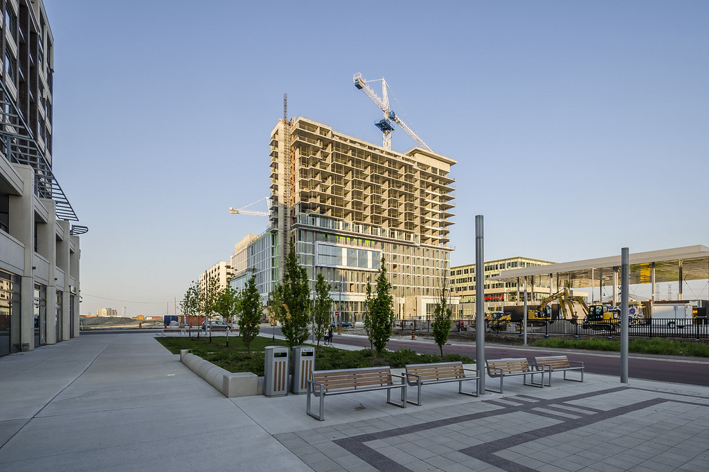
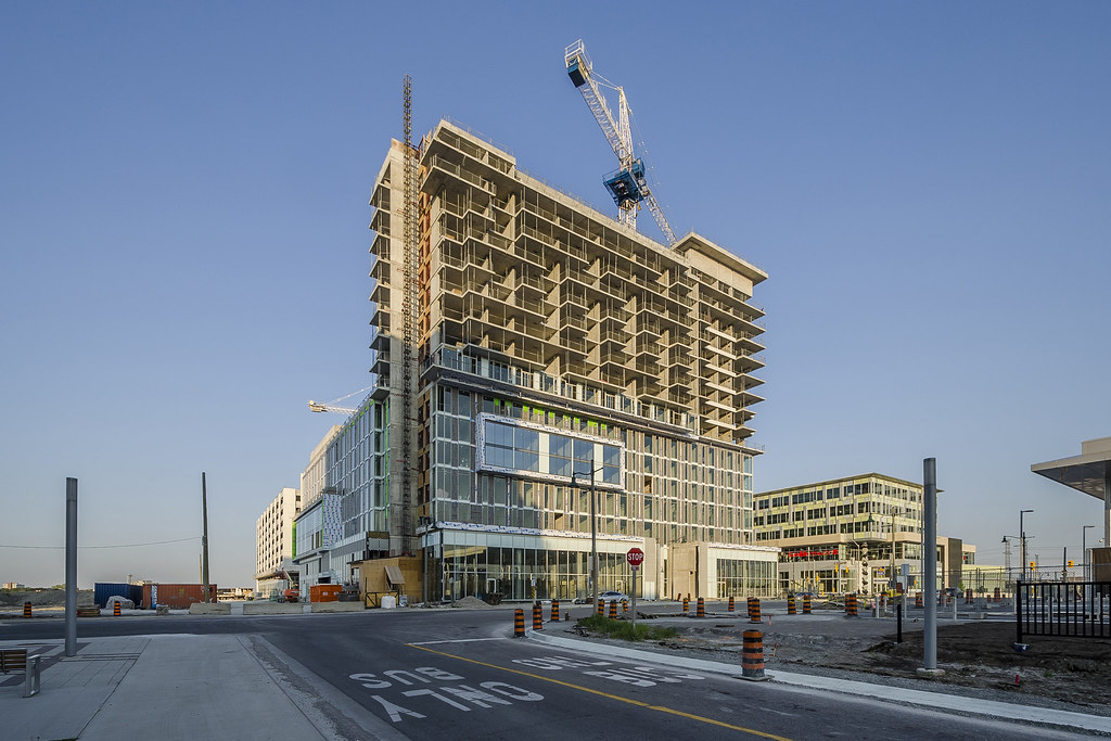
Painting on the precast concrete has begun; entire east elevation has been painted already, though I didn't get any pictures.
21 June 2016:
The Signature by Jimmy Wu, on Flickr
The Signature by Jimmy Wu, on Flickr
21 June 2016:

The Signature by Jimmy Wu, on Flickr

The Signature by Jimmy Wu, on Flickr
MafaldaBoy
Senior Member
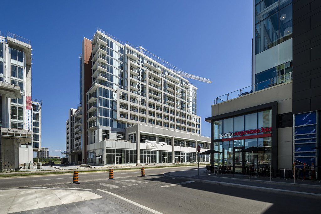
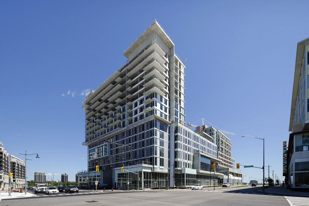
08 August 2016:
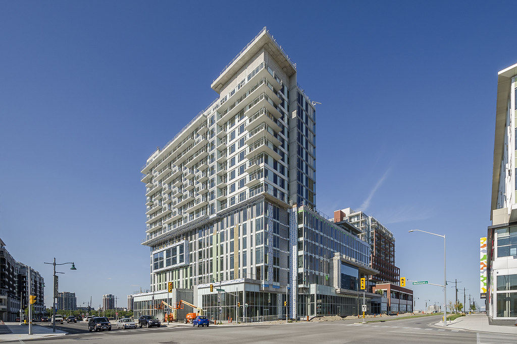
The Signature by Jimmy Wu, on Flickr
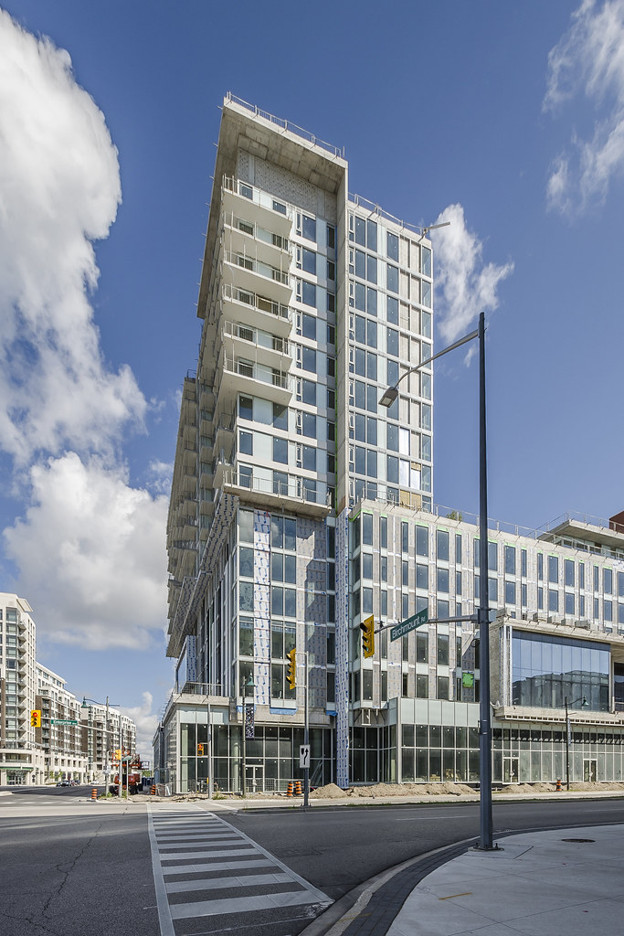
The Signature by Jimmy Wu, on Flickr
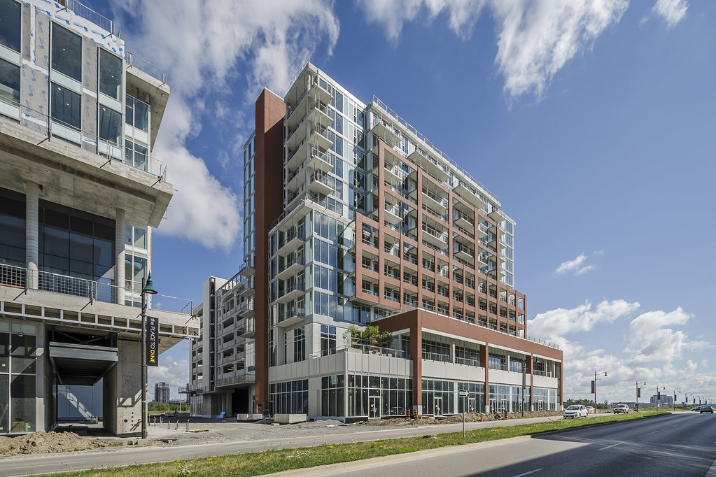
The Signature by Jimmy Wu, on Flickr

The Signature by Jimmy Wu, on Flickr

The Signature by Jimmy Wu, on Flickr

The Signature by Jimmy Wu, on Flickr
taal
Senior Member
For whatever reason don't love how this one turned out; Not bad mind you !
maestro
Senior Member
"brick" colour clashes
Actually funny. They are painting the precast which gives them virtually unlimited tints, shades and colours to choose from yet this same dull red has been used over and over again on numerous unrelated projects.
Actually funny. They are painting the precast which gives them virtually unlimited tints, shades and colours to choose from yet this same dull red has been used over and over again on numerous unrelated projects.
Waterloo_Guy
Active Member
The park benches are a great way to avoid talking with whoever is sitting beside you. And those rounded street corners will do a good job of prioritizing cars over pedestrians. Perhaps a sign saying "watch for cars" would complete the effect.
Not to be a downer, but if they are sincere about creating something urban, these are easily avoidable mistakes.
Not to be a downer, but if they are sincere about creating something urban, these are easily avoidable mistakes.
kdoubled
New Member
For whatever reason don't love how this one turned out; Not bad mind you !
I agree. I feel that the base of the west elevation is throwing it off, it looks too "vertically stretched" (if you catch my drift
Lumber King
New Member
This is what most of the Remington Group buildings end up looking like. If you take a look at Park Towers in Etobicoke, you may see some similarities.
Transportfan
Senior Member
The park benches are a great way to avoid talking with whoever is sitting beside you. And those rounded street corners will do a good job of prioritizing cars over pedestrians. Perhaps a sign saying "watch for cars" would complete the effect.
Get real. You're complaining about rounded street corners? That's the standard used all over the world, and has been since long before the invention of the automobile. It has to at least possible for vehicles of any type to turn.
Waterloo_Guy
Active Member
Get real. You're complaining about rounded street corners? That's the standard used all over the world, and has been since long before the invention of the automobile. It has to at least possible for vehicles of any type to turn.
It's a bad standard, and there has been plenty of qualified criticism about it. If you look at some older parts of this city and others you will find that cars are able to turn just fine without such dramatically rounded corners.
Transportfan
Senior Member
Why is it a bad standard and why would it help pedestrians if cars can turn anyways?
The wider the corner, the farther the crossing for pedestrians, who must deal with cars which are taking the corner at higher speeds. It's both more dangerous, and less inviting for street life.
42
42
innsertnamehere
Superstar
cars additionally turn at higher speeds with wider turn radii. Enterprise and Birchmount appear to have 15m radius corners, while downtown often has ~4m radius corners. The biggest corner I can think of downtown, Bay and Front, has a roughly 10m radius, and that is a noticably worse experience to walk across as a pedestrian.
That said, large freight vehicles do have to be accommodated in these suburban areas, unlike downtown, where they very rarely travel. 15m is unnecessary though, 10m could easily have sufficed.
That said, large freight vehicles do have to be accommodated in these suburban areas, unlike downtown, where they very rarely travel. 15m is unnecessary though, 10m could easily have sufficed.
Transportfan
Senior Member
So the issue is not curved corners as such, just the degree.
Woodbridge_Heights
Senior Member
Yes. Was just about the say that. It's not the fact that the corner is rounded but by how much the corner is rounded.
