News   Nov 22, 2024
 645     1 
News   Nov 22, 2024
 1.1K     5 
News   Nov 22, 2024
 3K     8 

Problematic Park Design - Why Some Parks Don't Work

Northern Light

Superstar
Member Bio
Joined
May 20, 2007
Messages
35,527
Reaction score
103,502
Location
Toronto/EY
A few forumers have expressed an interest in a thread about why some parks don't work.

So I thought I would start one with some examples and show what can go wrong from the subtle to the obvious.

****

A few words on me; and on some terms/ideas discussed below.

I am not a Landscape Architect, though I know many; I have had a hand in park design once or twice, but is not my professional calling.

Terms: (some will be well known, but just to acquaint everyone)

Desire Line: This is an informal path, typically over grass, or through a planting area made by people taking a short-cut to where they want to go.

Hardscape: Paving/brick surfaces; anything that isn't landscaping or water by and large.

Softscaping Not a commonly used term, but the opposite of above, used to describe any natural or soft area in park such as grass and planting beds

Paths or Trails: Seems obvious, but here I will use that exclusively in reference to intentional paths or trails (designed) as opposed to desire lines

I think everything else is fairly straight forward.

****

So first, lets talk park types.

Here we're talking manicured parks vs natural environment or ravine spaces.

Within manicured or table-land parks as Toronto refers to them, there are lots of classes.

Exact naming varies from City to City and Region to Region.

But in general, you have local/neighbourhood parks, district parks and regional or district parks (Toronto also uses the term Legacy Parks).

The park types above, generally flow from small to large, though there are exceptions.

Within these some parks are also 'destination parks'; which could be at any size level; and refer both to parks that attract tourists and also those that draw from across the City.

The information about park types is important; because it tells you about what function the park serves; and that dictates (or should) something about how the space is planned.

One last note.

The parks below that I list as failed are not based on personal taste; though I may well take issue w/their design.

I chose one simple criteria; are they well used; are they popular?

That's it.

Natural Environment Parks have a purpose apart from people-pleasing.

But Tableland or Manicured Parks are expressly for people to enjoy.

As such there is no greater testament to their success or failure than how busy they are (in my opinion)

With that, here we go:

******

All photos are from Streetview or Google Satellite unless otherwise noted.

Lets start by comparing 2 parks in Yorkville; one an undisputed success; though not without its problem spots.

One a pretty clear-fail, though not without a glimmer of something.

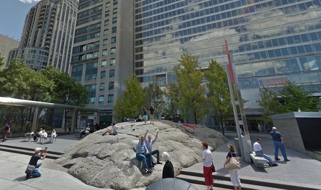
Good: Village of Yorkville Park
1614194914961.png


1614194947027.png


1614194968936.png


1614195106986.png


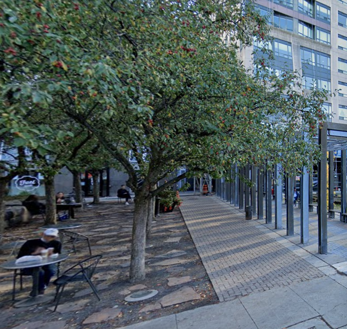
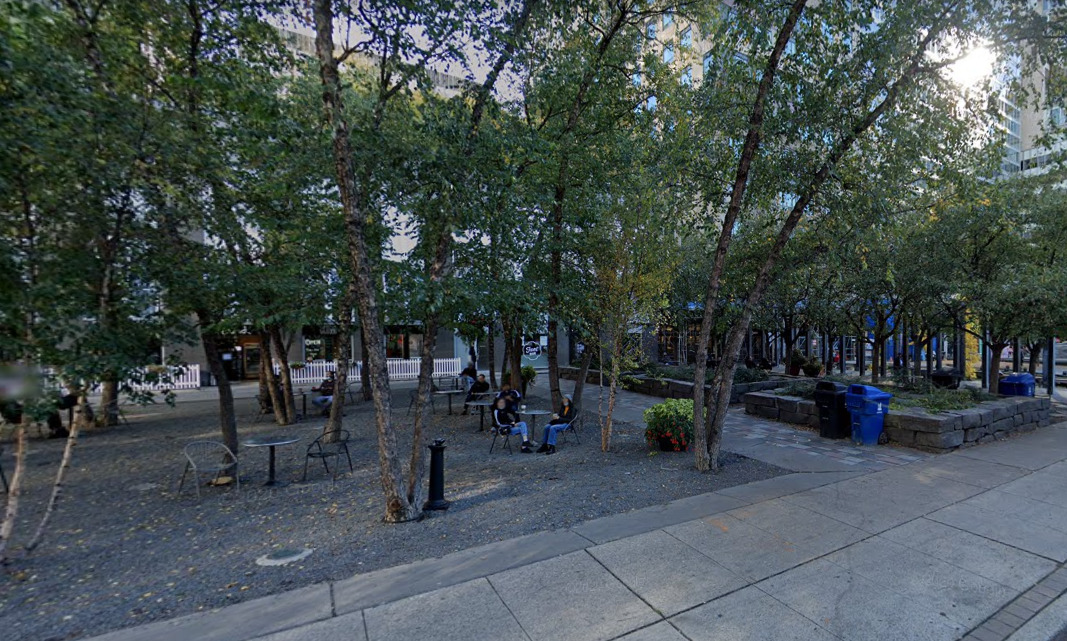
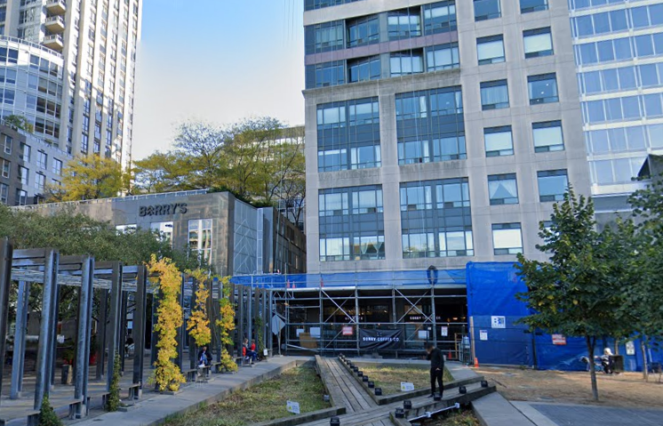
Why it works: First, because its busy.

But why is it busy?

Lets look: The first thing you'll notice is that the park features tables and chairs.

This is a clear invitation to walk to said tables and chairs and to sit and to sip a drink etc.

But also note that even the mini-wetland has a clear boardwalk feature, an identifiable path saying, 'come this way'.

Its also lit at night, and provides an interesting visual.

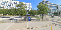
While that adjacent path to Bloor is both functional (it gets you from Cumberland Street to Bloor Street) but its also very clearly marked as a path, and well lit.

Of course, there's also the signature 'rock'. The rock works because people understand it as something to climb, something to stand on, take a photo at, a meeting place or spot to sit and grab some sun.

Now Yorkville park isn't perfect.

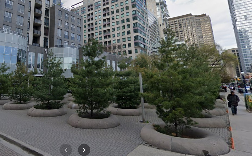
Much as I do love pine trees, this space has never really worked:
1614195416977.png


I think its easy to see why.

The circular edging around the trees is too low to be a seat wall; so there is no functional seating within this section.

There's also no clear path, indeed to the extent you might think you see one, there are light fixtures directly in the way.

It manages to be a space that doesn't really feel inviting.

Still, overall, this park is a big success.

So now lets go a couple of blocks over and see one that doesn't work:

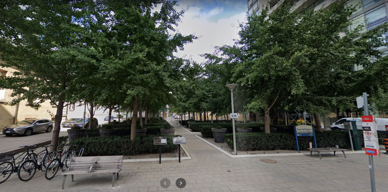
Town Hall Square Park on Yorkville Avenue. (the one to the east of the Library)
1614195684410.png


Healthy Trees; a nice sunny day...........a tourist area, next to high density housing.............where is everyone?

The park seems deserted.

Before I give the complete tour......other than the benches out front, you can't see any seating.

That's the first problem off the bat.

The second, there's a clear path, but there's no visual cue as to why you would want to wander down it.

There's no obvious place or thing to go to.

There's no there there.

There's also as noted, no seating.

And if there were, you'd be staring at big pots with small green plants in them. Yay!

Lets continue our tour now..

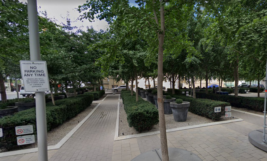
Looking from the lane on the east, across towards the Library, what do we see:
1614195935795.png


No seats!

Also, why do I want to walk down this path?

There's neither a destination, nor anything special here, not so much as a drinking fountain.

Lets try the other sides:
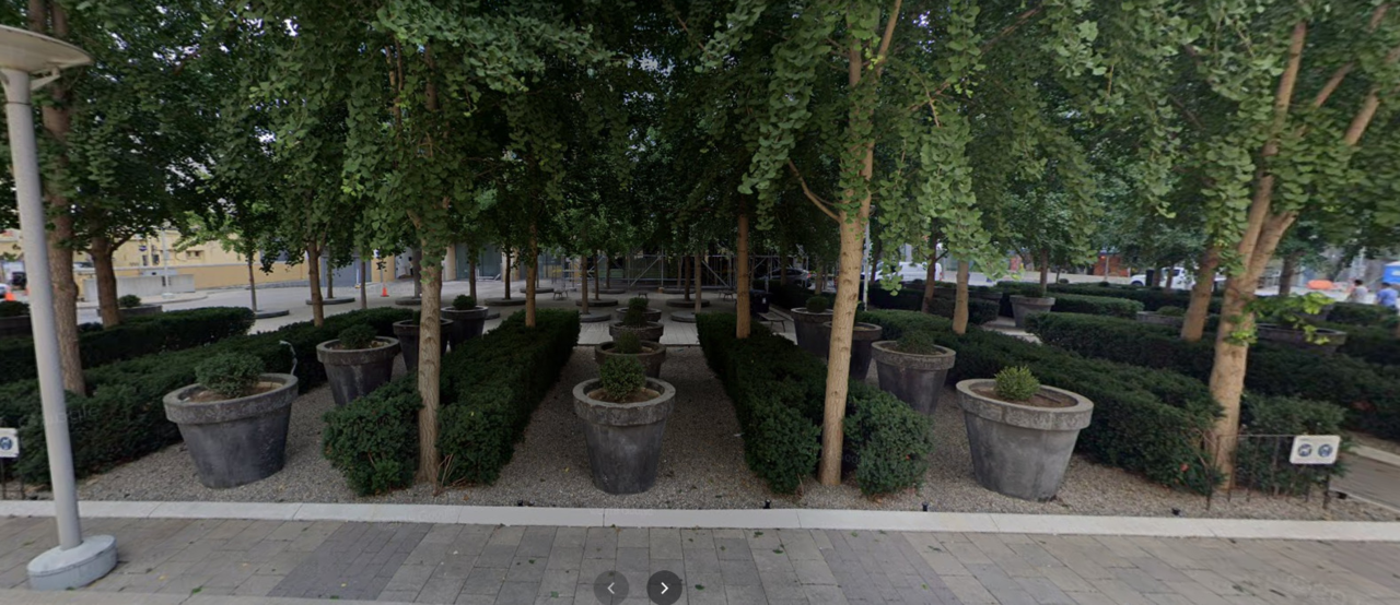
1614196098722.png


Here, on the west side of the park we see no obvious pathway into the space; it really looks like a gallery piece. a pretty picture (if a bit monotone in green and grey) that isn't meant for people.....
Hey, where are those damned seats?

So it turns out.....

There are some........buried at the back side of the park, on the east side.

Can you spot them?
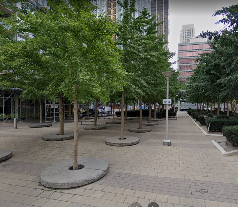
1614196250323.png


Swell, you've put seats where no one can see them from Yorkville Avenue; or from the Library.

How would you know they were there?

Well.....if you were coming from the garbage room of the adjacent condo, they would be obvious!
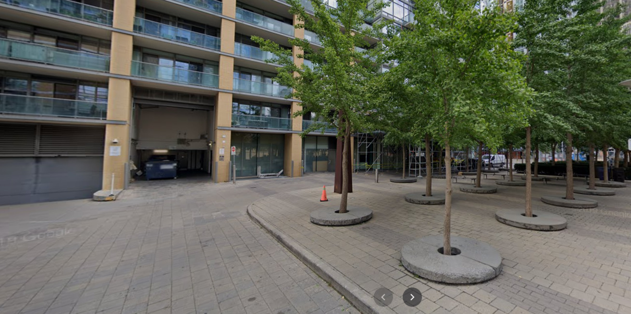
1614196340113.png


Or if you were walking in down this inviting lane from Scollard:
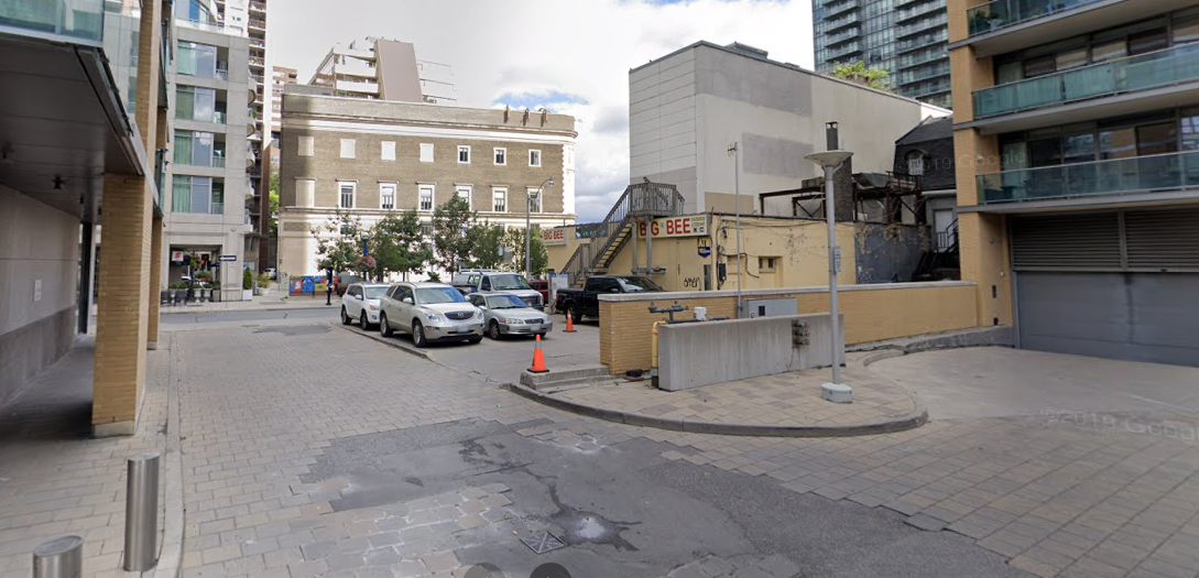
1614196385313.png


Key problems here:

1) Lack of seating

2) Lack of visible and well-placed seating.

3) A comparative lack of sun because there are actually too many shade trees; yes, this is me saying that.

4) Lack of a single obvious reason to come to the space.

5) Uninviting entrance

6) Cold colour palette

In fairness the seats do get used, from time to time, mainly by the condo residents who can see them from above.

But they are empty more than not.

Other examples will follow in subsequent posts.
 
Last edited:
Now the most unforgivably bad park design.....or...its close anyway, this and June Callwood.....

Wellesley-Magill Park.

1614196693446.png


Again, notice how popular it is!

Directly across from residential housing; this park is almost always devoid of life.

First question...............where the hell is the entrance?

There's only one tiny break in that curb stone (not visible in this pic) that would indicate a point of entry, or facilitate same for someone in a wheel chair or mobility aid.

But once you get into the park; where are you supposed to go?

There's no path, there's no indication of one by cue either in the way the landscaping or lighting or seating are arranged.

Its essentially a tree nursery covered in gravel/limestone screening.

Now there are some seats, though again, no obvious cue as to how to get to them (obviously you can just walk over the stone, but that's not most people's experience with a park, so it doesn't feel like one should or one is being invited to walk across the stone.)

Just a different view here from just a bit further north...........or is it different?

1614197034170.png


Well hey, there are two people visible in this picture..........that's a lot more than normal.

But notice, neither is sitting.

So lets just suppose you're willing to go in and sit on the bench.

What are you looking at?

1614197200730.png


Not much. No flowers, no playground or sports field. No dog run, No nothing......there's not even an interesting ground cover.

How's the other way?

1614197304607.png


Right into a sign, eye-level with heavy foliage, uninteresting ground cover, narrow sidewalk, paved road, fence.

Sigh.

Once again you'll also notice the same failing as Town Hall Square Park above................where's the space for the sun?
 
Last edited:
Other 'bad' parks I will cover in the posts ahead:

Sherbourne Common North, Lisgar, George Hislop and June Callwood

Other good parks that I will show a contrast with: 'Music Garden', and James Canning Garden
 
Are playgrounds considered hardscape or softscape if it uses sand, wood shavings, or rubber?

The surface material under them is certainly soft.

But generally they would be described as hardscape because the equipment would be considered the defining feature of the space.

Though technically it certainly incorporates both elements.

And

It could actually include trees if you wanted which can absolutely thrive in sand or lush mulch; if you pick the right species.
 
Ok, time to look at, Sherbourne Common North:

Now this park should have everything going for it in many respects.

Its got frontage on 3 major streets.

Its got a Lake View from the right spots.

Its got high density residential next door.

They even put in a signature water feature.

So.....why is it mostly empty?

**********

Lets start by looking that this park from Queen's Quay.

1614220634080.png


Nice healthy trees.........green grass..................hey.......how do I get there? Where's the entrance?

It must be on the corner, right?

Also can someone tell me with all that grass there doing nothing why the transit shelter isn't full-sized?

1614220751916.png


Hmmm, kinda/sorta? Maybe?......There's no path to the centre of the park, only one parallel to Queen's Quay!

It doesn't seem to go anywhere; if I wanted to walk beside the road, why wouldn't I just take the sidewalk?

Wait, there's also no real seating at the corner.

And the park sign doesn't face the corner, even though that seems like the entrance.................

There's nothing particularly appealing about this spot; nor is there a clear invitation to a space that is appealing.

Bonus Problem: (standing at the 'entrance' looking south..........)

1614220976745.png


Where the hell is my Lake view?

I love trees, its great to see so many healthy ones.............but somewhere on this site; anywhere .......I want a view corridor to the damned Lake!

I'm just over 150M from the Lake and its near invisible.

Wrong call.

Don't hide the "Money"

***

So there must be a more inviting way in, right? Lets walk up Sherbourne...........

1614221137749.png


We have no obvious path in the first 50M or so..................no obvious entrance.............

In fact.........we have what could pass for a dilapidated fence.........or oversized Popsicle sticks........interspersed with benches that cut off any opportunity to enter the park!

Pfft!

Further north....

1614221284473.png


Oh hey...there is a mid-block entrance.............but where does it take me?

Does anyone see anywhere to sit?

Does anyone see the park name anywhere?

Is there any obvious, compelling reasons I would be walking up or down Sherbourne and swing in?

There is a drinking fountain on the north side..........of course, it looks like a cross between a fire hydrant and an ashtray................but never mind............I'm being mean now.

Fine....lets go to the north side and see how it looks?

1614221452851.png


Oh wow, is that ever inviting...................

No obvious path or entrance..................but not one...........not two.............but three utility boxes strewn across the north face of the park. OMG.........

Lets go back down the Sherbourne side of the park for a moment............

1614221618363.png


Forget for one moment how we get into the park.......there is seating visible...............

But notice a couple of things.............first............no backrests...........that is going to put a lot of people off. If you go into a park to rest mid-walk, you want some support...........

Notice also.....even from within the park........how do i get to the benches? There's a grass buffer on one side......there's trees...........is there a clear way to get to the seats?

Of course you could walk over the grass..........but that's not what the designers want you to do...........

They want you so to somehow get to the interior of the park, a space no one has yet discovered............and then walk back out, along the narrow surface beside the trees.

Is that at all intuitive?

Meh.......

Now...............didn't I say something about a signature water feature? Don't people love those?

Of course they do!

Though you haven't really noticed it so far, have you?

Lets go looking.

1614221898906.png


Aha! There it is! Can you see it, hidden behind the thick foliage of the trees?

Probably not to be honest..........but if you could.............you'd think....how can I walk beside it? (hint, you can't, the path has a row of trees blocking your access.

You might think..........how can I sit beside it? Do you see any seating? Me neither!

Lets go check out the south side of this park's star attraction.

1614222118445.png


Because of the slight difference in the height of the land many walking by might not see the details of the water feature.

But they also won't see an obvious invitation to walk by or sit on the west side of the feature.

Lets look at the east side then, shall we?

1614222241064.png


Well, there's a path.....but its either uncomfortably narrow, or set back more than 2M and with a visual barrier to the feature.

And no @#$# seating!!!!!!!

One last trip back to the Sherbourne side again..

1614222389228.png


So...screw it..............I walked in...........I found the seats.............

What do I get to look at?

Notice that all the seating faces north-south.

None of the seating faces the park's signature feature!

Just wow............

Ok.....one last thing............this is a shot from the month of April (before Monde was built).......

But this gives you a great indication of how the space looks in winter:

1614222979493.png


Uhhhh

I rest my case.
 

Attachments

  • 1614221565171.png
    1614221565171.png
    1.9 MB · Views: 346
Last edited:
Lawren Harris Square is a park design that annoys me. How do we add some colour to the greyest neighbourhood in Toronto? A park made of gravel of course!

I can't wait to read your evisceration of June Callwood "Park"--quite possibly the most pretentious, useless and irritating waste of space in the city.
Most architects and designers I've run into have an open hostility to traditional design principles that have served us well for thousands of years. All the design features Northern Light is looking for are yesterday's news. Pretty much anything that's been done before has to be thrown out. Only abstract symbolism will do. And if the plebs don't like it, it's their fault for not being smart enough to appreciate the designer's brilliance. June Callwood Park is what happens when designers let their worst impulses get the better of them and forget to design a space that people actually want to spend time in. "What do you mean you don't like the park? It looks like a waveform from a point of view that nobody will ever see it from! I'm so clever."
 
Lawren Harris Square is a park design that annoys me. How do we add some colour to the greyest neighbourhood in Toronto? A park made of gravel of course!


Most architects and designers I've run into have an open hostility to traditional design principles that have served us well for thousands of years. All the design features Northern Light is looking for are yesterday's news. Pretty much anything that's been done before has to be thrown out. Only abstract symbolism will do. And if the plebs don't like it, it's their fault for not being smart enough to appreciate the designer's brilliance. June Callwood Park is what happens when designers let their worst impulses get the better of them and forget to design a space that people actually want to spend time in. "What do you mean you don't like the park? It looks like a waveform from a point of view that nobody will ever see it from! I'm so clever."

I agree with much of the gist above.

But I would note; I talked about Village of Yorkville Park as a mostly positive example; it is not conventional at all, and yet it works.

I don't mind people who want to turn things on their head; I just want them to stop and ask; "If I'm not making it work this way; how am I making it work"?

Village of Yorkville Park mostly lacks for clear entrances, but it still invites you in to enjoy it.

It has unconventional features; but people are interested in them; and you can see them from the street, luring you in to the park.

There are ways to make the unconventional work.

But you have to want to make it work.

I'll cover another example or two of parks that break many rules; but work anyway, and show why.
 
Great series, very well done.

Sherbourne Commons is one of those ideas that looks great in renderings, but is a bit of a headscratcher when you're actually there.

It's quite strange how difficult it is for Toronto to create great new public spaces and quality architecture.
 
Brilliant idea! I eagerly await your thoughts on current trends in park benches. I think I may have some extra spleen to vent on that subject.
 
Ok, its time for June Callwood Park's thrashing.

Here, I want to start with an overhead, aerial shot:

1614378306713.png


As one looks at the space, you can't say for sure there's anything wrong with it yet. (unless you know what you're looking for)

But you can say that there is no obvious entrance, or focal point.

I've pointed out previously, while those features are traditional, a park can work without them; but it requires careful consideration as to how.

But before we drop to street level, there is something you can see in this shot; but you might not know it.

Notice the discolouration or darker colour on some of the paved areas, especially at the south end of the park?

That's pooled water.

Even in summer, many park users will want a dry path to walk along, and one can see it might be difficult in some sections to find a way to cross the park either N-S or E-W w/o getting wet feet.

But far more important, in winter, that water is ice!

Drainage and sloping is a thing!

****

Now to street level:

1614378724017.png


Hmmm. The corner certainly isn't very inviting, its also rather small in terms of walking/standing area.

But lets move along to what looks like the way in just to the west:

1614378817533.png


Oh good, its an entrance.............ummm...........not a very pretty one.........but....hold on...........again....where's the Park Sign/Name? Places need names.

Also, its nice that I see seating......but why is most of it turned away from me?

The way in is there....but not exactly obvious, to the centre and right, trees and benches obstruct any path.

There's a bit more open space on the centre-left of this picture, but there's a light fixture right in the middle of the line of sight.

This is frustrating. I'm not picking on any feature aesthetically here, all I'm asking is that the design tell me where to go; preferably without a swear word at the beginning of the statement.

Now lets have a closer look at street level at all that pooling water:

1614379095052.png


This is what the southern end of the park looks like much of the time.

That's not pretty, its not pleasant, its just an annoying obstruction if your trying to get from anywhere in the park to anywhere else.

In winter, that space is a giant, but un-even sheet of ice.

Throughout this space there is uneven paving.

Some of it is intentional, as a design feature of some description............trip hazards as art.

But some of it is simply poor execution on the finish materials, settling and the freeze/thaw effects of that pooling water.

1614379316855.png


This is a side view of the park.

Once again with the gravel, and the rows of trees.

I don't know, but I'm going to assume the designers hoped people might walk the narrow paved paths here.

But the branches and canopy encroach tightly, meaning one may need to twist or duck.

While the paths also stop short or otherwise find themselves buried in gravel at various times, making for something less than comfortable under foot.

1614379467784.png


Here we are, at the north end of the space, looking from the side.

Uhhhh..........

Wow that gravel sure is sexy........I know I just have the desire to walk all over it, sit on it, take pictures of it..................err.....or maybe not.

This strange pink seating arrangement isn't to my taste.

But ya know, it could be made to work......if the distance between the forms allowed people to face each other, and not block the path through. But it doesn't.

Here, some dappled shade, on at least one side would be nice; along with something more aesthetically pleasing to look at than the gravel.

1614379685853.png


Above, we see the park from the north.

Now the good news is that this time the entrance is entirely clear, and there's no pooled water.

But why is the light fixture directly in the middle of the walking path? Its not a huge obstruction, but its not great. Also, if you think your pink forms are something to look at (whether I agree or not), don't you want a clear line-of-sight to them?

Shouldn't they make a good picture?

Of course there's again no sign identifying the park,, nor any seating right at the entrance.

But I'm more concerned about something else.

Look at those stone pavers that form both the sidewalk and park path.

Look how uneven they are, its really quite substantial in places, and its an unending trip hazard even on a dry summer's day; but its terrible with snow or ice on the ground when you can't see the unevenness

One more side view from the opposite side:

1614379961567.png


You'll notice, as per my common complaint, there is no clear point of entry.

There's a single narrow path to the left side of this pic, but nothing about it is attention grabbing or inviting; while the rest of the space could reasonably be called discouraging.

I'll add here that the planting beds are obviously under performing.

Further, this over reliance on gray screening/gravel is really not aesthetically appealing.

Tastes will vary; but I don't see many people claiming that its pretty.

While we're here..........lets look at the adjacent street:

1614381205783.png


Notice in the above pic that there is no sidewalk on the park side, but also that the sidewalk on the opposing side has a very long, raised curb planter that obstructs walking out across the road towards the park.

Also note that the road is in no way integrated into the park design, as, for instance we see at Village of Yorkville park where the road was narrowed, and then interlocking pavers used to visually connect both sides of the street.

****

Now, we can't omit a picture depicting winter in the park.

The picture below is actually April of 2016:

1614380236592.png


What a vibrant space! Look at all the people enjoying the park on a sunny day in April!

I'm at a loss as to why (some) landscape architects can't grasp that Toronto has 4 seasons.

That doesn't mean you need lots of conifers/evergreens; though the thoughtful planting of even 1-2 can add a great deal.

But the inclusion of trees or shrubs that have brightly coloured bark or branches can add a needed burst of colour:

1614380414549.png

From: https://chiefrivernursery.com/red-osier-dogwood-cornus-sericea-seedlings.html

The above is Red Osier Dogwood. A native species, it would naturally be found near wetlands, or wet meadows and the like.

But as with many swamp species, its adaptable and durable and will do fine in most landscapes.

That burst of red adds some cheer on a cold winter's day.

But lets also look at a Toronto Park where winter design was thought out.

The Music Garden on Queen's Quay:

1614380586748.png


Note the use of evergreen shrubbery, and a stone wall with warm tones.

But also a path, clear as day that takes you past trees with interesting forms.

And below, a burst of large evergreens and deciduous trees that hold their warm-toned brown leaves well into winter.

1614380685463.png


Finally, no pictures here, let's come back to a question of function.

This space could have many different functions.

But based on what's been heard in the community, the single most important was as a place to take the dog, especially in the winter, when the sole purpose might be for the dog to relieve itself, not an extended walk.

This landscape design doesn't afford any purposeful space w/that in mind.

Nor does it provide an interesting social space for people.

Nor is it winter-safe

Nor is it four season-attractive (its debatable whether its even one-season attractive, but I digress)

It also doesn't feature any play space for kids....(not essential, but might been an option here)

At the end of the day this space fails on form, on function, on concept and execution.
 
Last edited:
Great thread so far and I’m so glad that I wasn’t the only one who had some opinions about these parks. It’s almost as if the city just randomly threw it together with leftover materials as a way of complimenting and filling in a void by calling the space a park. I do notice that whoever is trying to design these “modern parks” they are simply just throwing together current trendy styles and to match the surrounding condos. Makes me wonder if the city is just slapdashing it together, which if it’s the case it really shows they have poor park designers or none at all.

Will there be a critique of Claude Comier’s Berzy Park? ;)
 

Back
Top