News   Nov 01, 2024
 1.9K     11 
News   Nov 01, 2024
 2.2K     3 
News   Nov 01, 2024
 703     0 

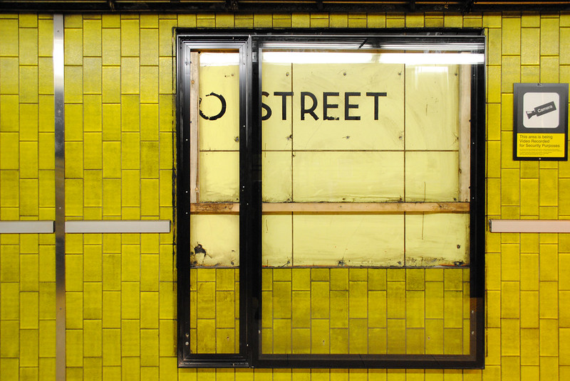
Original Vitrolite station tiles

They should do what they did with St. Andrew and just put up a newer version of the old thing.

This is the plan. They appear to be the same colour as well, but look different under the warm light.

I'd be totally fine with that. To me, stations should be reflective of the time period in which they were built. Spadina's stations may look horribly dated now, but at least they have character. To be in them is like going back in time. The same could be said for Union (Train) Station and the Great Hall. Even in NYC, going along the original Broadway line and seeing the early 1900s mosaic tiling is amazing.

Restoring the Yonge and University Line stations to as close to their original look as possible should be the goal, especially stations that haven't undergone a significant transformation since opening (unlike Union and Bloor-Yonge).

Building on that, this is why I believe Victoria Park's reno turned out the best. It kept the same basic aesthetic of the Bloor line while harmonizing with the new additions like the bus terminal and public art.
 
Building on that, this is why I believe Victoria Park's reno turned out the best. It kept the same basic aesthetic of the Bloor line while harmonizing with the new additions like the bus terminal and public art.

Though with the Bloor line, it's easier--unlike Yonge's Vitrolite, its glazed-concrete-block aesthetic is durable as heck, physically speaking...
 
Though with the Bloor line, it's easier--unlike Yonge's Vitrolite, its glazed-concrete-block aesthetic is durable as heck, physically speaking...
Oh no doubt. I always thought they took down what seemed like perfectly fine tile at Dufferin and Pape.
 
Oh no doubt. I always thought they took down what seemed like perfectly fine tile at Dufferin and Pape.

Well, there was an alibi of sorts: as "durable" as the 60s B-D aesthetic was, it couldn't shake its rep for "Toronto The Good" utilitarian blandness--whether alongside the vestigial Moderne of the 1954 Vitrolite, or alongside the contemporary Montreal Metro. And the fact that, unlike Vitrolite, it was virtually indestructable only made manners worse for the detractors; like we'd be imprisoned by 1966 high-school-hallway banality forever...
 
And even the Vic Park renos have their awkwardness relative to the old (station ID cut off by punched-out windows, etc)--though at least it generally respected how the most profound part of the existing station was the "platform experience"; hence they didn't seek to replace the wide-span concrete roof, etc.
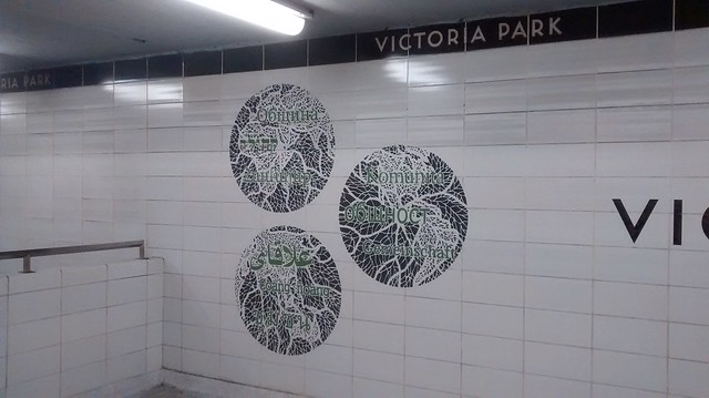
 
And even the Vic Park renos have their awkwardness relative to the old (station ID cut off by punched-out windows, etc)--though at least it generally respected how the most profound part of the existing station was the "platform experience"; hence they didn't seek to replace the wide-span concrete roof, etc.

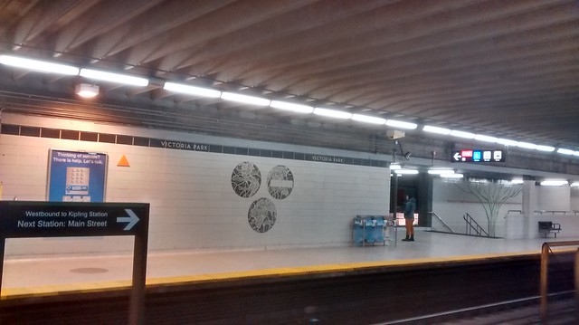
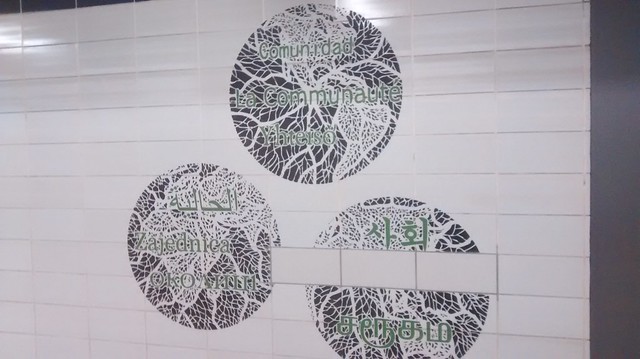
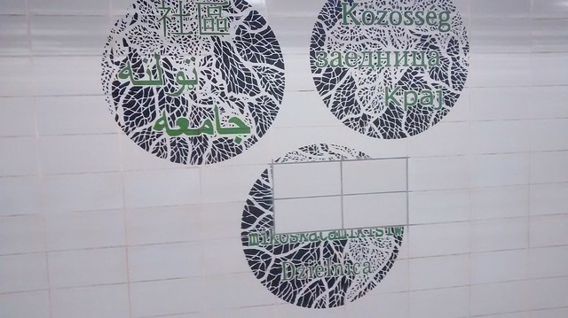
also there are some places where tiles have been replaced in the middle of the new artwork and not been re cut
 
here's the current state of the 4 pieces on the walls at platform level 3 of the four have had tiles replaced in them and nothing done with the overall design

23769962569_30e424686c_z_d.jpg

23842116030_fbb48c7d37_z_d.jpg

24029672262_69d78ac8aa_z_d.jpg

24137789375_774b552686_z_d.jpg
 
Hold on to your hats and grab your cameras, folks: now *Dundas* station's following in College's Vitrolite-peekaboo footsteps...
 
Yellow wouldn't have looked that bad in my opinion.

IMG_0644.JPG IMG_0644.jpg
 

Attachments

  • IMG_0644.JPG
    IMG_0644.JPG
    1.6 MB · Views: 386
  • IMG_0644.jpg
    IMG_0644.jpg
    2.4 MB · Views: 443
They should just leave one or two like that, sans ads, like framed artwork. Similar to how Union Square preserved bits of the original fittings when they renovated it. http://web.mta.info/mta/aft/permane...cy=n&line=Q&station=5&artist=1&img=1&xdev=360

tbh, the tiles that are under there are probably in such a bad state of repair that itll make things look worse. At least NYC preserved those sections so it looks good. We'll just make a mess out of it with botched plans and cost overruns
 

Back
Top