UtakataNoAnnex
Superstar
Welp, if you made the centre part yellow, it would be fairly Brazilian in it's approach... 
Tory Blue and Liberal Red…..not sure where or why the boreal forest green does not show, and perhaps the copper orange to signify natural resources extraction, and then you have all the main political spectrums covered as well.…And although I am not qualified to speak with any authority, I believe that Ontario First Nations use the cedar as a symbol of peace and reconciliation, so perhaps as part of the trillium motif?Please excuse my crude PP attempt below. While not a design that I personally would pick, I believe it's a decently elegant and simple compromise that would be palatable to traditionalists while following vexillological recommendations. It retains design cues and the colours of the Union Jack while still creating a distinctive flag for Ontario. The blue stripes on the top and bottom can also be interpreted as a nod to the bodies of water at the northern and southern ends of the province (Hudson Bay and the Great Lakes). Maybe to compromise even further and make it even more British-y for those loathe to give up that influence you could angle the stripes diagonally as well, which could make it more striking. And with the presence of both conservative blue and liberal red, there's something here to like for those of all political stripes! Thoughts?
View attachment 453667
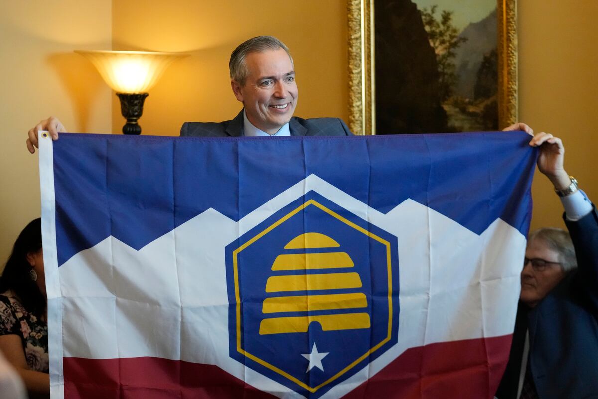
Yes, but it seems now they have four state flags (one official and 3 historic) and proposing a law that the old one must be flow with the new one. It doesn't seem as straight forward as it appears, and it took five years to get to this point..Utah has officially adopted a new flag as of today:
From this travesty:
View attachment 463514
To this:
View attachment 463515
If even a conservative place like that can replace a terrible flag design without much fuss, there really shouldn’t be an excuse in Ontario…

They are called the "beehive state"; has to do with the LDS Church's scripture.Yes, but it seems now they have four state flags (one official and 3 historic) and proposing a law that the old one must be flow with the new one. It doesn't seem as straight forward as it appears, and it took five years to get to this point..
What are they, the beehive capital of the US?

Utah has a new state flag after Gov. Cox signs banner bill — for now
Utah Gov. Spencer Cox signed legislation to adopt a new state flag. That change could be short-lived as opponents are hoping to collect enough signatures to put the issue up for a public vote.www.sltrib.com
You are correct that the old flag is still being kept active as a "historical" flag, but that really was just a shrewd, politically palatable maneuver to appease regressive elements of society opposed to any change in state symbols while introducing a new official flag. Check mate. In a way, it's a brilliant approach even if on the surface it seems convoluted.Yes, but it seems now they have four state flags (one official and 3 historic) and proposing a law that the old one must be flow with the new one. It doesn't seem as straight forward as it appears, and it took five years to get to this point..

Utah has a new state flag after Gov. Cox signs banner bill — for now
Utah Gov. Spencer Cox signed legislation to adopt a new state flag. That change could be short-lived as opponents are hoping to collect enough signatures to put the issue up for a public vote.www.sltrib.com
Utah has officially adopted a new flag as of today:
From this travesty:
View attachment 463514
To this:
View attachment 463515
If even a conservative place like that can replace a terrible flag design without much fuss, there really shouldn’t be an excuse in Ontario…
The flag is a joke, isn't it? It looks like the logo of a 'United Food Company Ltd' or similar.I'm not sure I follow?
Dated "Mar 22, 2023"@Towered this presumably is when you announce April Fools?
It most certainly is not a joke, though I would definitely describe the original as such.The flag is a joke, isn't it? It looks like the logo of a 'United Food Company Ltd' or similar.
The original bears comparison to many state flags, i.e. the arms on a navy background.It most certainly is not a joke, though I would definitely describe the original as such.


