News   Nov 15, 2024
 2.1K     6 
News   Nov 15, 2024
 1.8K     2 
News   Nov 15, 2024
 2.2K     0 

Ontario Flag needs replacing

It's not a priority now (as it shouldn't be) doesn't mean it shouldn't be considered going forward. I don't buy the argument that redesigning now for economic benefit - but it is an exercise that should be considered in the future - and it has nothing to do with cancel culture. I mean, our current Canadian flag was literally an exercise of "doing better" - and it turned out great, iconic even.

AoD
Fair point.
However, an old phrase is appropriate here: "You can't please everyone" especially when it comes to subjective things like art, graphics, symbolisms, or design.
I guarantee even if we're embarking on this exercise, people will still complain about the newly designed flag. Some people will like it and some won't. It's subjective. (I personally don't care how it looks as there are many more other important things)
And the whole cycle begins again with no end in sight and multi millions tax dollars down the drain that could be used to better people's actual lives and support those in need

Of course they will be - you can't avoid it in a society like ours, and even the new Canadian flag had plenty of detractors during and post-debate. That's not the point though - it is about constructing something new and an opportunity to be something greater and more universal. There is no need to rush into it - it will happens when it happens.

AoD

Precisely - and that's why there will be an ongoing, consistent push. Eventually its time must come. I'd like to see it happen in the next decade or so. And if not, I'll start using my own design for an Ontario flag.
 
The Ontario flag is crap, looks like 10 other forgotten colonial flags that nobody cares about, can't tell apart.
Just throw a stylized white Trillium on a solid background and be done with it.
And the Toronto flag is complete shite too but changing that would be a total nightmare so.. stick with shite.

What the Toronto might have looked like...

From link at blog.to...

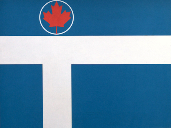
You can't tell to look at it, but the design of the blue, white and red city flag flying on Toronto's public buildings - always on the right when flown beside the provincial and national flag - is a competition entry from the 1970s submitted with close to 700 other hopeful designs.

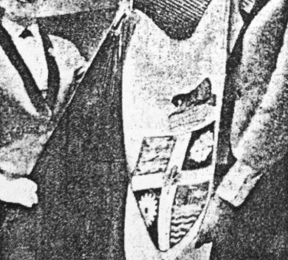
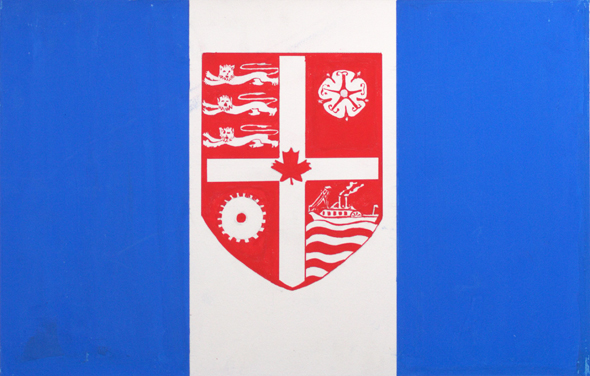
In August 1974, council, dissatisfied with the existing flag, assembled a five-member committee to come up with a bold new design that truly represented the city, its people and vision for the future. At the time, the flagpole at 100 Queen West flew a flag of the city crest (shown here between a Mississaugan man and Britannia) on a white background beside a blue column. Then Mayor William Dennison complained to the press: "It's not really a flag at all. It's just another way of displaying the city's coat of arms."

Old_Coat_of_Arms.jpg
20120228-Flag-Original-Alt.jpg


With city archivist A. R. N. Wouden leading the project, the committee decided to hold a public competition to find a suitable new image to represent the city. The rules were simple: any resident of Toronto could enter provided they submitted a viable design, an explanation of the motifs and a signed waiver to the image rights. The winner, selected by the committee and voted on by city council, would pocket a $500 Canada Savings Bond.

In the months the competition was open, city hall received over 700 applications from children, adults and design professionals. It's difficult to say what criteria were used — Wouden was extremely secretive about the project — but a document in the Toronto archives with marks next to each entry containing a maple leaf provides a hint at his thinking.

As you might expect from a public competition, the quality of the entries was extremely varied. Many young entrants decided to focus on themes of friendship, equality and optimism mixed with famous city landmarks. The newly completed CN Tower, City Hall, TD Centre and O'Keefe Centre (now Sony Centre for the Performing Arts) appear in various forms in many of the designs.

Flags submitted by adults tended to include the letter "T," city hall, and the colour blue — all things the winning entry would have - in abundance.

To ensure a level playing field, Wouden assigned each entry a number and locked the original entries in the basement of city hall with the archives. The committee didn't see any of the designs until the competition had closed. Meanwhile, vexillologists (flag experts to you and me), including Rev. W. R. Crummer of St. Michael's Cathedral, wrote to the committee to suggest the should flag remain simply the city's crest, of which Crummer wrote: "The colours are splendid, the heraldic symbols apt, and the whole has a professional and competent air about it."

20120228-Flag-De-Santis-Alt.jpg


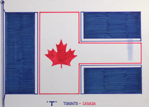
City council announced its unanimous decision on November 6, 1974, declaring 21-year-old Renato De Santis' blue, white and red design that included city hall, a letter "T" and, perhaps crucially, a maple leaf, the winner. His description of the white shape at the centre read: "T for Toronto, outline of city hall, diversity of streets in Toronto." The maple leaf is meant to double as the dome of city hall and, obviously, a symbol of Canada. A third year graphic design student at George Brown, De Santis was presented with his prize at a ceremonial flag raising outside city hall on November 7, 1974.

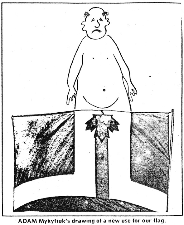
The new flag wasn't without its detractors. Adam Mykytiuk, a dissatisfied resident of Ellis Avenue, sent a cartoon to the Toronto Sun shortly after the raising ceremony showing how, if flown upside down, the flag looks like a pair of cartoon legs with a maple leaf covering the crotch. H. E. Skelton, a commander from the Toronto Power Squadron, a boating safety organization, claimed the flag looked strangely similar to their pennant.

20120228-Flag-Cartoon.jpg


The first copy of the flag, produced for free by Scythes & Company Limited, was stolen from the flagpole outside city hall and had to be replaced. Distribution of the De Santis flag to the various public buildings around the city was held up in Ottawa while the design was officially registered under the trademark act.

A second competition held 23 years later in 1997 to coincide with amalgamation failed to produce a new design accepted by city council. Instead, Renato De Santis suggested his flag be slightly altered to suit the new specifications and kept in place. A modified version of De Santis' design was approved in October 1999 and remains at the top of city flagpoles today.

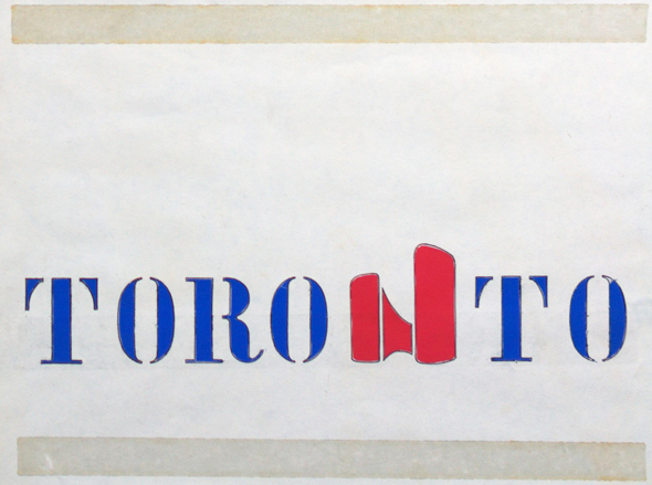
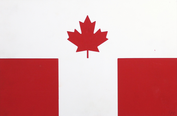
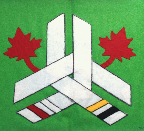
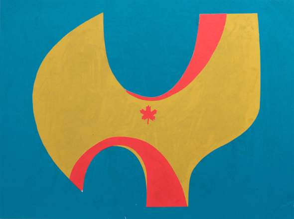
Had archivist A. R. N. Wouden taken a shine to a different entry, who knows what we'd have for a flag today? Here are some of the best unsuccessful entries with some information about the artist and their original description of the design, where available. Let us know what you think of the entries. Could some of these have better represented Toronto?

Unsuccessful Toronto flag candidates

20120228-Flag-Beattie.jpg

20120228-Flag-Connor.jpg

20120228-Flag-Birken.jpg

20120228-Flag-Cabral.jpg

20120228-Flag-Gibson.jpg

20120228-Flag-Greenberg.jpg

20120228-Flag-How.jpg

20120228-Flag-Martin.jpg

20120228-Flag-McNair.jpg

20120228-Flag-Myers.jpg

20120228-Flag-Pfau.jpg

20120228-Flag-Pupo.jpg


...etc.
 
I don't mind this one from that bad lot of potential Toronto ones from the past. Unique, but easy to draw and remember. Needs to be stylized better though.

View attachment 270091
I can see Ontario's flag with the same background, but with a politically neutral stylized trillium in the centre. It would be a very unique flag that is simple enough for a child to draw from memory.
 
With Covid cases on the rise again and Doug Ford reduced gathering numbers and a ton of businesses still closed, so many other priorities, I hope we can revisit this in 2050
Not a good use of tax dollars right now, lots of people struggling through pandemic
 
With Covid cases on the rise again and Doug Ford reduced gathering numbers and a ton of businesses still closed, so many other priorities, I hope we can revisit this in 2050
Not a good use of tax dollars right now, lots of people struggling through pandemic

If people are not commuting or social gathering, that means people will have something to do on their own time. They just have to announce a request for proposals, and in two or three years then start the judging.
 
With Covid cases on the rise again and Doug Ford reduced gathering numbers and a ton of businesses still closed, so many other priorities, I hope we can revisit this in 2050
Not a good use of tax dollars right now, lots of people struggling through pandemic

Ah, the classic old argument that we can only do one thing at a time.
 
With Covid cases on the rise again and Doug Ford reduced gathering numbers and a ton of businesses still closed, so many other priorities, I hope we can revisit this in 2050
Not a good use of tax dollars right now, lots of people struggling through pandemic
Ah, the classic old argument that we can only do one thing at a time.
Yet, Mississippi had the time to come up with a new flag amid COVID-19, BLM, and hurricane preparations (including for Hurricane Sally).
 
Last edited:

Back
Top