You are using an out of date browser. It may not display this or other websites correctly.
You should upgrade or use an alternative browser.
You should upgrade or use an alternative browser.
Toronto LSQ | 142.55m | 43s | Almadev | Wallman
- Thread starter PMT
- Start date
artyboy123
Senior Member
A new rendering is updated! This one is an office building in the Lansing Square Redevelopment. The height changed from 39.75m to 21.70m.
Rendering is taken from the architectural plan via Site plan approval:
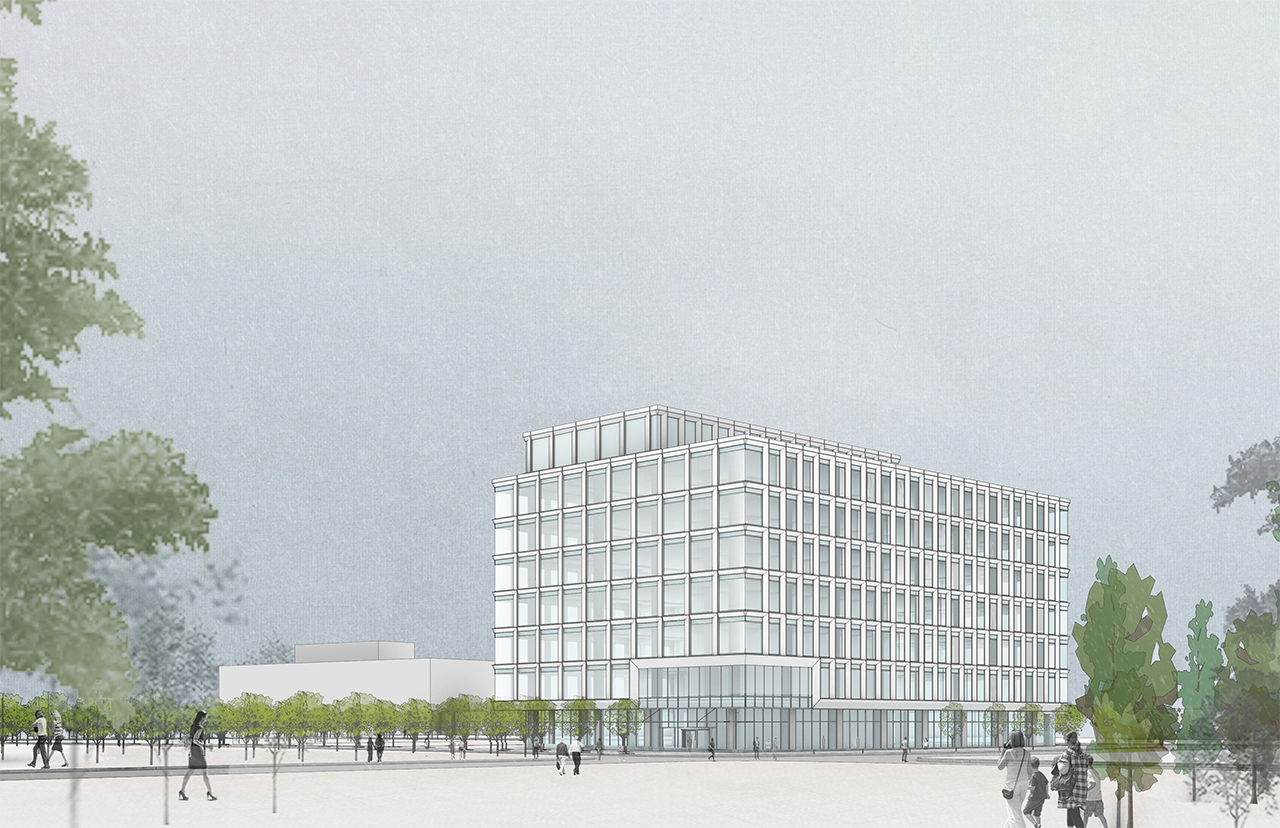
Rendering is taken from the architectural plan via Site plan approval:
Northern Light
Superstar
A new rendering is updated! This one is an office building in the Lansing Square Redevelopment. The height changed from 39.75m to 21.70m.
Rendering is taken from the architectural plan via Site plan approval:
View attachment 411849
Ummm; that render and the stated height do not seem to match, to me.
Even w/o the MPH, I can't see a Commercial building have only 3M per floor
AlbertC
Superstar
Brief mention in this article:
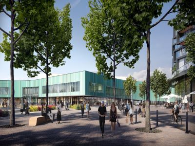
 renx.ca
Lansing Square is another big project at Sheppard and Victoria Park with 706 condo units and 80 affordable rental units, which is scheduled to start construction as early as next year.

Elad becomes Almadev, grows development pipeline | RENX - Real Estate News Exchange
Toronto-based Elad Canada has rebranded as Almadev as the multi-billion-dollar real estate development, investment and asset management company aggressively expands its residential development portfolio. Almadev has 4.4 million square feet of construction in its pipeline, more than 6,000...
Transportfan
Senior Member
Since when does Vic Park run through NYCC?
steveve
Senior Member
Looks like Block 1 (north-east corner of the site fronting the Vic Park/Sheppard intersection), got a redesign in the most recent plans submitted back in April of this year:
Source: http://app.toronto.ca/AIC/index.do?folderRsn=plEg0T0DBfhgjoO/UE5jTA==
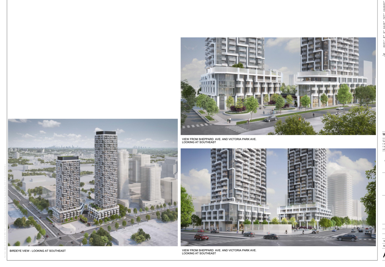
Source: http://app.toronto.ca/AIC/index.do?folderRsn=plEg0T0DBfhgjoO/UE5jTA==
A Torontonian Now
Senior Member
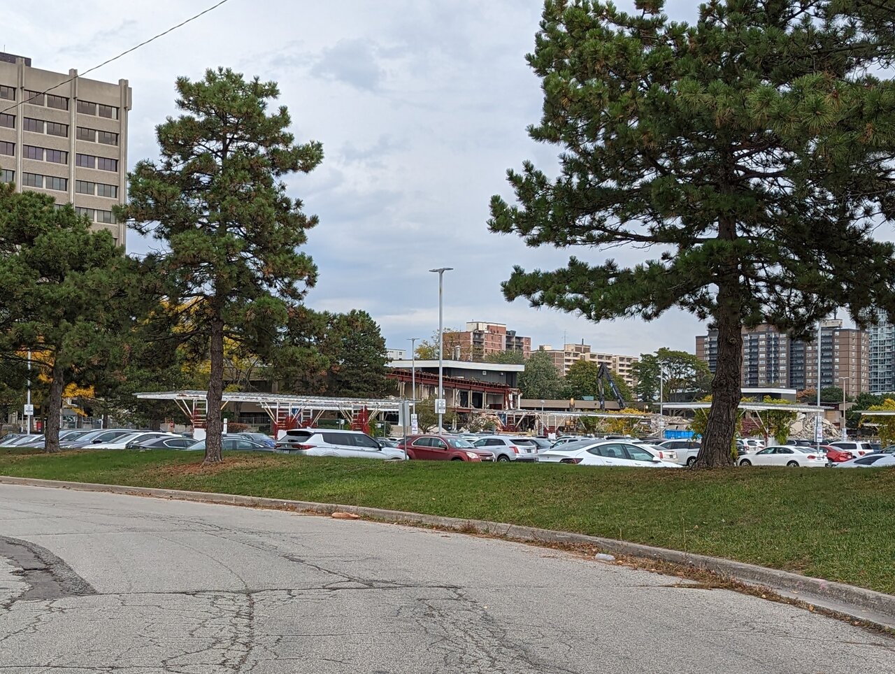
Looking back on them, these are some pretty awful shots with trees obscuring the view, but demolition has begun on a low rise office building here. Taken today:
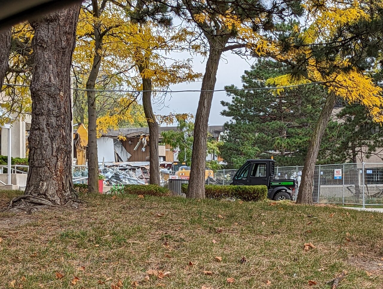
kris
Senior Member
Today.
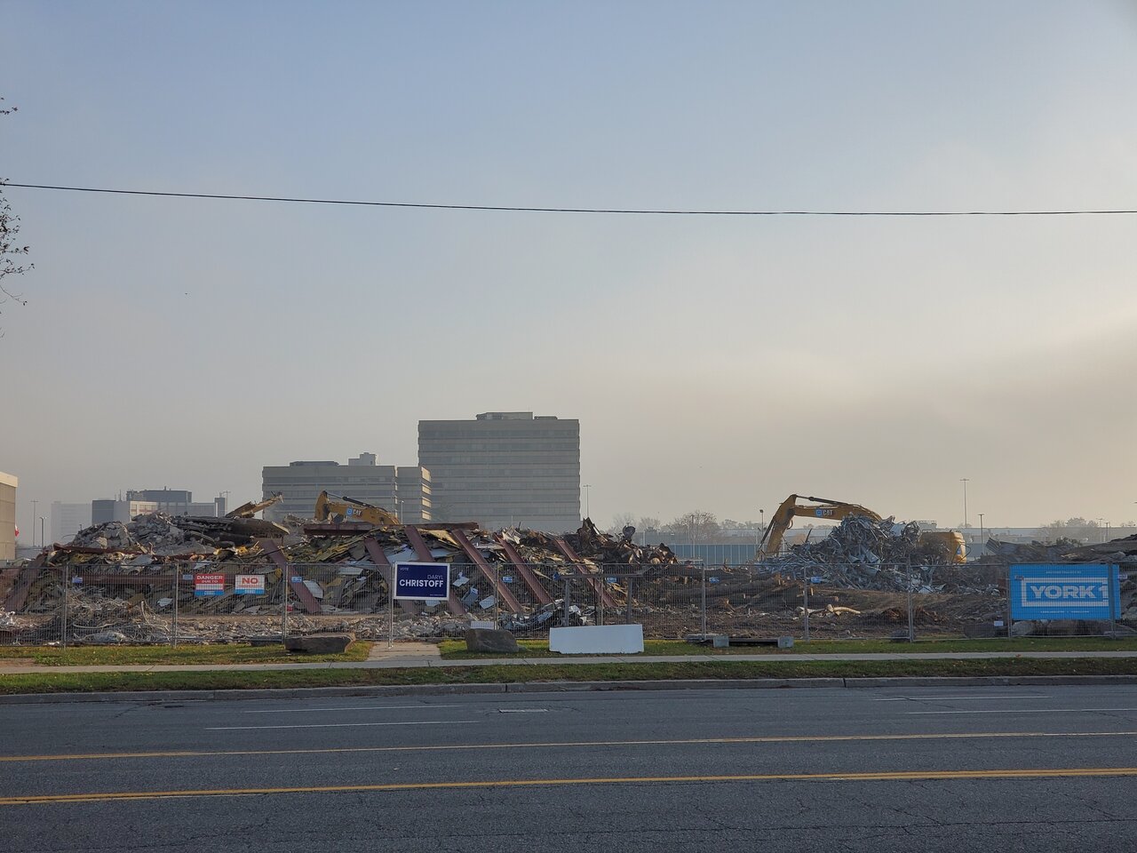
AlbertC
Superstar
AlexBozikovic
Active Member
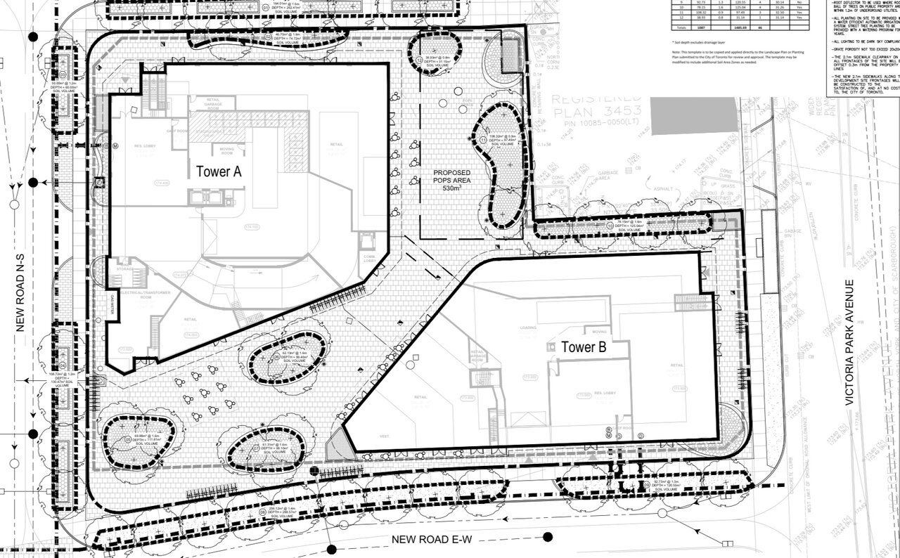
The ground floor plan is worth examining. The retail configuration is awkward. Neither of the two plazas proposed will be successful.
The northeast plaza is built around an existing Pizza Pizza, which presumably is going to go eventually. But the open space is super awkward as a result. The retail in tower B (which is a weird configuration to begin with) is cut off by a row of trees. That retail strip becomes what, back-of-house? If this becomes a full public square, one side of it will always be dead. And the bulk of the space, at the corner, will have no program and no focal point. Useless.
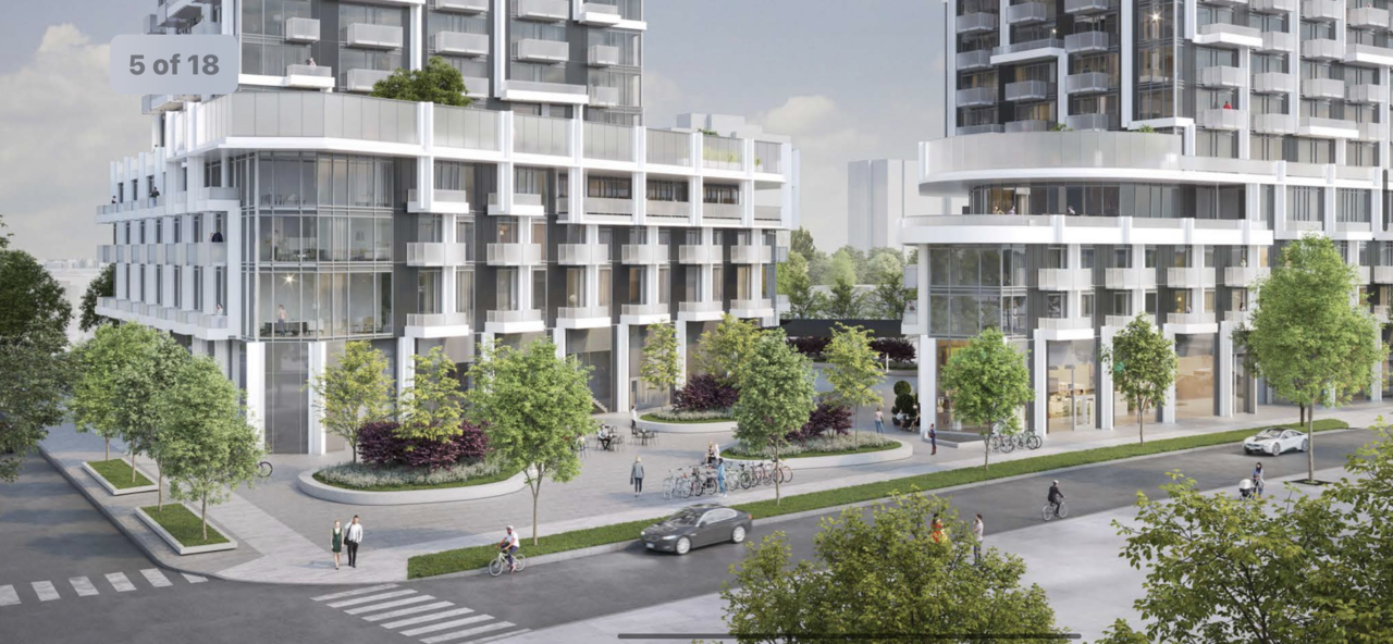
The southwest plaza, shown in the render, is no better. For activation it relies on that one wedge-shaped retail unit in Tower A, which they are showing as a Café with outdoor tables. Maybe. But the rest of the tower A facades at grade are blank. And the retail units shown in the other tower make no sense.
To be fair this seems typical for suburban masterplan projects. But the ingredients of a successful plaza are pretty clear: seating, a focal point for people’s attention, and active uses. The fact that Toronto gets this wrong almost every single time… Is unfortunate.
Last edited:
Northern Light
Superstar
The ground floor plan is worth examining. The retail configuration is awkward. Neither of the two plazas proposed will be successful.
The northeast plaza is built around an existing Pizza Pizza, which presumably is going to go eventually. But the open space is super awkward as a result. The retail in tower B (which is a weird configuration to begin with) is cut off by a row of trees. That retail strip becomes what, back-of-house? If this becomes a full public square, one side of it will always be dead. And the bulk of the space, at the corner, will have no program and no focal point. Useless.
The southwest plaza, shown in the render, is no better. For activation it relies on that one wedge-shaped retail unit in Tower A, which they are showing as a Café with outdoor tables. Maybe. But the rest of the tower A facades at grade are blank. And the retail units shown in the other tower make no sense.
To be fair this seems typical for suburban masterplan projects. But the ingredients of a successful plaza are pretty clear: seating, a focal point for people’s attention, and active uses. The fact that Toronto gets this wrong almost every single time… Is unfortunate.
View attachment 441207View attachment 441208
Agree w/your take pretty much completely. I take no issue w/trees in public squares as such, I think some respite from the sun and some green can provide relief from hardscape on a hot summer's day; but these are positioned inappropriately.
They ignore simple, basic rules of pops/parks landscaping like sightlines and being 'inviting'. As you noted the retail and the relationship of the landscape to the retail is laid out in a way that, to be charitable is sub-optimal; and to be less charitable doesn't make much sense at all.
What I find terribly frustrating about this here, is that its a clean slate start; and 'fixing' this might not require any net new dollars at all; and in fact, could improve yield in respect of retail rents in the longer term.
Last edited:
kris
Senior Member
xy3
Active Member
One of the parking lots in the middle of this huge business park would be ideal for a giant mixed use supertall. No SFH/Nimbys or Jesse Ketchum anywhere nearby
Last edited:
xy3
Active Member
I hope the spandrel and mullions are at least flush and colour-matched with one another. Raised bright aluminum mullions that criss cross over dark semi-glossy spandrel is the bane of my existance.
Midtown Urbanist
Superstar
To be fair, Toronto does this in downtown as wellTo be fair this seems typical for suburban masterplan projects.