News   Jan 10, 2025
 2.4K     7 
News   Jan 10, 2025
 1.6K     1 
News   Jan 10, 2025
 655     0 

GO Transit: Construction Projects (Metrolinx, various)

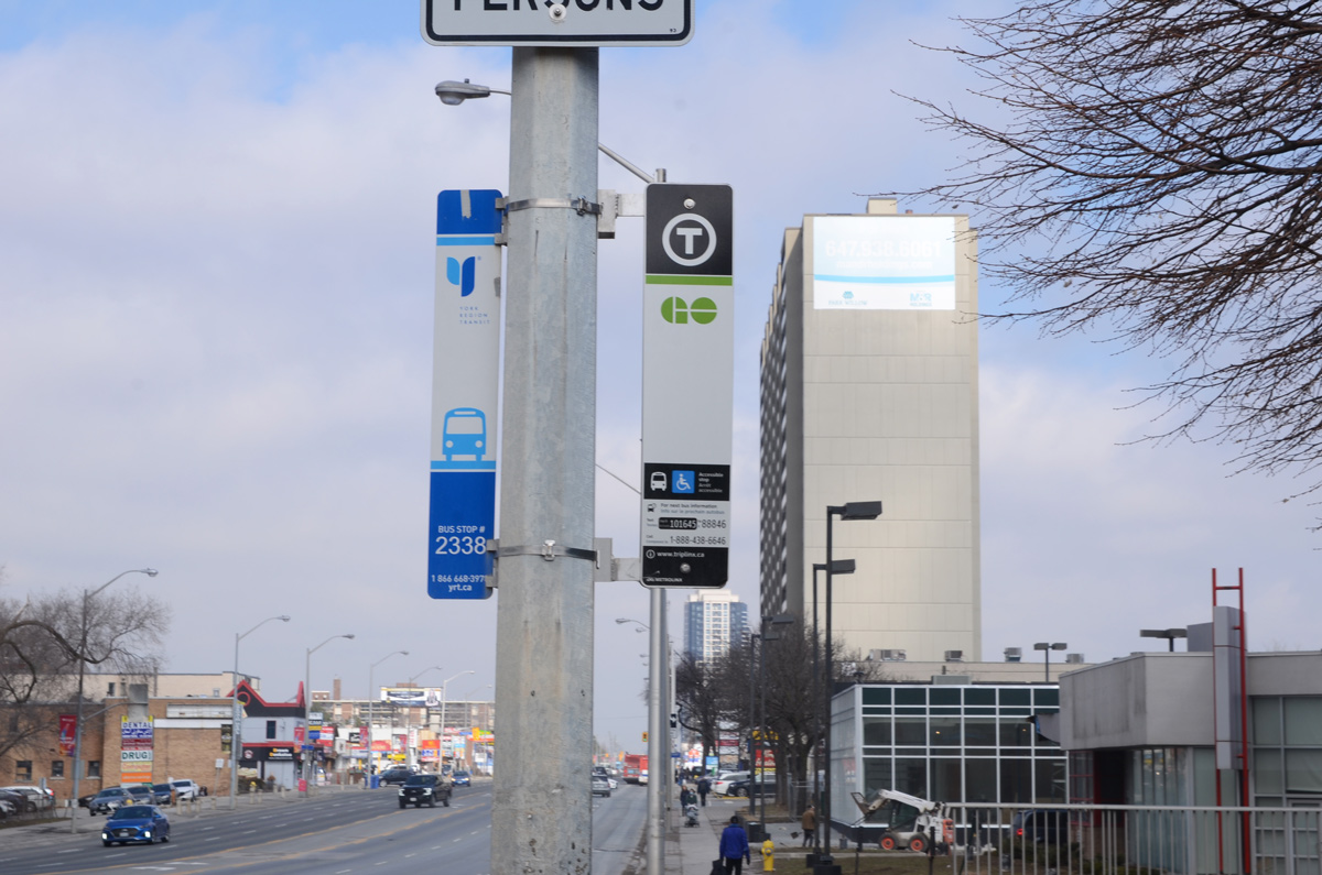
That’s because it’s only been used on a very tiny part of the GO network with no real explanation, it was supposed to be a symbol that represented the entire GTHA, if everyone adopted it the general public would soon know what it means
because it's not going to happen because the major transit agencies all said nope we aren't going to waste money to change all the stops and stations to add something that isn't needed at all. Metrolinx had a wayfinding expert who created a problem that didn't exist and then created a solution that we don't need. Even if every transit agency wasted their money to use it the public still wouldn't know what it means because by the time that happens Metklinx will have hied another wayfinding expert who will tell them somethig completely different.
 
In ten years people will ask why does unrenovated station X have such dated looking signage with a 1950s style shield logo or 1960s GO logo. Many products have changed their logo over time and is many cases, even when there was initial push back by brand loyalists, after time passes the old branding looks out of if date rather than timeless The more the T is used, the more people will relate to it. Unlike other logos where perhaps the goal is aesthetics or branding a unique service, the goal was the brand of "transit" universally and TTC wasn't going to become GO, and GO wasn't going to become TTC... but they can both be transit T.
 
Metrolinx had a wayfinding expert who created a problem that didn't exist and then created a solution that we don't need.
It wasn't some guy who picked it. It was a study that looked at many options and had many reviewers. I think some signs in Pickering still have an earlier test logo. I would argue it was needed. If we are going to have a seamless cross GTA network, the signage to say this is where you find transit should be similar. A rider should not need to be a transit geek that remembers all the logos of all the operators in the GTA Similar to going to the airport the symbol of airplane and name Pearson are shown on highway signs, not the GTAA logo which only transportation geeks (like myself) would be able to recognize. Putting "T" first says "this is not about unique branding, this is about purpose".
 
It wasn't some guy who picked it. It was a study that looked at many options and had many reviewers. I think some signs in Pickering still have an earlier test logo. I would argue it was needed. If we are going to have a seamless cross GTA network, the signage to say this is where you find transit should be similar. A rider should not need to be a transit geek that remembers all the logos of all the operators in the GTA Similar to going to the airport the symbol of airplane and name Pearson are shown on highway signs, not the GTAA logo which only transportation geeks (like myself) would be able to recognize. Putting "T" first says "this is not about unique branding, this is about purpose".

Many of us would and have argued, the T was a poor choice, and added confusion rather than clarity.
 
As I’ve said before, as much as I don’t like the T, the real issue is that this ‘standard’ was created without any implementation funding.

If Metrolinx wanted everyone to switch over, the provincial government should have had a capital improvement fund that municipalities could draw from to upgrade their stops. Hell, use that fund to allow transit systems to upgrade certain stops with shelters, electronic signage, etc.
 
what constitutes to "many of us"?? UT foamers?? or was there an actual study by a diverse general public?

I was speaking on behalf UT'ers and some additional transit nerds.

I don't think the broader public has really noticed or cared to this point. I'm unaware of any formal study.
 
It's utter foolishness dicking around with logos without increasing service levels--the factor that actually attracts people to transit. I can't believe anyone takes logos seriously when many areas throughout the region have a service level of 1-2 busses per hour. Talk about putting the LRV cart in front of the horse.
 
It wasn't some guy who picked it. It was a study that looked at many options and had many reviewers. I think some signs in Pickering still have an earlier test logo. I would argue it was needed. If we are going to have a seamless cross GTA network, the signage to say this is where you find transit should be similar. A rider should not need to be a transit geek that remembers all the logos of all the operators in the GTA Similar to going to the airport the symbol of airplane and name Pearson are shown on highway signs, not the GTAA logo which only transportation geeks (like myself) would be able to recognize. Putting "T" first says "this is not about unique branding, this is about purpose".
How does putting T logo help? People can see a subway station or a bus stop and realize it's transit. If they can't then adding a small T logo won't help either. What could help is the logo of the transit agencies and route numbers operated from that stop.
 
How does putting T logo help? People can see a subway station or a bus stop and realize it's transit. If they can't then adding a small T logo won't help either. What could help is the logo of the transit agencies and route numbers operated from that stop.
Once again are you seeing it from a general public hat or a UT foamer hat? ML is marketing the T as the sign for transit. People who are not transit nerds will be conditioned to recognize it for what it is. It's only here where we try to armchair it away. Let's stop wasting our energy on a freakn letter and focus on more important things such as why oncorr is taking so long to get going.
 
In order for people to start recognizing the T is for transit, they would have to stop labelling maintenance facilities with it and have some kind of rollout plan with the local transit agencies of the GTA. And if they're going to have a universal logo, they could choose something that looks quasi attractive.

Down with all anthracite coloured things 😡
 

Back
Top