News   Apr 26, 2024
 145     1 
News   Apr 26, 2024
 158     0 
News   Apr 26, 2024
 586     0 

GO Ticket Machine Issues and Upgrades -- GOTransit

mdrejhon

Senior Member
Member Bio
Joined
Oct 25, 2014
Messages
4,061
Reaction score
2,951
Location
Hamilton
First, the compliments. Credit where credit due. Many do love our Presto cards (when they work properly!) and the newer presto add-fare machines (when they don't crash!). And GOTransit added a boatload of extra Presto machines last year to the Bay West Teamway, which helped a huge deal, in addition to adopting commuter suggestions of two screens at entrance (one for schedule, one for full screen announcements).

Now, about GO ticket machines....which sometimes adds 25-30 minutes to commute

This is a thread I will post to help GO/Metrolinx (hopefully) improve the situation.

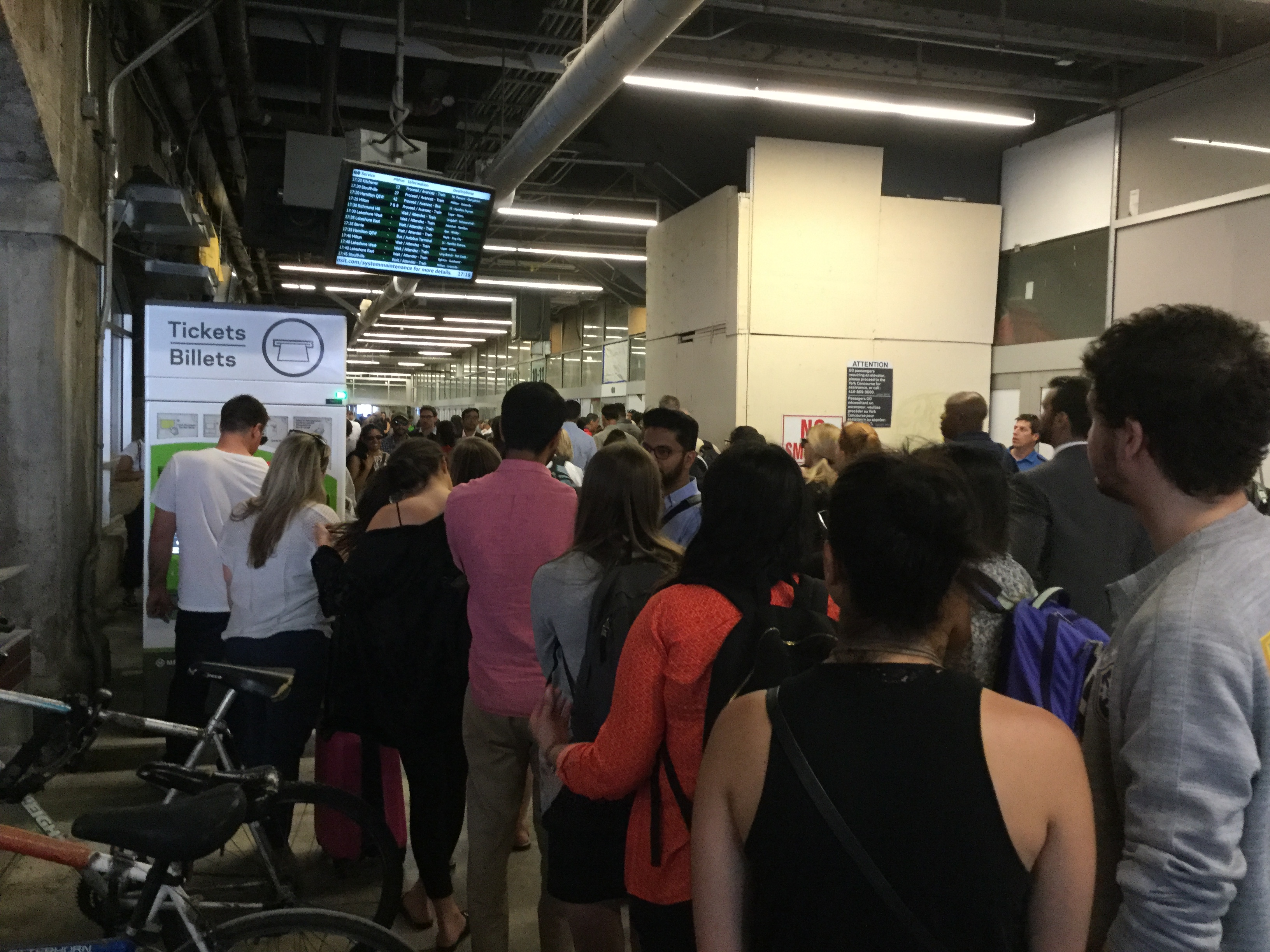
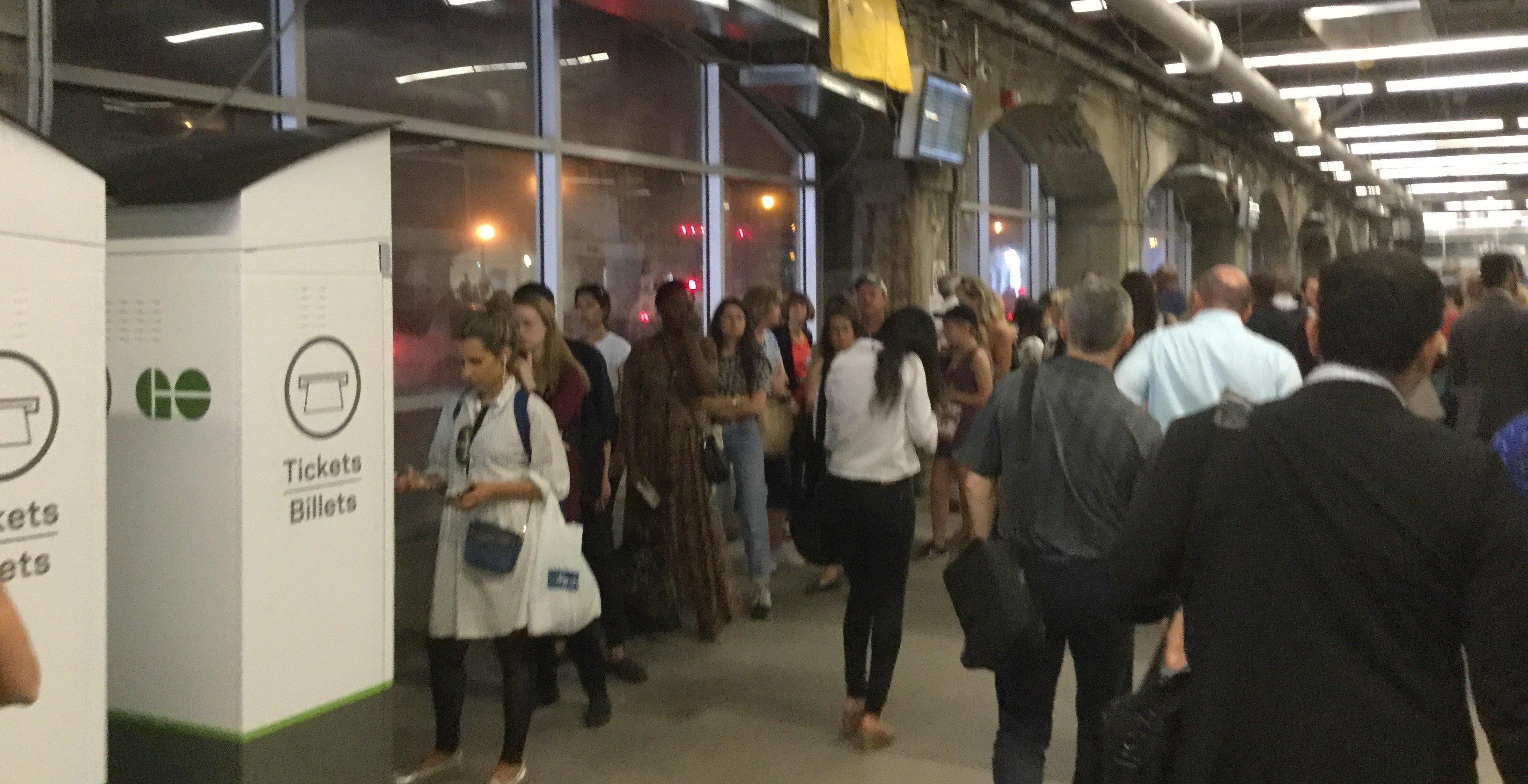
Factor 1. There is often a very long lineup at peak (5:00-5:20pm) at some machines

At 2-3 minutes average per user (due to slow performing machines and two major issues).
....a 10-15 person lineup like this photograph forces a 30 minute wait!
(P.S. In a subsequent post, I will describe two bug fixes that can double the speed per machine user)
IMG_3468.JPG


IMG_3469.JPG


Factor 2. Poor wayfinding to alternate machines. I saved 20 minutes by crossing Bay Street


There are GO wicket cashiers and additional GO ticket machines just across Bay Street. Just by going from Bay West to Bay East, you can save 20+ minutes buying a GO ticket. Much shorter lineups and more points of purchase.

Improved wayfinding is needed, in the form of a big sign near the machines, "Additional GO ticket machines and cashier wickets across Bay street in Bay East Teamway. Take Platform 3 to quickly cross Bay street"

Factor 3. Peak Searching Overload. The "Searching, Please Wait..." screen frequently takes longer at peak

This isn't even about slow touchscreens, but the even super-slower "Search" screen.
Sometimes it decides to take 75 seconds instead of 5 seconds!
Most are familiar with typing in a station name, and being greeted by "Searching". It takes an few seconds offpeak but I have seen this screen take over one full minute at peak for some commuters sometimes.

Compound this peak-period "Searching.." overload delay -- and a 15-minute lineup takes 30-minutes to clear because of searching-slowdowns -- Many people are searching simultaneously, which seems to have an effect in a "Searching..." slowdown system-wide. (Server? Congested network? Regardless, this screen always dramatically takes much longer at peak)

In addition, the mis-located button (screen layout flaw) causes a user to occasionally accidentally cancel (physical location of green button can become suddenly a red button at the most inopportunely unexpected time due to unpredictable screen slowdowns) and then spend 3 munutes starting over, holding up the lineup longer. See below for flaws that causes the "start over again" holdup.

Factor 4. Ticket Machines are often used by inexperienced users who don't travel often.

The Presto machines have taken the "fast machine users" away, leaving the slow users behind. The average ticket-time-per-user has gone up dramatically as a result.

While many of us are experienced in these machines, the lineups always contains inexperienced people every time. The slow machines plays havoc with less experienced commuters who fumble whenever caught off guard by the machine's erratically slow-at-peak behavior.

Frequent travellers have a Presto card, leaving the slow users to slow down lineups even further. Sometimes our Presto goes empty, or we have companions, and we are forced to wait because the machines flaws often cause people to start over.

Net result (of Presto add-value machines) is more percentage of lineup seems to be slow/inexperienced users nowadays, the users who don't yet have a Presto card.

Understandably, GO/Metrolinx employees get free roam on GO as a work requirement (no need for tickets), always bypassing these machines, and never experience these problems that peak commuters get. So sometimes an issue-report thread is needed to highlight a "weak link" in the GO system such as this...
 

Attachments

  • IMG_3468.JPG
    IMG_3468.JPG
    2.2 MB · Views: 1,589
  • IMG_3469.JPG
    IMG_3469.JPG
    1.1 MB · Views: 1,506
Last edited:
As a computer programmer developing apps for iPhones, iPads, and Androids...

...I hereby will now critique the kiosk user interface that often turns a 10 minute lineup into a 30-40minute lineup. Here's a scorcher of a post below.

Get your BBQ steaks ready. ;)
The flame roasting temperature of this brutal honesty will reach 550 degrees F shortly. :D

IMG_3321.JPG


The search screen. Typing lags like hell.

Often takes 1-to-3 seconds at peak (overloaded machines) for the next keypress to respond.

This leads to typos as users try to type ahead.

Even offpeak, there is still a noticeable keypress lag (1/4 sec).

Perhaps the drilldown needs to execute in a multithreaded way, with higher priority to the keyboard thread. It is an old single-threaded microprocessor, but a firmware upgrade can minimize those slowdowns. Interrupt routines? Timers? Sequence of code?

IMG_3327.JPG


Commuter's #1 most dreaded enemy of these GO ticket machines.

....especially when this spinner spins for 75 seconds instead of 5 second, with a lineup of 15 annoyed impatient commuters behind you.

Why not cache common search results?

There is enough memory to cache "Union" and "Oakville" even if not enough memory to cache the whole GO network list. Skip the "call-the-server-every-time", please. The server's tired at peak, it will thank you.

The previous 5 users probably searched for your exact station, so why can't the software simply remember these results from 5 minutes ago, and skip trying to connect to a peak-overloaded server?

That's not even the worst thing.

The "Back" button is located in exactly the same location as the "Cancel" button.

If suddenly Search decides to complete at the same time you try to tap "Back", you're accidentally tapping "Cancel" of the next screen below (and frustrating the commuter behind you as you start your search over again).

IMG_3322.JPG


This is an easy screen.
We finally calm down a little.

We tap the green "Accept" button, but it lags bad. Sometimes bad 2 seconds instead of usual 1/2 second. Some inexperienced commuters mash the "Accept" button again, and then it eventually becomes the next screen.

....fortunately, if that inexperienced commuter is still mashing "Accept" in a hurry to get their ticket to catch their train, at least it harmlessly mashes this above greyed-out button:

IMG_3323.JPG


Rare UI design compliment.
Correct graying-out of Accept button rather than rudely replacing an Accept button with a Cancel button.

Thank you -- but why isn't this best-practices exercised in the other screens?

Once you increment passengers, things go quickly back to bad. The green button now appears, but sometimes it doesn't respond instantly. So the commuter begins to tap "Accept" again:

IMG_3324.JPG


....but the commuter accidentally clicks "Cancel" below when the exact screen-surface location of "Accept" becomes a "Cancel" button.

IMG_3325.JPG


Grumble.

Now that inexperienced commuter in front of me has to start all over again (with a slow search again too!)

All just because the slow nearly-non-responding "Accept" button suddenly becomes a "Cancel" button while the impatient commuter is still mashing that corner of screen in a hurry to buy a ticket.

Why this byzantine user interface decision? ☹️

The Turd Awards
1. Slow (at peak) uncached search spinner screen.
2. Slow
Accept buttons that suddenly become Cancel buttons (especially as user tries to aim at re-tapping a non-responding Accept button)

Fix Ideas for Ticket Machine Software Developer
- Caching searches to cut machine time waste dramatically.
- Simulate slow networks using custom router firmwares or "Apple Network Link Conditioner". Ping 2000 milliseconds, 10 percent packet loss. And test at 5:10pm. Challenge yourself to make machine behave faster under such network duress.
- Grey-out or hide buttons. Keep Accept/Cancel in same physical locations without shifting buttons into each other's place in subsequent screens.


These two bugs, ALONE, has probably wasted millions of dollars of commuter time...
Even we can "tolerate" the slowness if only these two bugs were fixed...

I think even with the slow CPU, that minor programming improvements can halve lineup time quite easily. There are machine limitations, but minor quick fixes are warranted.

So, let's fix 'em with a quick firmware upgrade! ;)
They still update firmwares, they added presto features to some of the GO ticket machines.
So perhaps fix the two turd-award flaws?

Everyone worked hard I am sure, under deadlines, and budget crunch. But surely, 1% more work could be done? Surgically?

(Quick fix at least until new machines in 10 years time)

Note1: I took pix offpeak out of respect for peak commuters
Note2: I am a big supporter of GO -- such as my Huge Hamilton GO Train Article
 

Attachments

  • IMG_3321.JPG
    IMG_3321.JPG
    2.4 MB · Views: 1,861
  • IMG_3322.JPG
    IMG_3322.JPG
    2.2 MB · Views: 1,376
  • IMG_3323.JPG
    IMG_3323.JPG
    2.2 MB · Views: 1,596
  • IMG_3324.JPG
    IMG_3324.JPG
    2.5 MB · Views: 2,112
  • IMG_3325.JPG
    IMG_3325.JPG
    2 MB · Views: 1,468
  • IMG_3327.JPG
    IMG_3327.JPG
    2.1 MB · Views: 1,448
Last edited:
Most of you know of my tweets about GO is positive.

Heck, I even can wait a little longer for more Hamilton GO trains.

But....30 minute of waiting for 10-15 people if you lined up at a very bad 5:10pm time?

The specific fixable flaws of these vending machines warrants this rare tweet of mine, tagging GO to inform them (Feel free to retweet). It is unnecessary extra waiting pain during Union rehabilitation.

Sure, sure, the machines are okay and tolerable offpeak when they perform faster but they have self-cascading usability-per-user failures that spikes (slower response, slower searches amplifying frantic tapping) during the big lineups. QA testing probably didn't test 5:10peak on a simulated network-conditioned network.
 
Last edited:
I don't get why that can't simplify it by giving a list of lines then you pick the station you want to go to instead of having to type it out. I gave up on using one the only time I have ever used it and went to the ticket agent at the station instead of tying to use it. I rely don't get how somewhere like Cineplex can have a machine that can print and process tickets in simple and easy to use manor and go transit and Metrolinx have to reinvent the wheel in the most complicated manor possible. Even Airline check in kiosks work better then these.
 
Weren't these machines first released more than ten years ago -- they seem to have developed these a long time ago, so some of the software is very old.

But they still keep updating it.

Presto features getting added.

Perhaps while adding the next firmware upgrade, maybe spend a little extra time fixing the critical flaws that discourages the inexperienced new GO users and repels them the next time?

Sure, sure, sure, GO/Metrolinx may think, "We're fixing them in new faster machines coming in two years". But that is not mutually exclusive!

Why not spend one week programmer time quickly fixing the two biggest "Turd" critical flaws. a A vending machine developer's programmer brainstorm lunch roundtable to come up with quick fixes -- and implement! Done deal, if they're still deploying regular firmware updates anyway?

I can imagine Dilbert & Pointy Haired Boss at ACME Vending Machines Inc.

"...Dilbert: We've received a request from our client to fix the search screen and the Accept/Cancel problem..."
"...Pointy Haired Boss: (Sighs) The new machines are coming, we don't need to do this...."
"...Intern: (Interrupts) but the old vending machines will also be deployed for five more years..."
"...Worker1: The machines don't have enough fast memory for a cache!..."
"...Worker2: The GO network is constantly changing, we can't cache!..."
"...Pointy Haired Boss: Why can't we just upgrade the servers to search faster instead?..."
"...Intern: Excuse me, but we can use the cookie feature in a RAM-drive as a self-expiring search cache..."
"...Dilbert: Oh, brilliant! I could cache the last, say, 4 hours of search results via temporary cookies..."
"...Worker2: Hmmm, that is acceptable. That'll speed up most peak searches to 2 seconds from 2 minutes."
'...Worker1: And massively lighten server load. And save money by not needing new servers!"
"...Pointy Haired Boss: Can you do it in 2 days?..."
"...Dilbert: Uhhh, two weeks...."
"...Pointy Haired Boss: You got four days...."
"...Worker1: You know, that cancel-and-accept button problem is an easy fix..."
"...Worker2: I can fix that UI problem in just 1 day..."
"...Pointy Haired Boss: Approved. And our transit client will be happy with your brilliant cache idea too."
[lunch brainstorm meeting adjorns, meeting room empties except Intern]
"...Intern: but it was my idea!"
 
Last edited:
I'm not sure about when they were designed but like I said before they made them to complicated for anyone to be able to use efficiently or effectively. Having to spell out your destination on a touch screen just seems lie a waste of time. Like I said before if Cineplex can have sytem in place that all you need to to is touch what movie you want to see then surly go transit can just give you a list of destinations by line or even bus routes too pick from. Although having a presto card pretty much makes this machine redundant.
 
The lag is the worst - it's like touchscreen tech from 20 years ago. And having to type the station name has got to be the stupidest, lowest common denominator UX decision - like there aren't better ways to hierarchicalize that process (e.g. destination city; line - then station choices) so that one doesn't default to searching an alpha-list?? Or if you must, adopt something like an alphabetic scrollbar?

Whoever designed this mess should meet a Sisyphean hell of having to help someone using this ticketing machine who accidentally presses cancel each and every time, ad infinitium.

AoD
 
Last edited:
The lag is the worst - it's like touchscreen tech from 20 years ago. And having to type the name has got to be the stupidest, lowest common denominator UX decision - like there aren't better ways to hierarchicalize station information (e.g. destination city; line - then station chioces) so that one doesn't default to searching an alpha-list??

AoD
exactly I tried using one a few years ago before I had a presto card and got so annoyed with it that I just went into the station and found it more convent to have them print out my ticket than stand out in the cold almost kneeling on the ground just so I could see the scree. That's another pet peeve of mine given the size of them they seem to have made them for poel way shorter than average. I'm about six foot tall and find them to be relly low compared to an ATM or other types of machines like the TTC onesfor pases and alos the reload machines that the TTC has for Presto other then the key pad for punching in your pin code all of them seem to have been designed for anyone of any height to be able to use easily.
 
exactly I tried using one a few years ago before I had a presto card and got so annoyed with it that I just went into the station and found it more convent to have them print out my ticket than stand out in the cold almost kneeling on the ground just so I could see the scree. That's another pet peeve of mine given the size of them they seem to have made them for poel way shorter than average. I'm about six foot tall and find them to be relly low compared to an ATM or other types of machines like the TTC onesfor pases and alos the reload machines that the TTC has for Presto other then the key pad for punching in your pin code all of them seem to have been designed for anyone of any height to be able to use easily.

Yeah, ergonomics is another issue as well, but I must say I had totally ran out of patience with it before I suffered that aspect. Honestly, if they wanted to be effective, they should look at the Apple Store sales approach at rush.

AoD
 
Last edited:
Yeah, ergonomics is another issue as well, but I must say I had totally ran out of patience with it before I suffered that aspect. Honestly, if they wanted to be effective, they should look at the Apple Store sales approach at rush.

AoD
I think that would be helpful in Union station and I think that's what the TTC is looking at for the stations having the fare collectors have a tablet type device that they will be able to use to assist someone with getting a single fare and directions.
 
Last edited:
exactly I tried using one a few years ago before I had a presto card and got so annoyed with it that I just went into the station and found it more convent to have them print out my ticket than stand out in the cold almost kneeling on the ground just so I could see the scree. That's another pet peeve of mine given the size of them they seem to have made them for poel way shorter than average.

Almost certainly a wheelchair accessibility thing. Of course, the obvious solution (which ATMs often use) of having normal height machines + 1/2 lower height ones doesn't seem to have been considered.

My favourite part of those GO machines is they'll happily sell you a ticket for a cancelled train; such as a ticket from Union to Oriole on a holiday Monday. There is no alternative bus service to that station.
 
Last edited:
Almost certainly a wheelchair accessibility thing. Of course, the obvious solution (which ATMs often use) of having normal height machines + 1/2 lower height ones doesn't seem to have been considered.

My favourite part of those GO machines is they'll happily sell you a ticket for a cancelled train; such as a ticket from Union to Oriole on a holiday Monday. There is no alternative bus service to that station.
A few months ago, I was watching a vision-impaired person get confused by the random pauses before the screen changed.

Basically, often kept tapping the wrong button that appared in place of the correct button.

After thinking they'd tapped the same button again.

After thinking the first attempt to tap didn't work. (When in actuality it was just lagging bad).

This person took about 4 minutes before giving up (probably went for a long walk to York concourse). I was next in line.

Many have probably missed their trains due to holdups from the Two Main Flaws above-forementioned. There is no budget to fix all possible bugs, but there ought to be bidget for two surgical critical fixes.
 
A few months ago, I was watching a vision-impaired person get confused by the random pauses before the screen changed.
Basically, often kept tapping the wrong button that appared in place of the correct button.
After thinking they'd tapped the same button again.
After thinking the first attempt to tap didn't work. (When in actuality it was just lagging bad).
This person took about 4 minutes before giving up (probably went for a long walk to York concourse). I was next in line.
Many have probably missed their trains due to holdups from the Two Main Flaws above-forementioned. There is no budget to fix all possible bugs, but there ought to be bidget for two surgical critical fixes.

The designers and decision makers should be fixing this mess on their dime - it should never have been approved for use in the first place.

AoD
 
Last edited:
And having to type the station name has got to be the stupidest, lowest common denominator UX decision - like there aren't better ways to hierarchicalize that process (e.g. destination city; line - then station choices) so that one doesn't default to searching an alpha-list?? Or if you must, adopt something like an alphabetic scrollbar?
When I was in Milan, their system for purchasing tickets for trains worked the same way. I tried to buy a ticket to Milan Airport, but it was in their system as Malpensa Airport so I couldn't even find it. I gave up and just went to a person to buy my ticket.
 

Back
Top