The Evolution of an Un-Stern-like Comcast Center is Revealing
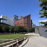
After making a special trip to Philadelphia last week to see
Comcast Center, I finally got motivated to find out more about it - precisely because it didn't look like a Stern skyscraper, even upclose. I came across some timeline material on the evolution of this project from
phillyskyline.com. The visuals you see below are a condensed version of the releveant material on their website. While the commentary is mine, part of it is derived from a few newspaper articles that I read on the topic in either the
NY TImes or
Philadelphia Inquirer. You can see how Stern gradually got to this final result by following his version changes, and factoring in reactions to leaks to the press,
etc. All this pushed this project into uncharted territory for his architectural firm.
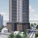
The original design in 2000 was a classic setback.
Earliest known Stern version is the tallest building on the left of this rendering,
Not yet scaled to be the tallest in Phialdelphia.
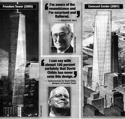
At one point in 2001, during re-design, the use of glass had been settled upon. Somehow this was leaked to the press, and it was immediately noticed that it bore a strong resemblance to David Childs'
SOM model for
Freedom Tower in NYC.
A Stern copy of Freedom Tower in Philly?
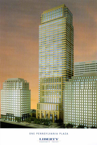
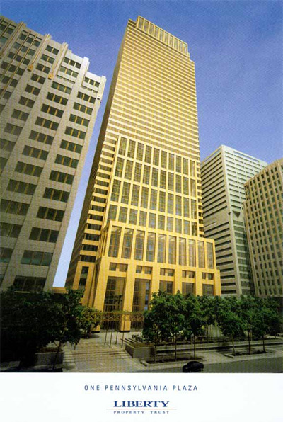
The first time the public saw an official rendering of the building, it was cladded in a beige limestone, not glass. This is a special type of limestone known for its beauty and also expense:
A new traditionalist retreat into masonry for the exterior.
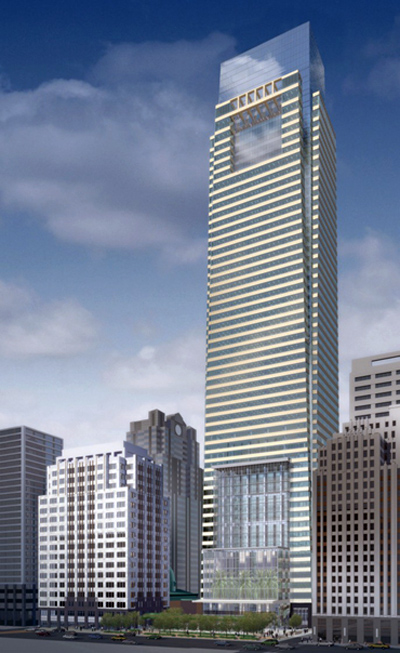
Then there was a version change in 2004, with a new cladding of glass at the top, and with a more affordable granite grey cladding on the main exterior of the building:
Despite version change, masonry still defines most of the structure's exterior cladding.
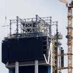
Stern's staff had something to do with the final result, but just how much remains unclear. We do know that Stern worked on the boxlike top to the end, but he delegated the rest to senior personnel.