News   Apr 25, 2024
 381     0 
News   Apr 25, 2024
 1.1K     4 
News   Apr 25, 2024
 1.1K     0 

BFdesign Blog's TTC Brand Concept

Great work that you've got there, but my only complaint would be the logo. I prefer the first one of the set of four that are shown.

Btw I love the designs of te metropasses, much better than the version now. I'll even say that the old metropass design was much better (the ones that you had to fill in your id number)
 
Last edited:
The logo is incredibly outdated and needs to be freshened up. I was surprised at how good your version of the TTC lozenge looked, considering I see it as an archaic 50s throwback which has no place in the modern times we live in.

And I feel there's an awful lot of sensitive folk out there who'd feel your dismissal of the existing logo to be even more of "an archaic 50s throwback which has no place in the modern times we live in". Not that it couldn't be supplemented by a simplified version for certain graphic purposes (as it already is--thanx, interchange). But, to trash it altogether? Even graphic-clarity stickler Joe Clark would shudder...
 
Given that Toronto is fairly unique in having lines that run along the same street for a long distance, I would be tempted to use the a letter reflecting the name of the line instead:

Y - Yonge/University/Spadina (Yonge is clearly more important)
B - Bloor/Danforth (Drop Danforth. I know residents along Danforth that call Danforth "Bloor")
E - Eglinton/Scarborough RT
S - Sheppard

The names of the commuter trains are less meaningful because all lines but the Lakeshore line are named after the terminus and several of the lines might be extended in the future. It would probably be better to use numbers for these.
 
@bg I do like the new simplified mark, but I feel that the TTC text on the inside looks a bit awkward. Maybe if you increased the tracking? The text could also look good as a larger black overlay, going outside the bound of the ribbon, but not the crest. Either that, or remove the TTC text from the mark entirely.
 
Last edited:
@bg I do like the new simplified mark, but I feel that the TTC text on the inside looks a bit awkward. Maybe if you increased the tracking? The text could also look good as a larger black overlay, going outside the bound of the ribbon, but not the crest. Either that, or remove the TTC text from the mark entirely.

Agreed - I'm not 100% convinced that the words TTC need to even be included … but I included it as an option just to see what it would look like. I think the icon itself would be strong enough and wouldn't need the letters ...
 
Removing the TTC letters from the logo would allow subway stations to be identified by versions of the logo with SUBWAY inside - unless we're going to switch to "Metro". :)
 
I love it, especially the logo!

When I first saw the logo, I had my doubts, but in the PDF how you used it in a contemporary examples really allowed me to see how it can work - especially on the new streetcar. You should do one on the new Toronto Rocket trains as well. I disagree with DavidH that short logos should remove the "TTC" text, as without that there would be no official linkage to that term. But removing it from the long logo works exceptionally well, or when other text is needed (the ! in the notices was fantastic).

Just wondering, did you ever see the simplified logo which was used at an office tower north of Finch? It is no longer there, but it is quite similar. Also noticed how when you did up the line logos, you used extra marks on the right side. Was wondering why you didn't use those elsewhere? Personally though, I like how it looks with the single marks at the ends, and am concerned that by adding the extra marks could undo the simplistic symmetrical charm - then again, maybe I'm being too conservative.

And yes, I fully agree that using the three letters jumbled on top of each other just doesn't cut it. Even as a small child, it looked more like an awkward graphic trying to be text rather than actual legible text.
 
All I can say is, "OH my god...yes!"

Jason, your friend gets my highest regards.

Every time I travel, most particularly to London, I have noticed how much better transit authorities elsewhere manage their brands and communicate with the public.

In Toronto's case, I strongly suspect that part of the lack of regard for this with the TTC is because for the better part of its history, it's probably viewed itself, more or less as a department of the municipal government. It does not see itself as arms length enough to strongly promote its brand.

Interestingly, there is one agency that's really pushing its brand. And it's rather analogous to TfL. That's Metrolinx.

In any event, I sincerely wish that your friend push his report to anybody and everybody who's willing to listen.
 
Last edited:
WRT the logo, I'm curious. Was the original inspiration for the logo drawn from the shape of the system or did this logo exist before the subway lines came into being?

And I'm with Electrify on this one. On first look, I had my doubts on the new logo. But once I saw how it could be used, I was sold. But I'm also wondering if that 'inspiration' can't be played with some more. How about modifying the shield? Or just having a thick plate super-imposed on a U. Etc. I'll leave the desginers in this forum to pontificate on what's best.
 
I love the Metropass idea!

The new logo is nice but the current one is nice and iconic already. I wouldn't complain if either were the logo but it seems like it's well-liked already as it currently is.
 
I love the Metropass idea!

The new logo is nice but the current one is nice and iconic already. I wouldn't complain if either were the logo but it seems like it's well-liked already as it currently is.

People like Tim Hortons coffee too but that doesn't mean it's good.
 
Agreed - I'm not 100% convinced that the words TTC need to even be included … but I included it as an option just to see what it would look like. I think the icon itself would be strong enough and wouldn't need the letters ...

Did you ever try a version of it which used, instead of the thick line things on the sides, maybe using a thinner line but outlining the whole thing, so it looks slightly more traditional? I feel like those two lines at the sides make it feel....kinda incomplete somehow. But then I really like what you did with the lines with the different line colours.

I don't know about the "TTC Primary Red" though. That should be reserved for the DRL in my view. Can you have a transit system logo that's one colour and then have one of the line be the same colour? I don't think there's a reason not to.
 
Every time I travel, most particularly to London, I have noticed how much better transit authorities elsewhere manage their brands and communicate with the public.

In Toronto's case, I strongly suspect that part of the lack of regard for this with the TTC is because for the better part of its history, it's probably viewed itself, more or less as a department of the municipal government. It does not see itself as arms length enough to strongly promote its brand.

Interestingly, there is one agency that's really pushing its brand. And it's rather analogous to TfL. That's Metrolinx.

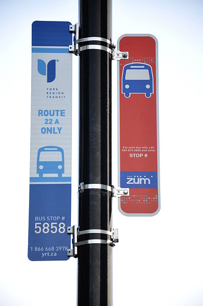
In addition to Metrolinx, there are also the suburban transit agencies. YRT seems to put a fairly high importance on branding, and has relatively consistent signs. As well, I've noticed that the current bus stop signs for YRT, Brampton Transit and GO Transit seem to share the same style.
398px-Zum-YRT.JPG
 
I don't think the biggest problem with TTC's corporate branding is not that it's not unique. I think the biggest problem is that it's inconsistent. Just like with every new thing that the TTC has implemented (the OneStop signs, streetcar arrival time displays, Presto, etc.) things are never implemented system-wide or they are implemented at a snail's pace.

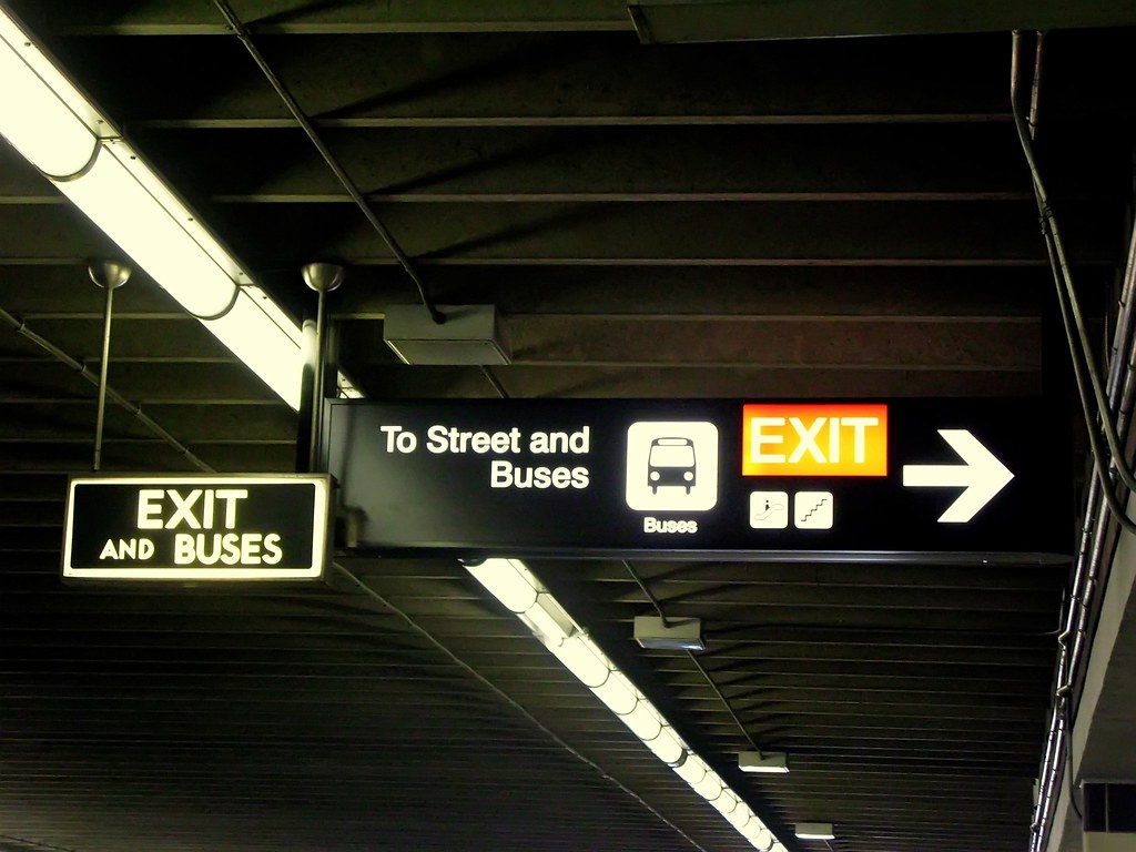
As a regular YRT/Viva rider, I am really impressed by the consistency of YRT's corporate branding. Everything from the signage to the buses (except the ones that are still in the old YRT livery), to the literature to websites and blogs show a unified corporate image. Compare that with the TTC, which I think has 4-6 generations of signage, from the 1950s Toronto Subway Font to the Paul Arthur signage at St. George Station, to the NYC Subway style signage today. On top of that, we still have handwritten paper signs taped haphazardly on the walls by subway fare collectors, which really is an embarrassment to the TTC and to the city. I think the TTC needs to clear all this signage clutter. In this area, I've noticed that recently subway platform signage has been replaced at a quicker pace than before. Some of the signs that are being replaced are the 'EXIT' signs on the B-D subway platforms with the Toronto Subway font - which I'm not exactly happy with from a heritage perspective.

5596268597_dbd23247d1_b.jpg
 
I think the most telling thing about that picture is both signs are lit and right next to each other. No sign that they are actually removing the old one. Seems typical to the signs that plague the TTC. Many are redundant or conflicting.
 

Back
Top