3Dementia
Senior Member
My eyes!
Hopefully all that colour will fade soon.
Hopefully all that colour will fade soon.

They wanted to make a statement and they did a good job I personally like the colors it's better than the normal white and gray and beige were always stuck withsomeone help me understand the colour choice here
I don't mind the podium uses, because it probably speed up construction by a year or two. Parking is obviously better underground, but if we want more housing built faster, seems to be a decent compromise for this projectYup the colour choices here are fantastic.
I'm still not supportive of the long podium wall of this development and it's uses. But the cladding and colour choices used here, along with the execution makes this better than 90% of developments in this city.
Yeah, should have been GREY.someone help me understand the colour choice here
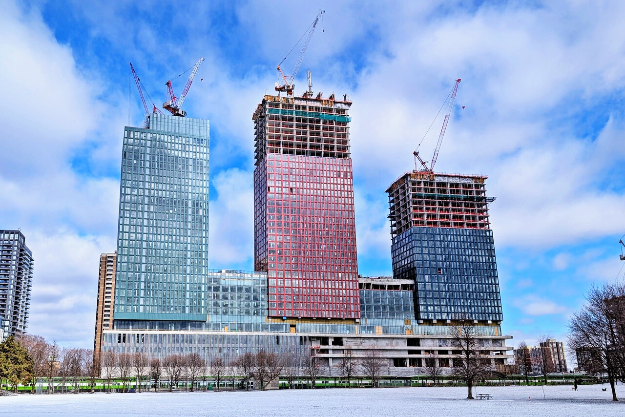
Don’t get me wrong—I like the blue colour of the left tower and how the lack of balconies gives it a clean look. It’s just that the base is one colour, while the three towers are different colours. Using a single colour throughout would’ve looked better, or even a more natural tone like the one used in the Roq City development. Little stylistic choices like that can make or break a development and even enhance our skyline.Yeah, should have been GREY.
It looks like a variant of RGB. /shrugsomeone help me understand the colour choice here
ROQ city is the positive example here? The Frankenstein's historic preservation red brick corner on an otherwise Entirely Grey building? I personally would have done these buildings as a gradient- green, blue, red rather than green, red, blue and the podium is maybe a bit loud but I will take this over most attempted "pops of colour" on grey or white buildings any day. Jewel tones look good!Using a single colour throughout would’ve looked better, or even a more natural tone like the one used in the Roq City development.