News   Mar 13, 2025
 201     0 
News   Mar 13, 2025
 167     0 
News   Mar 12, 2025
 742     1 

Weird floor plans…

neuhaus

Senior Member
Member Bio
Joined
May 18, 2010
Messages
1,683
Reaction score
1,574
Location
Downtown Toronto
It has been a while since there has been any activity in this forum sub-category, so lets get it going again.
Post here if you seen any really weird, what-were-they-thinking floor plans.

I’ll start here with something I recently spotted:
IMG_2608.jpeg

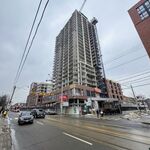
This condo is in Scarborough (the slogan is pretty funny).
I’m baffled why they labelled that room a den when it clearly should be a living room. The den is the largest and nicest room of this unit.
The living/dining room is a tiny dark 8-foot room when it should be a dining room (or a den, but who wants a den facing a kitchen?) and furniture layout makes little sense.

if I were to redesign this plan, I would flip the bedroom with the living/dining room creating an in-board bedroom (I think this is fine for a unit of this size) and have the typical glass sliding doors that opens up at the corner. This will create a more practical, spacious and bright combined living/dining/kitchen that allows for more flexibility.
 
This is a topic of great interest to me. Most recently, I saw this from the upcoming 316 Junction condos:

1682881101388.png


The primary bedroom not having any windows while the second (practically unusable, at just over 6' width) bedroom has all the windows is a bit of a weird choice. I'm also not so sure about the kitchen island being perpendicular to the sink area. I guess this is what happens when you try to cram 2 bed 2 bath into ~650 sqft, but still. Functionally, it's pretty bad.
 
This is a topic of great interest to me. Most recently, I saw this from the upcoming 316 Junction condos:

View attachment 473188

The primary bedroom not having any windows while the second (practically unusable, at just over 6' width) bedroom has all the windows is a bit of a weird choice. I'm also not so sure about the kitchen island being perpendicular to the sink area. I guess this is what happens when you try to cram 2 bed 2 bath into ~650 sqft, but still. Functionally, it's pretty bad.
Ooof, that island. Also that bedroom closet is way too small, and storage for this unit is pretty lacking overall. Also, are there 2 back to back fancoil units in this layout? I wonder why this is necessary in such a small space, and why they're beside each other?
 
That is a unit for very skinny people with excellent dexterity. There is so much that is wrong here!
For that size it really should be a 1-bedroom/1-bath unit.
I don’t think that’s a kitchen island but a dining table, but still, the table is less than 2 feet wide, not very practical and only has a foot of space for someone to stand at the sink. The chairs are shown pushed against the table meaning it only has less a foot of depth (must be a kid’s sized dining set?).
The second bedroom is not even a legal bedroom due to being 6-feet wide at the widest point and surrounded by windows (it’s almost the same size as the main bath!). There is not much room on the one side of the bed which makes getting in and out and making the bed a big headache. The primary bedroom also has barely a foot of space at the end to walk around, not to mention a sliding door on the side of the wall which will slide with you as you shimmy and brush against it.
I agree having two fan coil units is excessive for a unit of this size not to mention taking up valuable floor area.

i was checking out their website and there are some really bad floor plans there with thoughtless furniture layouts that’s akin to a rooming house, with a combination of wasted and disfunctional tight spaces. The design team should be ashamed!

IMG_2609.jpeg

😂🤣😂🤣😂🤣
 
I came across a ton of distressed assignment sales lately. I can understand that whoever purchased pre-con in the last 5 years have paid way too much and more than the market value today, but I also see that these units are having a hard time selling because of their really poorly designed, impractical, tiny floor plans. I think many investors/speculators got caught up in the hype with each condo launch with their slick marketing and elaborate launch events and parties, so FOMO takes over and they grabbed whatever units they could get their hands on with little thought or due diligence.

Here is one of these really bad floor plans (I will post more):

IMG_3122.jpeg

WTF is going on here?!!! It’s like the developer is trying to create a unit out of leftover space around some elevators or utility rooms on that floor.
The kitchen and living room are essentially circulation/hallway space.
The den is a prison cell. It should be a walk-in closet with laundry as there’s just two linen-closet sized closets in the entire suite, or maybe put an L-shaped kitchen there so the hallway becomes dining/den space.
The bedroom has so much wasted space and you can’t properly fit a proper size bed (a double is depicted here), not to mention the tiny window which doesn’t do much to get light deep into this oddly shaped room.
 
Last edited:
This is a unit at CG Tower in Vaughan. The layout looks much smaller than its 531 sq.ft. floor area would suggest (but it is located next to elevators so the floor area includes the walls shared with the common areas and exterior walls).
The furniture plan doesn’t do it any favours and makes it look sad. A lone chair in front of the TV and next to the washer/dryer (doesn’t look like the room can fit even a tiny loveseat without blocking something). Looks like a home for a hermit, or a stoner that plays video games all day.

There are some odd dead spaces like next to the bedroom closet (why can’t the closet extend across the wall?) and next to the laundry closet. The powder room-sized bathroom has a very tiny shower that’s not very pleasant to use. Also it’s interesting that the bedroom door swings outwards as the bed would block the door if it opened into the room (like it should), but instead will block part of the doorway to the bathroom when open.
IMG_2911.jpeg
 
Last edited:
It's small and the angles are not ideal which is what makes it challenging. I'm mostly ok with the unit, but the shower is flashing me back to my poor university rental days which is not good at all.
 
@tripwire: I’m surprised that you’re ok with this unit.

There is no room to place any size sofa in the living room. This is not a home to have any guest over.
The door of the laundry swings too far into the living room. Double doors would be less intrusive.
Also the area in front of the bathroom door is wasted space, I could only see a small desk and chair (for work & eating) against the window being an option.
This unit really should be designed as a bachelor suite (with a sofa bed or Murphy bed), and the kitchen should be made smaller (it doesn’t need a full-size fridge and dishwasher).

I’m curious who would live in this kind of unit. Most likely a student, but what student would live all the way up in Vaughan?
 
Oh yes, I would want some tweaks. They should really have built the unit with sliding or folding doors in mind. This unit is definitely not good for entertaining except for maybe just one other person. :) I would "give up" on the living room and just extend it to ktichen/dining. Maybe a sofa bed in the "bedroom", and make that the living. Knock out the bedroom closet maybe for something more custom and space saving.

As I said before, it's a small space with bad angles which makes it challenging, but I think with a few small tweaks the unit would be ok. Not great by any means, but ok.

in contrast, I hate the layout in your post #5 more! That kitchen would drive me nuts.
 
Here’s another sad floor plan at CG Condos in Vaughan.
It’s approx 550 sq.ft. The furniture plan is again rather depressing; a tiny dining table with a lone chair facing a wall wedged between a small love seat sofa and laundry, the bedroom closet will prevent any drawers of the nightstand from opening (and there’s only a foot of space in front between the bed and closet), and full-sized kitchen appliances at the expense of usable cabinet and counter space.
IMG_3180.jpeg
 

Back
Top