You are using an out of date browser. It may not display this or other websites correctly.
You should upgrade or use an alternative browser.
You should upgrade or use an alternative browser.
Toronto The Georgian | 27.6m | 7s | Stafford | RAW Design
- Thread starter AlbertC
- Start date

jje1000
Senior Member
This building is proof that Postmodernism never really went away.
tripwire
Active Member
I really like it - much better than the initial Frankenstein. But like Lenser said, the black on top is overpowering.
Riverdale Rink Rat
Senior Member
Member Bio
- Joined
- Apr 29, 2008
- Messages
- 2,775
- Reaction score
- 272
- Location
- Back to East York... Alas!
We used to live on Ontario just north of there. Anything this side of a gate to Hell would be an improvement.
IIRC the next building south is an old Victorian converted into a Union office. They shouldn't be too worried about a tall wall across the lane.
IIRC the next building south is an old Victorian converted into a Union office. They shouldn't be too worried about a tall wall across the lane.
Last edited:
WayneBrady
New Member
I don't really understand why people are upset with this development. I live in the area, and this area of Gerrard needs a development like this to bring some life to it. 28 metres isn't anything compared to some of the other developments in the area, a little bit closer to Dundas.
LUVIT!
Senior Member
One little circle does not make a post modern statement. In addition this corner has been a crappy dilapidated ugly eyesore forever. This will be a great improvement like it or not.
Gphorce
Active Member
I live right around the corner, I think it should look okay. Fits the gentle density targets I'd say. It will look big for a while but Oben Flats on Sherbourne should balance it out.
UrbanFervour
Active Member
My problem is less with the density (6 storeys would be better than 8 considering its surroundings) but with the architecture
I can't fathom how a so-called architect could sh*t this design out for a downtown site in 2017. Even when they tired to "refine" it, it still looks like an absolute F'n mess. Sorry, but it does.
let's run the equation:
Pomo clocktower from 1988 +
Faux-mansard roofs from 1991 +
Two-tone buff and orange brick from 1994 +
5-6 layer wedding-cake effect from 2004 +
Ginormous spandrel-clad mechanical penthouse from 1998 +
Metal wrap-around brise-soleils from 2006 +
Squared-off "dormers" from 2010
= CLUSTERF*CK
Architects need to remember Mies' maxim: "less is more"
PMT
Senior Member


Toronto1834
Active Member
Much better. It was way too busy before, much nicer with amplified architecture and removal of black cube at the corner. With only 6 storeys visible from the street, this is appropriate for a road with a 20m right-of-way and no tall buildings nearby.
junctionist
Senior Member
Much better. It was way too busy before, much nicer with amplified architecture and removal of black cube at the corner. With only 6 storeys visible from the street, this is appropriate for a road with a 20m right-of-way and no tall buildings nearby.
The black cube was really ugly, but it was never right at the corner. Rather, it was part of the penthouse level, which was set further back from the street. It's still there, but the building is shorter and the cube is less noticeable.
TheKingEast
Senior Member
Better. Will all depend on the quality of materials used IMO.
PMT
Senior Member
This has been appealed to the OMB. A pre-hearing is scheduled for August 2, 2018: https://www.omb.gov.on.ca/ecs/CaseDetail.aspx?n=PL171292
someMidTowner
¯\_(ツ)_/¯
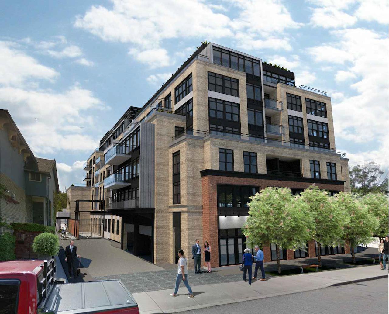
Breezeway has been removed from the east side in the latest iteration. New renderings have been added to the database file!
torontologist
Active Member
Breezeway has been removed from the east side in the latest iteration. New renderings have been added to the database file!
This building gets better as they remove elements. Now if they could just stick to one colour of brick...