You are using an out of date browser. It may not display this or other websites correctly.
You should upgrade or use an alternative browser.
You should upgrade or use an alternative browser.
Toronto The Taylor | 121m | 36s | Tricon | Diamond Schmitt
- Thread starter AlexBozikovic
- Start date
Rascacielo
Senior Member
Today
DavidCapizzano
Senior Member
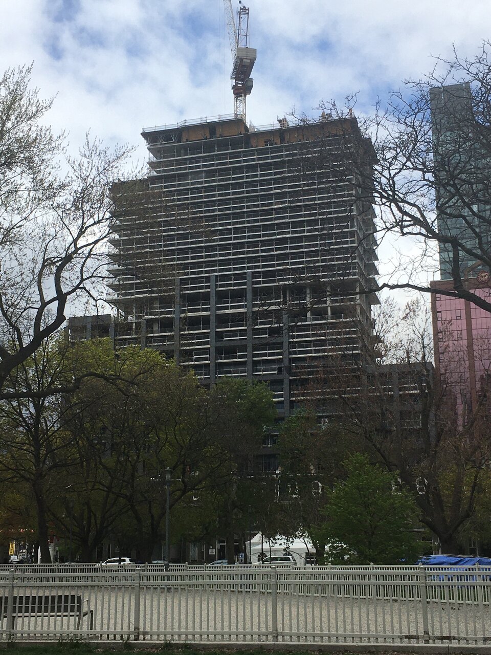
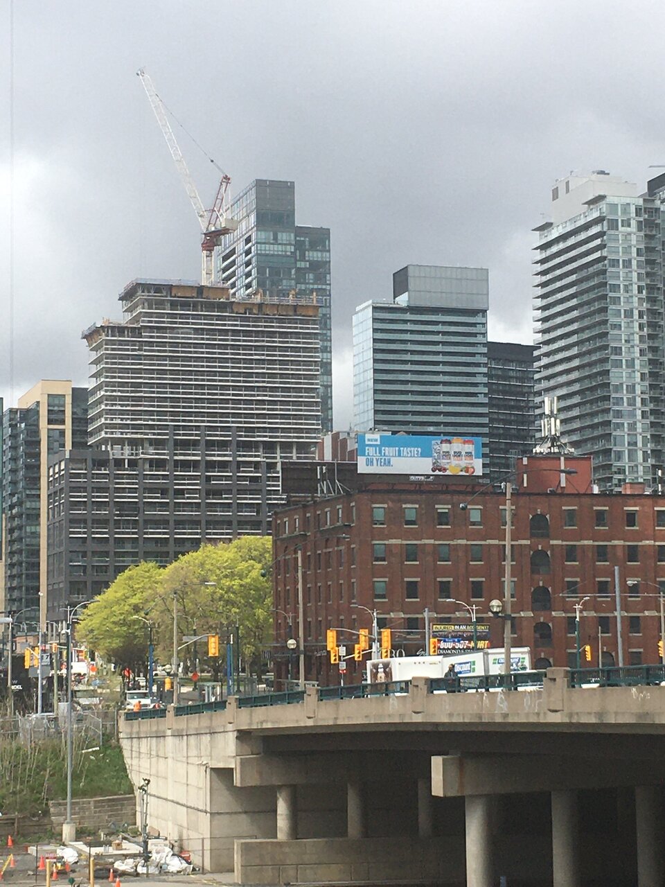
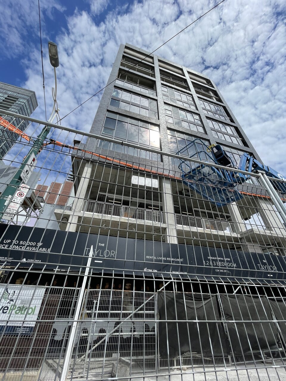
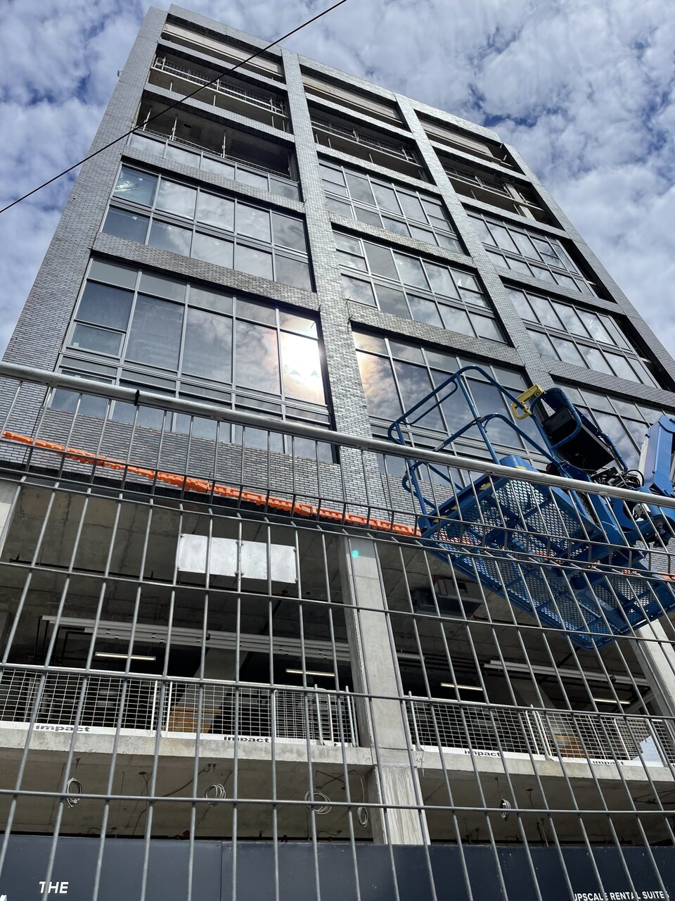
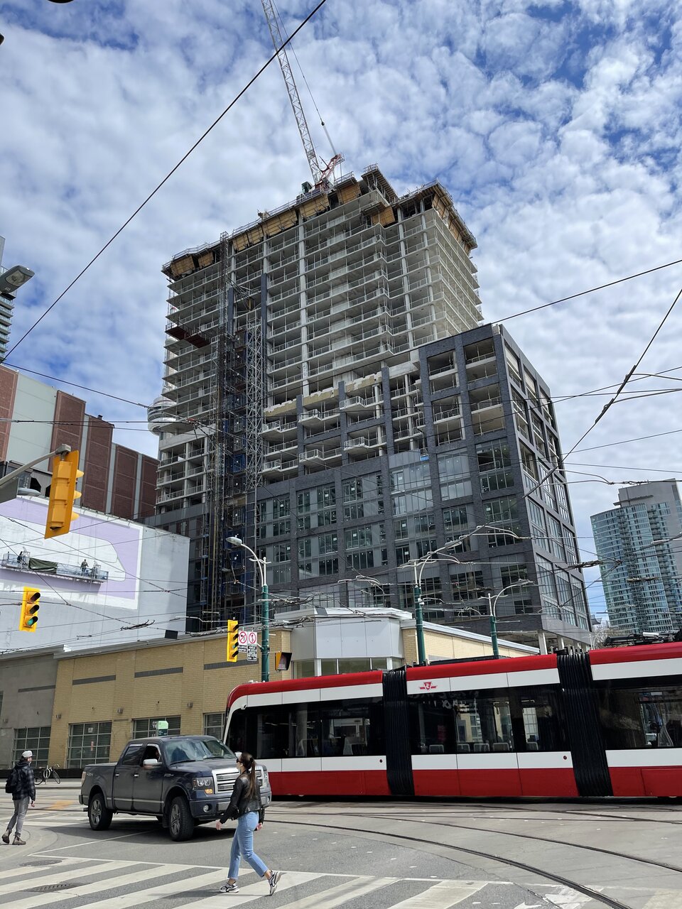
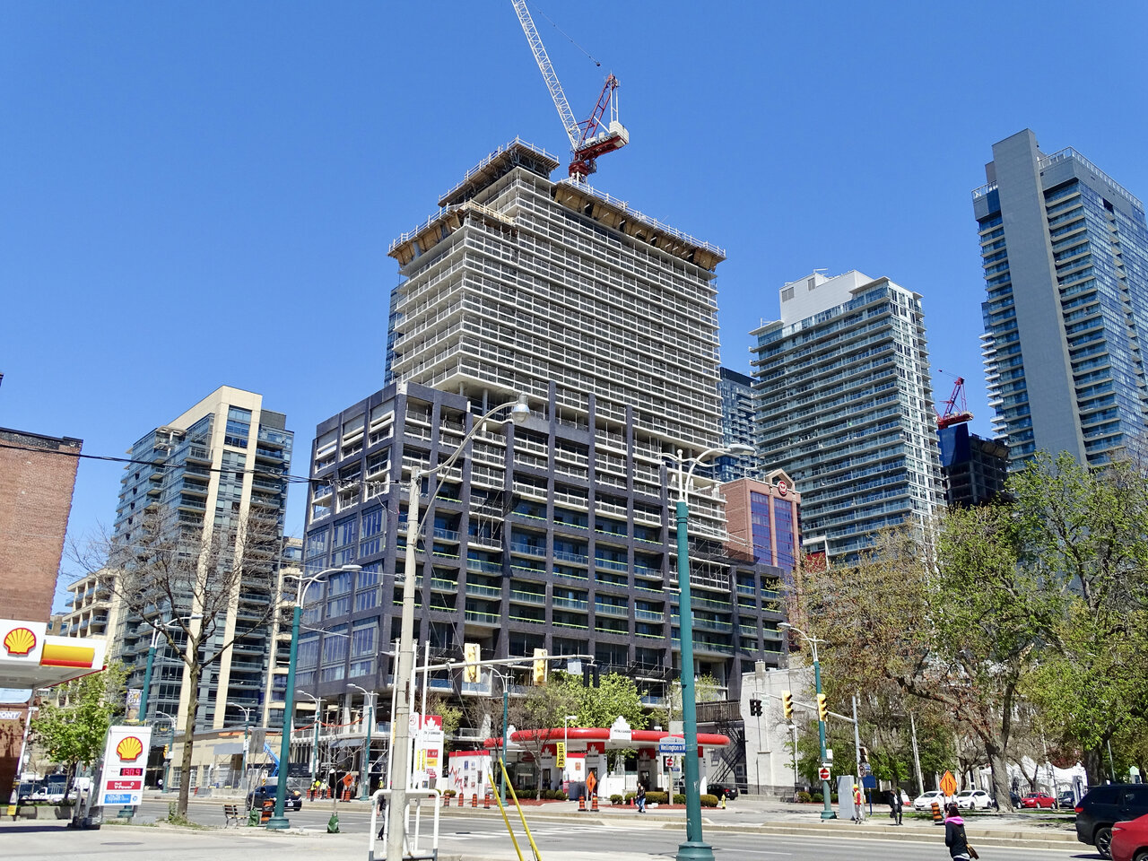
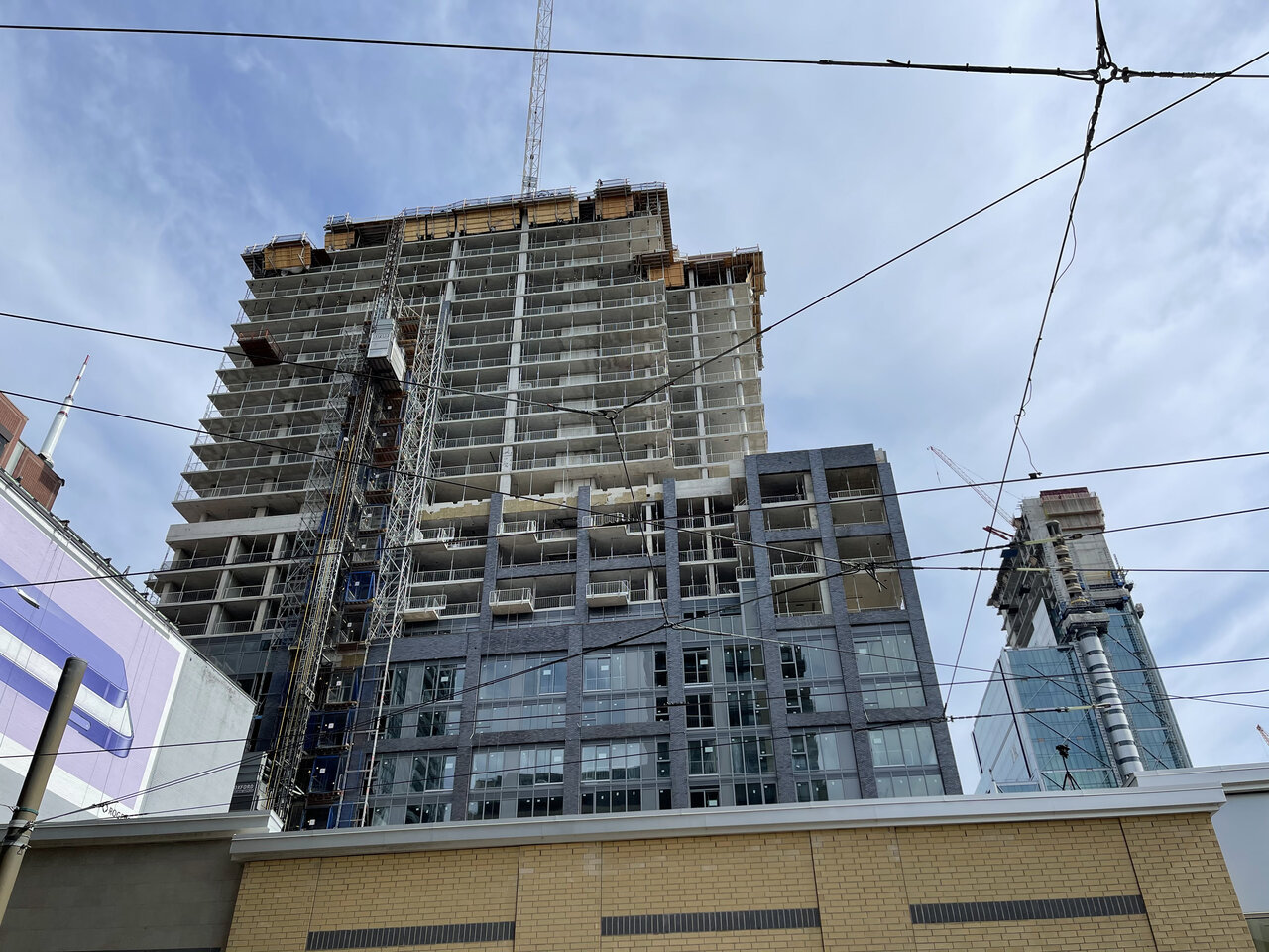
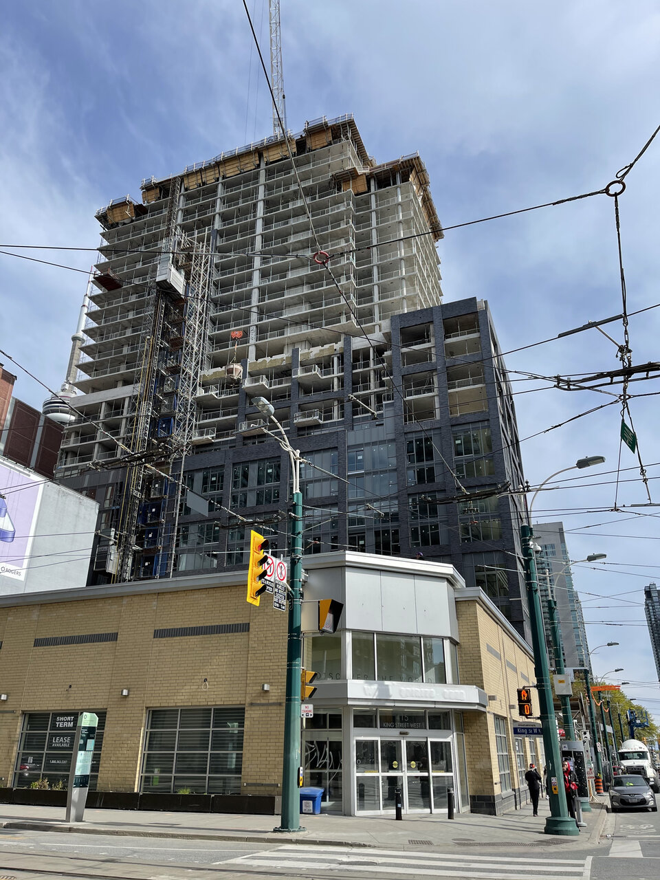
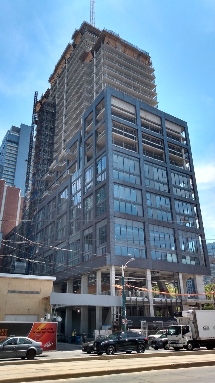
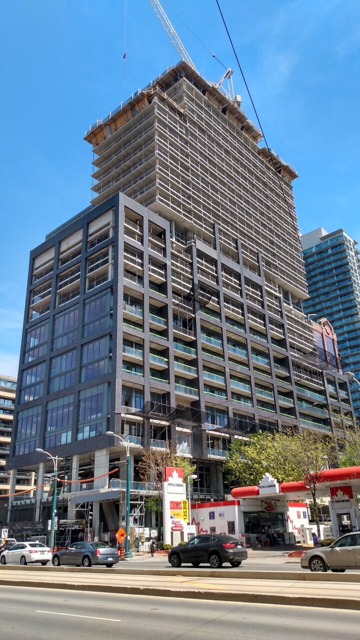
This would have been really impactful from this angle had they gone with a brighter brick but instead the grid kind of just blends in becoming a big dark blob. A nice red similar to the well would have distracted from the terrible spandrel here and made that grid pop at a distance.
Riseth
Senior Member
I like the darker brick used here. It's bold and contrasts nicely with its surroundings. Certainly caught my eye as I was walking past it.
Johnny Au
Senior Member
May 1, 2021:
ProjectEnd
Superstar
What a lazy mess.
Red Mars
Senior Member
May 12, 2021
Johnny Au
Senior Member
A little late
May 7, 2021:
May 7, 2021:
Riseth
Senior Member
May 17, 2021
aznih_aznih
New Member
wmedia
Senior Member
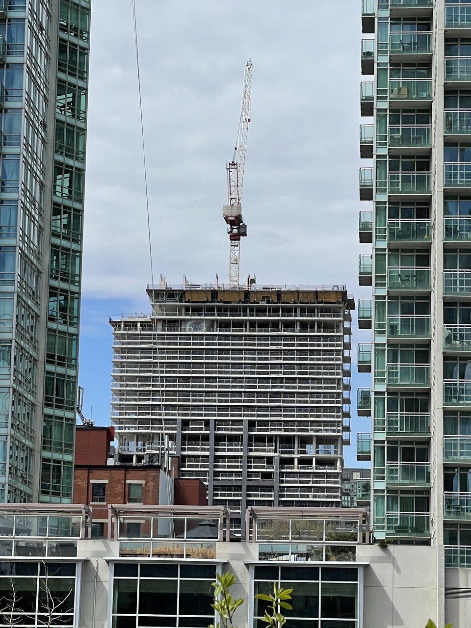
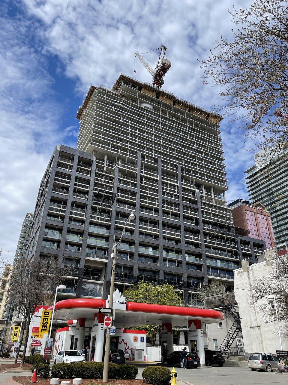
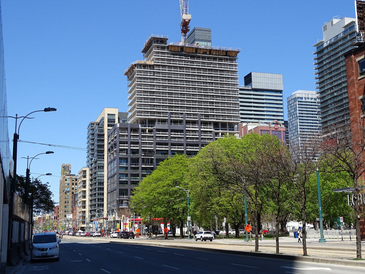
Such an incoherent design. I'm looking forward to the day this gets hidden from most angles, but I suppose some poor souls will then have a view of it out of their windows.
Yegger
Active Member
imagine paying a million dollars to look at this beastSuch an incoherent design. I'm looking forward to the day this gets hidden from most angles, but I suppose some poor souls will then have a view of it out of their windows.
AlvinofDiaspar
Moderator
I am relatively "ok" with it, other than a big misgiving over the injudicious use/location of spandrels. The dark grey brick-faced precast for the podium is fine; but it would have been so much better if they went with a say a light beige for the tower portion - it would have reduced and broke down the mass a bit better. The sad thing is Hudson and Victory - by D+S and about two decades and a decade prior both looked better and less clumsy.
AoD
AoD