DatTranzitGuy
Active Member
I hate to ask but are there any updated pictures of what’s changed at union station recently
Progress is so slow they are hiring oil paint artists to document changes, stay tuned!I hate to ask but are there any updated pictures of what’s changed at union station recently
How is this relevant to anything? That took place in Nov last year.
Actually I think they have these events monthly: https://torontounion.ca/news/union-draws/Progress is so slow they are hiring oil paint artists to document changes, stay tuned!
View attachment 172837
After looking at this for months, and wondering "WTF?"...I finally 'get it'....oh man...did they actually pay someone to come up with that? If it wasn't for seeing "Union" on the pic, I would never have made the connection, literally and figuratively. And it's expected that this is intuitive for visitors?
I've done dumps that say more than this....actually, hold on! I'm seeing other things in it the more I stare, I see...wait for it...worms! In segments...Actually, wait again, I see dead people...people thinking this is a direction somewhere, and it takes them on the tracks. Or is it stairs that dissolve at some point? That's it! It's illustrative of the piecemeal State of The Union Address! Broken borders and walls, and people going this way and that. It's actually social comment! Brilliant! So when you're lost, you can ponder the state of your being so insignificant to the Layers of the Onion (Station).
But what does the 'n' stand for? 'Nothing?'
I believe it is meant to be the word "Union" that has been stylized and abstracted.
I 'got it'...it's a long way from being intuitive. Perhaps each sign could have a legend on it so normal people might understand it? Just a thought.If it wasn't for seeing "Union" on the pic, I would never have made the connection, literally and figuratively.
Why not just use the word "Union" in a clear, concise and fully legible font?stylized and abstracted
https://www.signmedia.ca/directional-signs-offer-endless-design-possibilities/Directional signs offer endless design possibilities
July 21, 2016
No commercial or public space, be it an office building, hospital, bank or shopping mall, is complete without directional signage to welcome visitors and guide them throughout the facility’s maze of offices or stores.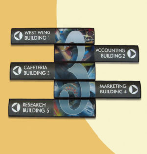
With today’s range of wall-mountable signs and frames, any design vision shared by an architect and a building owner can be complemented by blending signs into a facility’s overall plan. The following are a few examples of directional sign types.
A single poster frame can feature an entirely graphic sign face without any physical divisions within it, so it has become a common choice for indoor applications. The esthetic advantages are somewhat overshadowed, however, by the need to replace the entire sign face whenever a minor change is required.
In response to this issue, a single poster frame can also be internally divided with separator strips. This configuration, which has become the preferred choice around the world, allows the graphics to be changed out only for the required slots. Movable separation strips enable customization, such that the quantity of strips within a given sign frame can be adjusted based on how a particular wayfinding system needs to be updated going forward.
Several wall-mounted signs can be combined to form a single directory. This is a more challenging option installation-wise, but offers further flexibility and can use wall space more effectively. Again, updates can be handled modularly, as each individual sign within the directory can be swapped out as needed.
Finally, larger multi-panel directories have proven both elegant and functional for shopping centres and other complex facilities. In this case, a few directories are all mounted together under a single header, providing an overall ‘road map’ for the building.
By combining modular products with tailor-made design schemes, today’s sign systems can easily be adapted to a particular location’s esthetics without abandoning functionality.
With files from Vista System. For more information, visit www.vistasystem.com.
http://www.gregoryschmidt.ca/writing/navjunk-vs1NOV 17
Navjunk = horrible hospital navigation (+ a solution)
ARCHITECTURE
Finally ! I have found an intuitive and easy to follow hospital directions system. The ‘Route Number System’. We will review this at the end of this post (Part 5).
But first, let’s look at the disaster modern hospital signage has become. “… the popular (yet misguided) addition of colors and tones, brighter and bolder patterns, cartoons and photos, textures, lines, arrows, and 3D effects. Although well intentioned it clutters and impairs the message….” as we will see…this describes both chartjunk & navjunk.
[...]
Part 1:
Current hospital navigation
1.1 Need for clear directions
Everyone has a different term for how to help people get around a hospital: navigation / directions / maps / way-finding / wayfinding.
Hospitals are complex buildings that have been expanded and renovated, with new buildings built upon each other over decades. Finding one’s way around this labyrinth is tricky.
To help make directions clearer, many hospitals have undergone ‘wayfinding’ upgrades. Perhaps it is better than the previous signs, but I think often the result is less than desirable.
Lets look at this…
1.2 Rapid growth of wayfinding
As a way to help ‘improve directions’ it seems the predominate contemporary ideology is to make signs bigger, brighter, bolder, and more colored. It involves adding more arrows, lines, cartoons, pictures, and photos.
The line of thinking is… ‘if we can make each unit and department look different it will make it more memorable’. (uh ok…but how does this make getting to it easier?)
Therefore, we find that instead of having Traditional floor plans such as:
Building Name / Wing (north, south, etc) / Level 1, 2, 3, etc / Department Title
We now have things like
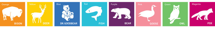
Cardiology clinic in purple-polar bear
or
Unit B in Green-Owl in Orange-striped zone.
Below are some actual geographic area titles. ‘Green Owl’. ‘Yellow Deer’. ‘Pink Goose’. Can you guess which of the are on level 1 vs level 2. Or which are beside each other vs an entirely seperate building? [Also…“teal fish”…how many people even know what color teal is…. Why couldn’t the fox have been called Red Fox? I think ‘Magenta Fox’ is far less ‘accessible’ for people to understand]
To match the silly name changes, ‘modern wayfinding ideology’ requires the entrances to these clinics and units be decorated floor to ceiling in an over the top manner to reflect their ‘unique name’. (Cringe at the many examples in photo portfolio below).
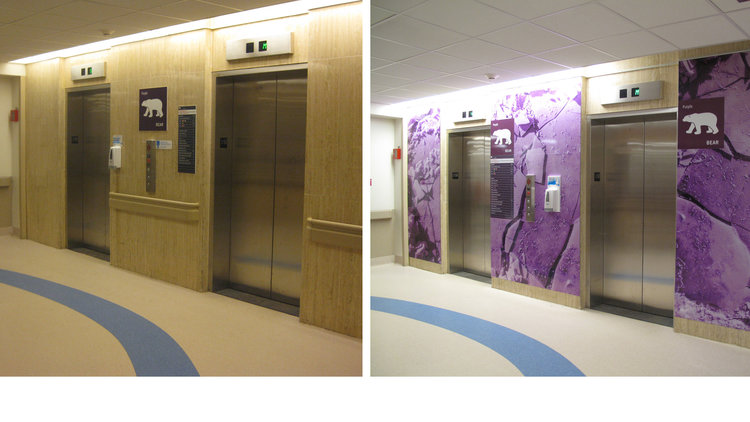
A perfectly decent wall (aside from that purple bear in the middle), replaced with a macro-photo of purple-ice and some pictures of a bear…
Two comments…
First - these animal/color associations are ridiculous. They don’t even make sense. Did these designers fail elementary school?
Second - how does placing the focus that a Unit is in ‘the green-owl part’ of the hospital, or in the ‘orange-deer part’ of the hospital add value to the user in helping understand how to get there These name/color/picture associations do not help the user know which sections are within the same building, or close beside each other.
Part 2:
The new navigation names suck.
Lets add arrows and lines.
As we discussed, making the unit entrances different from each other does not actually improve the ability to know where in a hospital complex that new tacky entrance is.
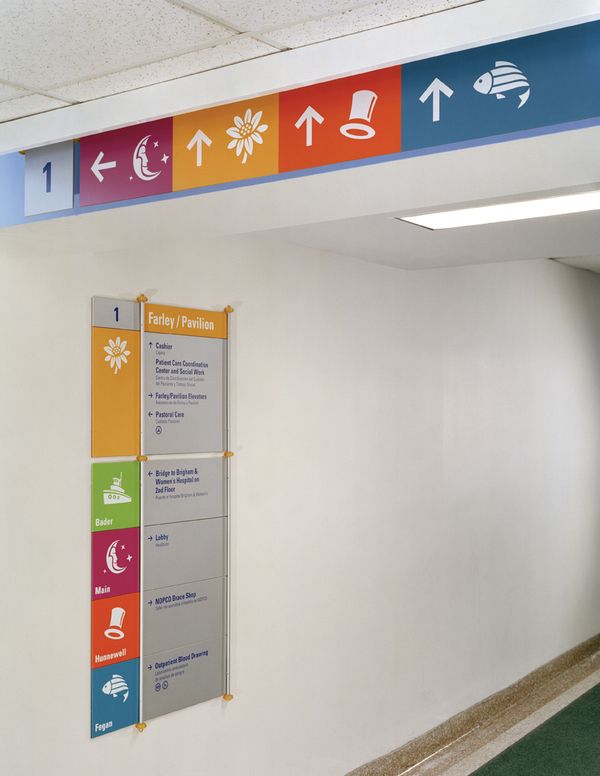
Therefore, the workaround that wayplanning vigilantes have adopted is to install larger & bolder signs than ever before combined with lines and arrows. These lines run up and down the floors, walls, and even ceilings.
The problem with these navigation lines is twofold.
[...continues at length with Youtube link demonstration and fine details...]
?It’s not that deep.
I 'got it'...it's a long way from being intuitive. Perhaps each sign could have a legend on it so normal people might understand it? Just a thought.
Why not just use the word "Union" in a clear, concise and fully legible font?
God help any company that uses icons like this for maps...or highways use icons that no-one has a clue as to what they mean. Or is this the 'secret challenge' of what the 'Icon might mean'?
Case in point:
https://www.signmedia.ca/directional-signs-offer-endless-design-possibilities/
Two words I didn't read in there: "Simple and Effective"...because it's all about being clever, so clever than no-one but Waldo knows where he is. Everyone and their iMemyself device thinks in terms of selfies, because it's all about them, not everyone else.
I'm far from being alone or out of date on this. Example:
http://www.gregoryschmidt.ca/writing/navjunk-vs1
There's a perfect metaphor with what's happened to "wayfinding":
Digital watches. You don't see them anymore. Ever wonder why? Because the mind doesn't work in digital expression. It works in analog. Hearing, for instance, is based on ratios (dB), Brightness levels? In ratios, and so on. And so the 'old fashioned' clockface once again reigns supreme. It took an extra mental step to convert a digital readout to a geometric form that the mind reads in a flash.
Analog clockfaces are *intuitive*. Perhaps the concept has been lost. Maybe you need an app for that? Short of that, you certainly need a posted legend to understand a lot of the signs in Onion Station.
Gobbledygook never is.It’s not that deep.
The prime requirement is clear, concise *written* directions. If there's an app on top of that, fine, but the majority of persons in such a situation *don't have smartphones*!How about, as you were saying, they create an app of all maps requiring for navigating around Union Station, inculding, GO and TTC,the PATH, etc.
Etc, etc..(The following also include PATH, indicative of the same mental sign disorder as afflicts Union Station)
Union Station and PATH signs need less design, more direction
Bad signage, Difficult to find, bright lights make it difficult to see outside ...
https://www.tripadvisor.ca › ... › Toronto › Toronto - Things to Do › UP Express
Rating: 1 - Review by a TripAdvisor user
Feb 8, 2018 - I started walking, with my luggage, into the Path and followed the signs to get to Union Station / UP Express. I found myself coming up against
The Walk Under Toronto: A difficult PATH to follow | National Post
Toronto's PATH tough to follow: Underground passages keep you
Connecting at Union Station - Toronto Forum - TripAdvisor
https://www.tripadvisor.com › Canada › Ontario › Toronto › Toronto Travel Forum
Oct 5, 2015 - The 509 streetcar enters the UNION subway station through a tunnel ... The most difficult aspect about following the signs, imo, is that the UP ...
Sounds like more progress to meI was just in Great Hall and I think that the hoarding fir the restaurant on the north side has moved further into the Hall and I see they are putting finishing touches to the walkways that run to the Great Hall from the VIA arrivals area and Front Street Promenade - to left and right of the ramp. They ceilings seem to be finished and the antique lights are back and cleaned up
Gobbledygook never is.
Getting lost because of someone else's vanity and narcissism is, however.
As per the links and reference posted prior, many find the signage next to worthless.
The prime requirement is clear, concise *written* directions. If there's an app on top of that, fine, but the majority of persons in such a situation *don't have smartphones*!
The latter point has been made clear on GO's lack of printed timetables at hubs, let alone at individual stops. There's times when you don't have or want a smartphone when travelling (I travel with a cell-phone, to be reached or to make a call myself, and if it gets lost or broken, as happens travelling, it's not a major cost) and you have a choice of taking various buses/trains to your destination. You want to know which is next and best. There's this brilliant old-fashioned device called a "timetable" or "schedule" that makes that choice eminently simple and expedient. And the batteries never go flat, and it never gets hacked.
What a concept. But such thinking is rare nowadays. Many are dumbed down with a 'smartphone', and think the rest should be too. Etc, etc..