greenleaf
Senior Member
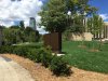
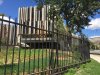
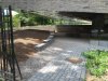
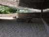
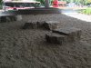
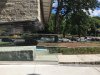
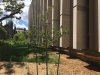
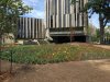
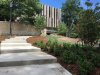
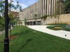
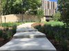
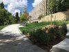
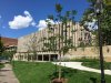
Sod put in today on Philosopher's Walk side. I'm still holding out hope for a whack of lilac bushes along the fence where Hoskin meets Queen's Park to replace the ones that were pulled out.
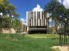
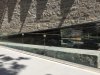
I wish there were more US embassies that look this good.
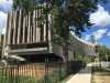
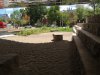
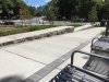
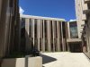
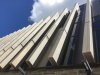
It's a bit forbidding, but that's the nature of lawy-courty architecture. This isn't the student activity centre or the daycare. That said, some softening when the landscaping grows and greens up will not be a bad thing.