Toronto TeaHouse 501 Yonge Condominiums | 170.98m | 52s | Lanterra | a—A

While better than the first, this base still doesn't adhere to the "20 foot Rule" that is needed psychologically to make street life interesting. It is a scientific fact that if the facades change and break up every 20 feet or so then pedestrians will slow and take notice, even stop and look in windows. When the facade is flat and relatively featureless, or the storefronts uniform except for signage, then pedestrians motor on by and the whole block becomes sterile.

Traynor, this makes sense and I agree with it. However, I was wondering if you know of a study or author that came up with this? I'm genuinely curious, as I would like to use it against developers who bring lifeless streetfronts to the city as evidence that they need to do a better job!
 
I will look for the study I read that from, but it was long ago, so give me some time.

Edit: Of course, I should have remembered Jane Jacobs. Her work is the forefront of this rule. I have found a very comprehensive study done in Florida that takes all street design and Urban Planning into account, including studies by Jane Jacobs and many others.

*Page 9 of the PDF talks about Jane Jacobs... Read it all... It is a treasure trove of good Urban Planning ideas.

http://www.epa.gov/dced/pdf/ptfd_primer.pdf
 
Last edited:
Page 21 on that PDF even talks about the size that signage should be and the lettering on them, to maintain interest for drivers and pedestrians....

OMG! I am still reading this thing! I love it... Someone should print a copy and carry it like a bible to City Planning meetings.
 
Last edited:
OK This is the most comprehensive book I can find on the subject. It is called "Companion to Urban Design" and appears to be completely free online.

Chapter 12 by Jack L. Nasar speaks directly about the psychology of pedestrian cognition and interaction with urban street design.

It is deep... but really cool.

http://books.google.ca/books?hl=en&...ULSQBTiWKgmwzSO-vONeJX774#v=onepage&q&f=false

Traynor, all three posts: Thank you!

Very much appreciated. Now I have some reading to do.
 
While better than the first, this base still doesn't adhere to the "20 foot Rule" that is needed psychologically to make street life interesting. It is a scientific fact that if the facades change and break up every 20 feet or so then pedestrians will slow and take notice, even stop and look in windows. When the facade is flat and relatively featureless, or the storefronts uniform except for signage, then pedestrians motor on by and the whole block becomes sterile.

If you want a Toronto example of this in practice, check out Queen East between Kingston Road and Woodbine. On the south side, where the racetrack used to be, they got the scale of the buildings right (4 floors) but although they are modern buildings with big wide sidewalks, NOBODY walks on that side of the street because it's monotonous and boring (basically the whole stretch looks the same) - meanwhile, the north side, with narrow sidewalks, has lots of people usually because it's visually interesting - with small stores and a changing street wall... every 20 feet or so.
 
CanadianNational has had some enjoyable recreation doing these renders (I can tell) and I have absorbed the work fully. I am echoing the sentiments of others re. the Yonge portion which fails to meet and greet the pedestrian. Something far more interactive (to coin a phrase) is needed. While the colourful podium effect is something I can appreciate, the whole thing still comes off as too sanitized at street level. Where is the retail? It may be there but it doesn't show. Finally, I can cope with the height of the skyscrapers, but I can't cope with the lack of trees on the Yonge stretch.

As for the towers, well, sorry, but they are a rehash. I hope to see something really fresh from the architects. I am worried that we are seeing the same building with a twist, now, with all the construction that is being proposed. It's a genuine worry.

The fabrics being presented are good, but how about buildings of different shapes, and perhaps buildings set on the bias ...anything to avoid the monotony that I fear is setting in.

I'm starting to worry. I think I'll chill and get another latte.

EDIT: This is key. The 5 storey parking garage is something we are going to have to live with. These are actually all over Chicago now and they will catch on here in Toronto. I am upset that more car ownership is being encouraged (especially downtown), but I choose my battles, as any reasonable person must do to keep sane. Make it attractive, that is what I am asking - just make it attractive.
 
Last edited:
The parking garage is proposed to hold 360 cars: 302 for residents, and 58 for visitors. For a project where they propose 960 units, 302 parking spots aren't that many. Now, whether 960 units is appropriate here is a separate question; I think that comes down more to massing and design of the whole complex than it does new numbers in the 'hood. Only superior architecture can make this work.

42
 
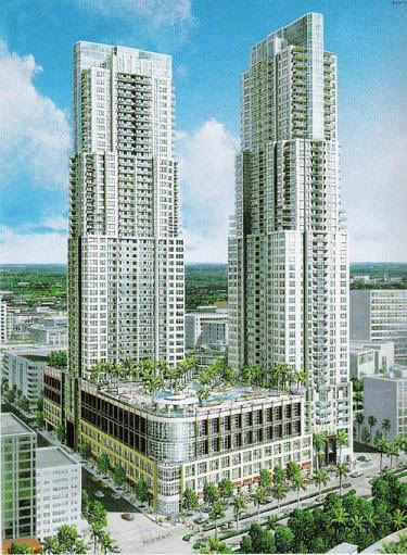
This i think looks similar! I want the real design to look a bit taller=(
Everglades-on-the-Bay1.jpg
 
This i think looks similar! I want the real design to look a bit taller=(
Everglades-on-the-Bay1.jpg

That could be nice. The podium is kinda boxy though? Maybe a small set-back after the first 3 stories? A terraced approach, leaving space for bar/resto patio space?
 

Back
Top