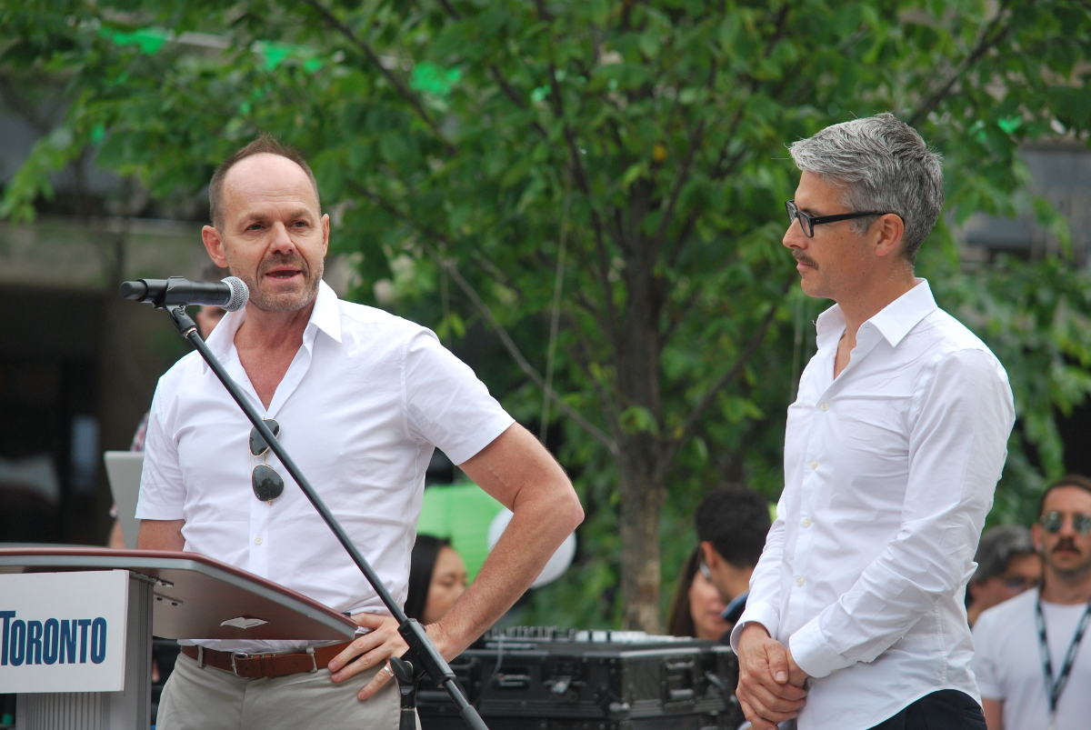
Toronto Berczy Park Revitalization | ?m | ?s

Some more from yesterday evening...

Berczy Park by Marcus Mitanis, on Flickr

Berczy Park by Marcus Mitanis, on Flickr
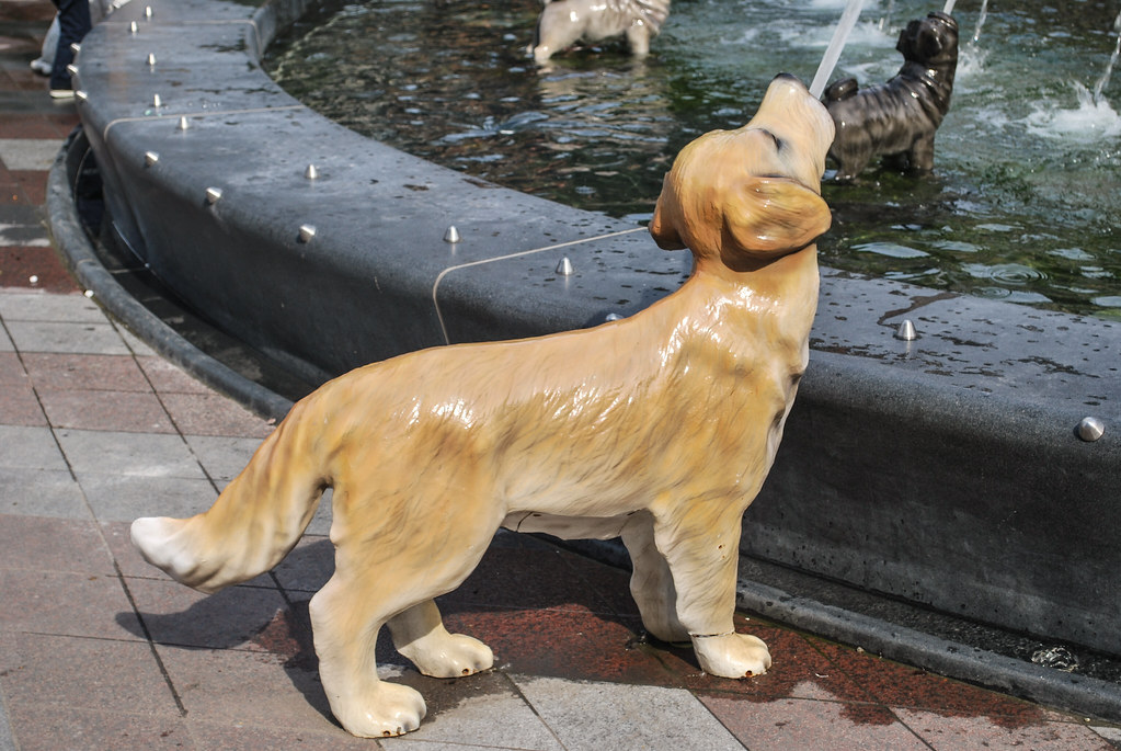
Berczy Park by Marcus Mitanis, on Flickr

32qwe.JPG


3rwqede.JPG


Claude Cormier and Marc Hallé:

23dewdsa.JPG


Berczy Park by Marcus Mitanis, on Flickr

Berczy Park by Marcus Mitanis, on Flickr

Berczy Park by Marcus Mitanis, on Flickr
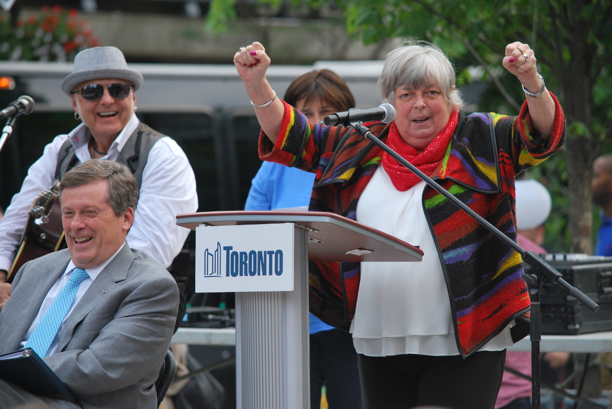
Berczy Park by Marcus Mitanis, on Flickr

Berczy Park by Marcus Mitanis, on Flickr

Berczy Park by Marcus Mitanis, on Flickr
 

Attachments

  • 23dewdsa.JPG
    23dewdsa.JPG
    741.4 KB · Views: 372
  • 32qwe.JPG
    32qwe.JPG
    806.3 KB · Views: 393
  • 3rwqede.JPG
    3rwqede.JPG
    718.7 KB · Views: 412
Doesn't he already have a few projects in the works fior the city? Such as ... ROM??
They are working at The Well, Daniels Waterfront, Vaughan Metropolitan Centre, 88 Queen East, Garrison Point, The Selby, Distillery District Ribbon Building, River City 3, Sony Centre, Tableau and the triangle across the street.

They will be doing 3C Waterfront.

They did Sugar Beach, H2O, the Four Seasons (which we need to get back up to—there's now seating there, for one thing) , 300 Front, Evergreen Brick Works.

I'm not sure of the status of the ROM plans. Not sure since the new director came in whether or not they are continuing with them. All I've heard about lately are Hariri Pontarini's interior upgrade plans there, and there's no mention of any changes on the ROM's website currently.

42
 
The late Ms. McConnell was correct; you can't walk by that fountain without smiling. I visited the park last weekend, and it was a delight. Before it was built, I was disappointed by a design that seemed childish to me, but I just didn't get it. Now I do; the park is a great success.
 
The late Ms. McConnell was correct; you can't walk by that fountain without smiling. I visited the park last weekend, and it was a delight. Before it was built, I was disappointed by a design that seemed childish to me, but I just didn't get it. Now I do; the park is a great success.
I served as a member of the 'working group' that worked on this project for 4 or 5 years and can assure you that without Pam McConnell driving it, this project would never have been as wonderful as it has turned out. She worked diligently to put together s 37 $$ from several projects to enhance the City money, she worked with City staff to include the work on Scott Street with the work on the Park and she got the layout of Wellington north of the Park changed - this will happen in a few months when the current water & hydro work there finishes. It was wonderful that she was able to attend the opening on June 28 and sad that it was, I think, her final public appearance. (She had to unplug her oxygen to speak and, typically, spoke a lot!) She will really be missed.
 
Will there be a call to rename the park after her? Or perhaps a new one on the books in the ward.

The park is already named after the co-founder of Toronto. Perhaps a new park could be named after her, but scratching Toronto's co-founders name from the park probably wouldn't fly.
 
At least Pam got to see the park completed. It's nice to come to the end of one's life on a high note. I will always associate this Park with her.
 
Perhaps the City could incorporate a high-quality plaque designed by M. Cormier, with Pam McConnell's portrait, a brief bio, and a tribute to making the park rebuild happen. This project is so far above the miserable norm for Toronto that we should honour Ms. McConnell some way.
 
The thing I like about this design in a greater discussion of architecture and design is that it acknowledges that people like whimsy and character. No matter how much the design community sometimes wants to airbrush humanity out of their designs, people will always love symbolism, representations, nature etc. With a little skill and luck we can create amazing things that celebrate all the human emotions without being tasteless. Not all designs need to be somber, serious, introspective and unambiguous. These are all great qualities but maybe reflect the personalities of the designers more than humanity at large.
 
Between this and the giant inflatable duck, I almost have hope for this city. For decades it seems we have been ruled by types who insist on scrubbing all traces of vibrancy, whimsy, and colour from view, as if "tackiness" -- a highly subjective factor -- were the worst crime against humanity imaginable. What we've been left with is a city of unimaginative and joyless designs of beige, gray, glass, and concrete, inoffensive to the point it has become offensive.
 

Back
Top