You are using an out of date browser. It may not display this or other websites correctly.
You should upgrade or use an alternative browser.
You should upgrade or use an alternative browser.
Toronto Aura at College Park | 271.87m | 78s | Canderel | Graziani + Corazza
Roundabout
Senior Member
Irishmonk
Senior Member
I believe this increasingly sleek and majestic tower, along with L Tower are the most daring and bold new towers in the downtown. Kudos to both for bravely and gracefully sidestepping this city's ever present POSGB (piece of shit glass box) curse.
Torontovibe
Senior Member
Personally speaking, I don't think that the top of the tower excuses what's below. Nothing changes about how the building meets the street, or the million mullion mess that runs half way up (including the uneven variations in floor height). By your own admission this building has permanent problems, and in my opinion, they are not excused or made irrelevant by how it has been completed up top.
You might forgive the noted shortcomings because of how the tower has been topped off (which is admittedly quite nice), but for those of us who find the rest of it to be something of a mess, it's no consolation.
Actually, this tower meets the street pretty well. It's not your typical glass wall. Sure, the retail choices might suck (banks) but the podium uses a variety of materials with contrasting colours and textures. It's better than the vast majority of new retail spaces in condos. It's at street level and up top, where this building does well. That roofline has to be one of the best in the city. (if not the best)
WiddleBittyKitty
Felis catus
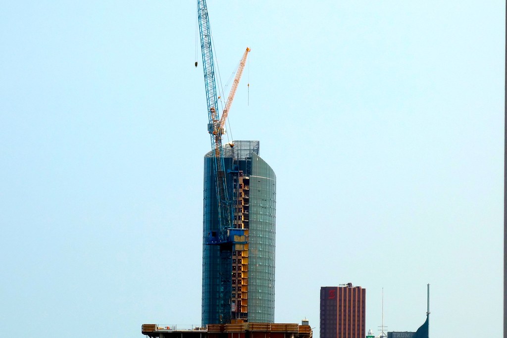
Apologies to the mods for reposting this photo so soon after its original posting, but I believe it's needed to assist with what I'm about to say.
Over the years this tower has been repeatedly slighted for its execution -- more specifically for its use of spandrel, and the design and massing of its podium and lower tower portions.
While these criticisms aren't entirely without merit, in light of how the upper part of the tower is being done, they're both over-exaggerated and overblown.
Aesthetically, the most important parts of any tower how it relates to the street and how it finishes at its top. These now appear to be the areas where this tower excels.
I agree that the lower portion of its tower is somewhat clumsy, and the use of spandrel and associate materials don't come together well especially on the north side, but the tower caps off deftly and interestingly, in a way that echoes the asymmetry of its mid portions. It's also sleek and looming in a way that draws most attention away from its less well executed parts. And it meets the street nicely, both in terms of design as well as function: its restaurants, bars, shops as well as the generous and partially sheltered sidewalk around it ensure that its context remains vibrant at nearly all hours.
Other buildings may have more consistent quality throughout their design and cladding, other buildings may have a better mix of integrated uses, but overall I think this building excels where it counts and will serve as a handsome landmark. Overall I think it's raised the bar for buildings in Toronto.
I'm looking forward to its successors.
^-1
Personally speaking, I don't think that the top of the tower excuses what's below. Nothing changes about how the building meets the street, or the million mullion mess that runs half way up (including the uneven variations in floor height). By your own admission this building has permanent problems, and in my opinion, they are not excused or made irrelevant by how it has been completed up top.
You might forgive the noted shortcomings because of how the tower has been topped off (which is admittedly quite nice), but for those of us who find the rest of it to be something of a mess, it's no consolation.
^+1
I believe this increasingly sleek and majestic tower, along with L Tower are the most daring and bold new towers in the downtown. Kudos to both for bravely and gracefully sidestepping this city's ever present POSGB (piece of shit glass box) curse.
^-111111111 to the 111111111th power. Sheesh. 80% of this building is still inexcusable.
Johnzz
Active Member
^-1
^+1
^-111111111 to the 111111111th power. Sheesh. 80% of this building is still inexcusable.
-1
mdparker
Active Member
+1...
someMidTowner
¯\_(ツ)_/¯
Ok guys, math class is adjourned for the day.
CITY_LOVER
Active Member
I believe this increasingly sleek and majestic tower, along with L Tower are the most daring and bold new towers in the downtown. Kudos to both for bravely and gracefully sidestepping this city's ever present POSGB (piece of shit glass box) curse.
What about the Ice Towers?
CITY_LOVER
Active Member
Ok guys, math class is adjourned for the day.
+1 ... sorry, i couldn't resist!
MCDM
New Member
Anybody have an idea when they will start testing the lighting feature?
Benito
Senior Member
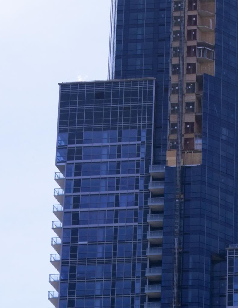
From just now. Just a small bit of the crown left to complete it.
 Untitled by Chmd_Benito, on Flickr
 Untitled by Chmd_Benito, on Flickr
steveve
Senior Member
Over the years this tower has been repeatedly slighted for its execution -- more specifically for its use of spandrel, and the design and massing of its podium and lower tower portions.
I agree that from many parts of Yonge Street/vantage points to the south, the dominance of the lower portions/setbacks is less noticeable, in fact, Aura looks pretty darn good from NPS. But much of this is due to perspective and the way Aura was designed. Go anywhere east or north along Yonge and this all changes. The tallest setback still creeps up on the curved portion a bit too much to my liking. I've said this before but it would have helped if they reversed the east/west setbacks. It doesn't make sense to have one that high up facing east on an area of Yonge Street where there are essentially no high-rises.
And I agree that Aura's criticisms overshadow the good. The upper portion looks fantastic and it's hard to ask for more. As a whole, it's still one of the better condos to go up in recent memory. Despite it's flaws in it's spandrel spamming on the lower-half, there are few projects exempt from similar problems across the city. It's become the norm.
I hope the canopy at street level will be removed shortly (I expect when the crane comes down).
And ya the glass is almost at the top on the west side. I could be wrong, but are they gonna install more steel to close the gap on the north side? Maybe once the external elevators are removed?
someMidTowner
¯\_(ツ)_/¯
Anybody have an idea when they will start testing the lighting feature?
They were testing it back in March and again last month.
ssiguy2
Senior Member
At first I was very ho-hum about this tower but I must confess it has grown on me and I like it more every time I see it. Not only does it have some interesting dimensions but I also like the bulk of the building as I have never been much of a fan of tall toothpicks.
It also really fills in the gap between downtown and Bloor nicely. Due to the incredible density of the financial district, the downtown often looked like a peak which made the rest of the skyline look somewhat small and irrelevant and Aura brings height and clarity to the areas between downtown and Bloor.
It also really fills in the gap between downtown and Bloor nicely. Due to the incredible density of the financial district, the downtown often looked like a peak which made the rest of the skyline look somewhat small and irrelevant and Aura brings height and clarity to the areas between downtown and Bloor.

