


k10ery
Senior Member
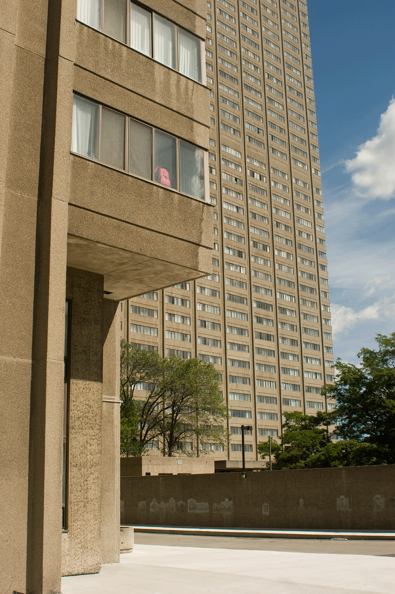
pman: When these buildings are bad, they are very bad. HBC and, I think, Four Seasons are bad. And even the best of them tend to have failings where they meet the street.
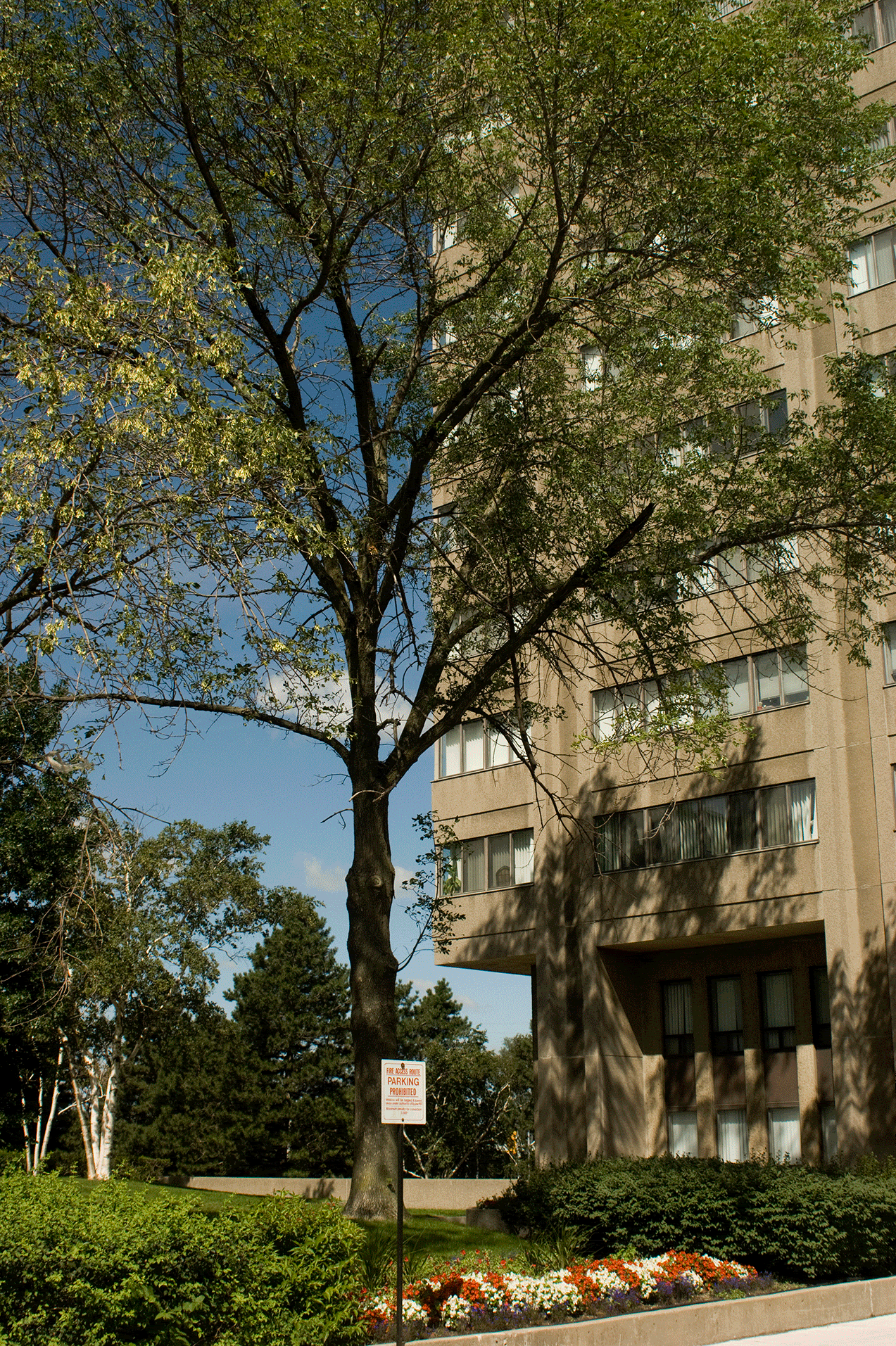
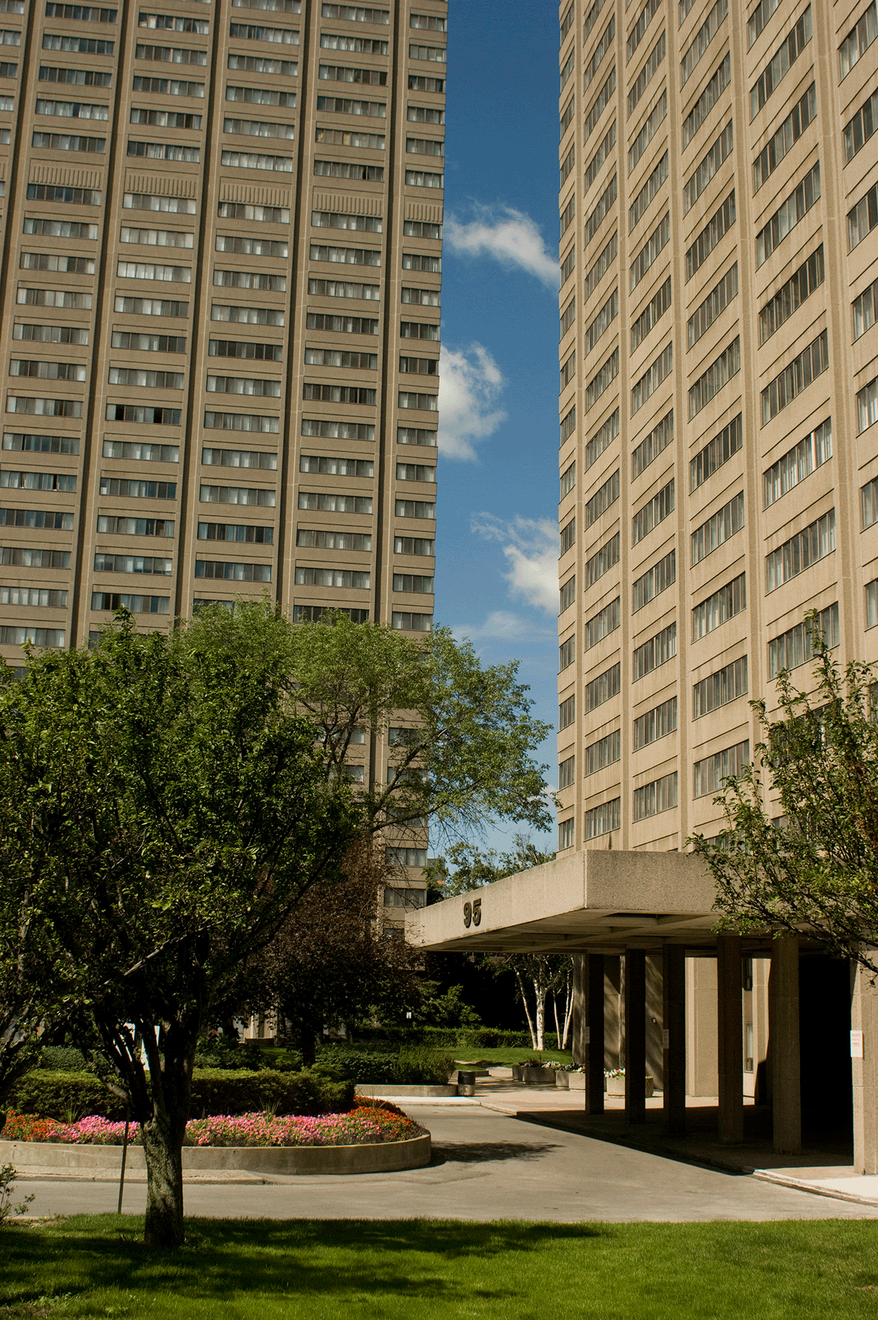
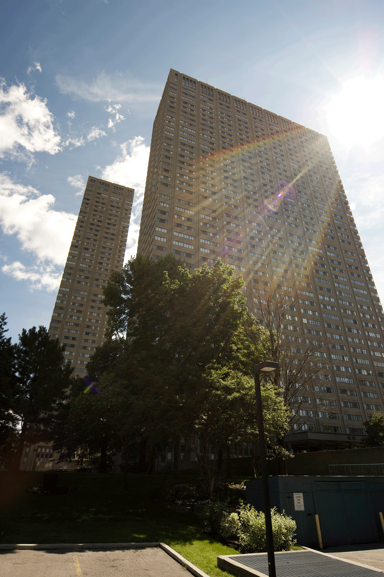
But you can't blame the architects entirely for the mistaken planning ideas of the time. A building was something you drove to rather than approached on foot. Urban plazas and setbacks make more sense in that context.
So at the Sheraton the internal gardens relate beautifully to the interior spaces, but the Queen St frontage is basically ignored. Even Nathan Phillips Square tries consciously to shut out the street instead of relate to it.
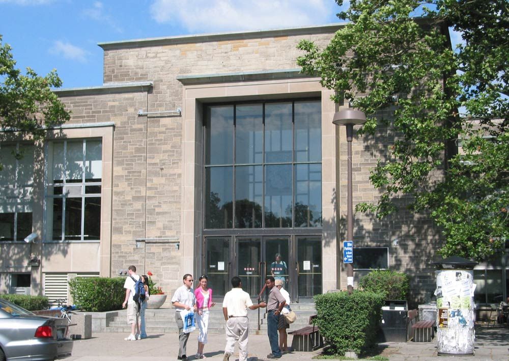
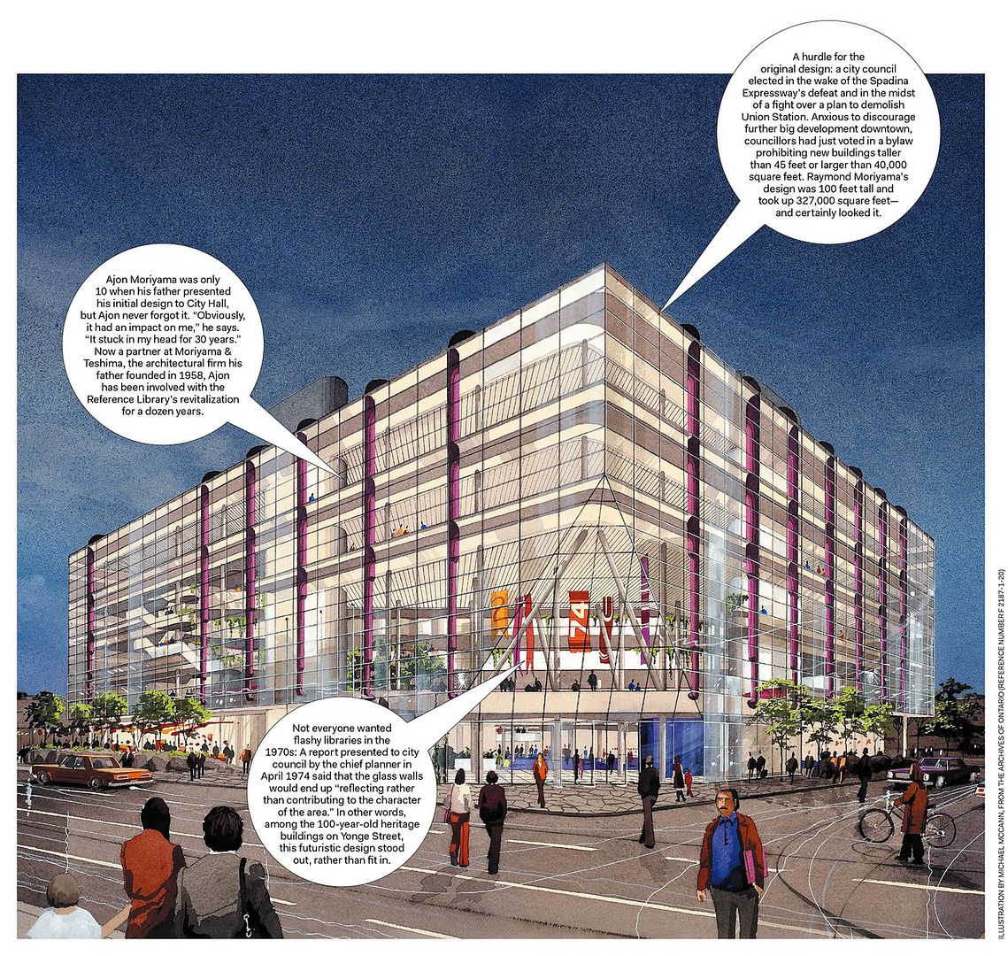
As to the Reference Library: Moriyama's original plan was for a cube of mirrored glass. The brick and the setbacks were forced on him by politicians and the community.
But you can't blame the architects entirely for the mistaken planning ideas of the time. A building was something you drove to rather than approached on foot. Urban plazas and setbacks make more sense in that context.
So at the Sheraton the internal gardens relate beautifully to the interior spaces, but the Queen St frontage is basically ignored. Even Nathan Phillips Square tries consciously to shut out the street instead of relate to it.
As to the Reference Library: Moriyama's original plan was for a cube of mirrored glass. The brick and the setbacks were forced on him by politicians and the community.