Logan
Active Member
TLS sure is ugly from above!

|
|
|

It's receiving attention because it's one of Toronto's most important corners and it's generally regarded as a big disappointment.
Mostly it is disappointing because the agony has dragged on for so long.
.. and we've all noticed that the builder decided not to pick up the pace too much despite the recent flurry of activity. I guess they know what awaits them when they finally finish this -- the "my dog's back-end looks better" Pugly award. They can rest assured they'll get it for whatever year they complete this.
There is of course a repetition of a very tiresome occurrance, my friends. I walked by this TLS thing on Boxing Day and for the first time I noticed the cooling/heating units on top of the building. These could be disguised, you know. The developer is doing his/her best to make this a gut-wrenching sight.
I don't advocate violence, or anything like it, but someone deserves a good slap.
Another thing; did the rooftop cooling boxes appear in the rendering?
Yeah, because TLS is one big fat pile of effort. Vents covering fake fans could be the finishing touch on this masterpiece. That's all it needs!
")
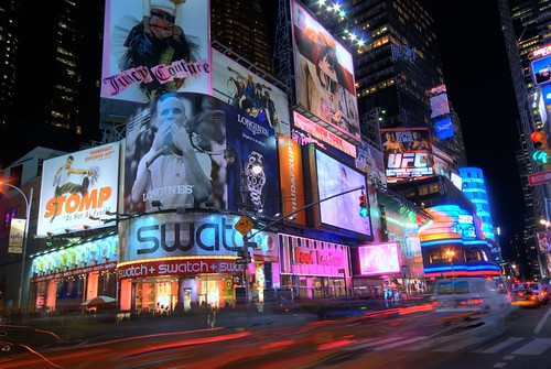
To see a truly terrible alternative, one only needs to look across the street to the media tower over Forever 21. I would rather see another TLS behind all that advertising than open sky.
Am I the only one here that thinks it is what it is and actually likes it in a novelty kind of way? This building over time will evolve over and over again and it will help (not that it already hasn't) give 24 life to that intersection.
How is that "truly terrible"? I can imagine discerning people actually *preferring* its functional/structural honesty: it is what it is, a straightforward advertising pylon. Better that than PenEquity's aesthetically inept attempt to extrapolate it all into a functioning building.
Heck, if you find that media tower objectionable, you might as well find the original 70s high-tech pipeworks Eaton Centre aesthetic more objectionable than TLS...